Rootwork Eco Non-Profit Nature Mark
English full prompt
A hopeful, organic logomark for an environmental non-profit called "Rootwork". The icon depicts an abstract root system drawn in continuous single-line style — three branching roots below ground mirrored by three branching stems above, all emanating from a central axis, forming a symmetric but biologically imperfect plant in cross-section. The line is a warm forest-green on an unbleached paper-white. The wordmark "ROOTWORK" is set in a rounded, slightly condensed sans-serif beneath, with the letter O replaced by a small circle containing a leaf dot. The sheet shows the full horizontal lockup, a stacked lockup, and the standalone icon used as a small wax-seal embossed in olive-green on kraft brown. Mood: earnest, grounded, activist without aggression.
中文完整提示词
一款充满希望的有机标志,用于名为 「Rootwork」 的环保公益机构。图标以单一连续线条描绘抽象根系——地下三分叉根系与地上三分叉茎叶对称映像,均从中轴线延伸,形成生物感的植物截面图。线条为暖森林绿色,底色未漂白纸白。字标 「Rootwork」 以圆润略压缩无衬线字体排印于下,字母 O 替换为内含叶点的小圆圈。展示横排全锁版、堆叠版,以及在牛皮棕纸上橄榄绿压凸蜡印章的独立图标版。气质真诚、接地,有行动力而不具攻击性。
Related cases
-
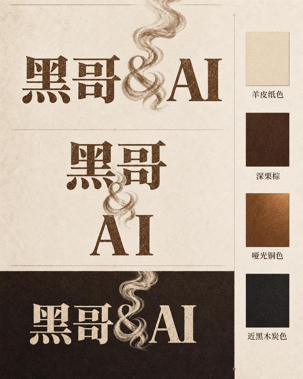
Ember & Roast Coffee Wordmark
A professional brand identity sheet for a specialty coffee roaster called "Ember & Roast". The wordmark is set in a condensed, slightly weathered serif typeface with warm ink-brow…
-
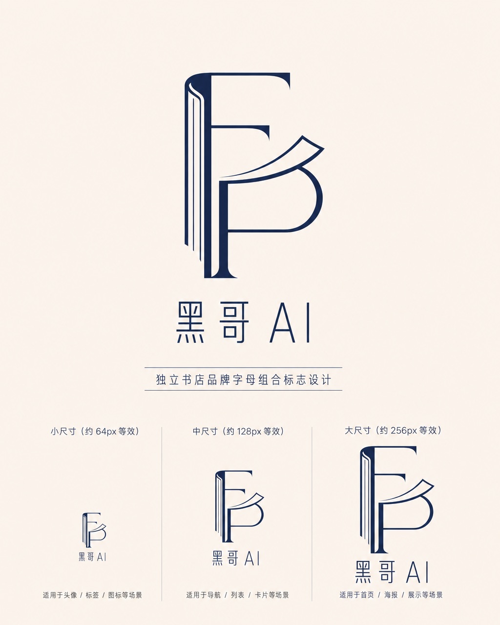
Folded Page Bookshop Monogram
A refined monogram logo design for an indie bookshop named "Folded Page". The monogram interlocks the letters F and P in a clean, geometric negative-space construction — where the…
-

Axon AI Startup Geometric Mark
A polished geometric logomark for an AI startup called "Axon". The mark is a precise dodecahedron-derived hexagonal node with thin connecting lines radiating from each vertex — su…
-

Brightly Dental Clinic Friendly Mark
A warm, approachable logo system for a dental clinic called "Brightly". The icon is a simplified tooth shape with a small smiling arc cut into its base and a single sparkle star a…