Brightly Dental Clinic Friendly Mark
English full prompt
A warm, approachable logo system for a dental clinic called "Brightly". The icon is a simplified tooth shape with a small smiling arc cut into its base and a single sparkle star at the upper-right corner — friendly without being childish. Color palette: fresh spearmint-green and clean white with a secondary pale sky-blue. The full lockup places the icon to the left of the wordmark "Brightly" in a rounded, friendly sans-serif with soft letter terminals. The sheet shows the primary horizontal lockup, a stacked version for small applications, and a favicon-scale version. The overall tone is reassuring, modern, and gently optimistic — the kind of clinic branding that eases anxiety.
中文完整提示词
一套温暖、平易近人的标志系统,用于名为 「Brightly」 的牙科诊所。图标是简化的牙齿形状,底部刻有微笑弧线,右上角有一颗小闪星——友好但不幼稚。色调:清新薄荷绿与洁白,辅以淡天蓝。横排全锁版将图标置于字标 「Brightly」 左侧,字体为圆润友好的无衬线体,字端柔和。展示横排主版、堆叠版和 favicon 尺寸版。整体气质令人安心、现代、温和乐观。
Related cases
-
Ember & Roast Coffee Wordmark
A professional brand identity sheet for a specialty coffee roaster called "Ember & Roast". The wordmark is set in a condensed, slightly weathered serif typeface with warm ink-brow…
-
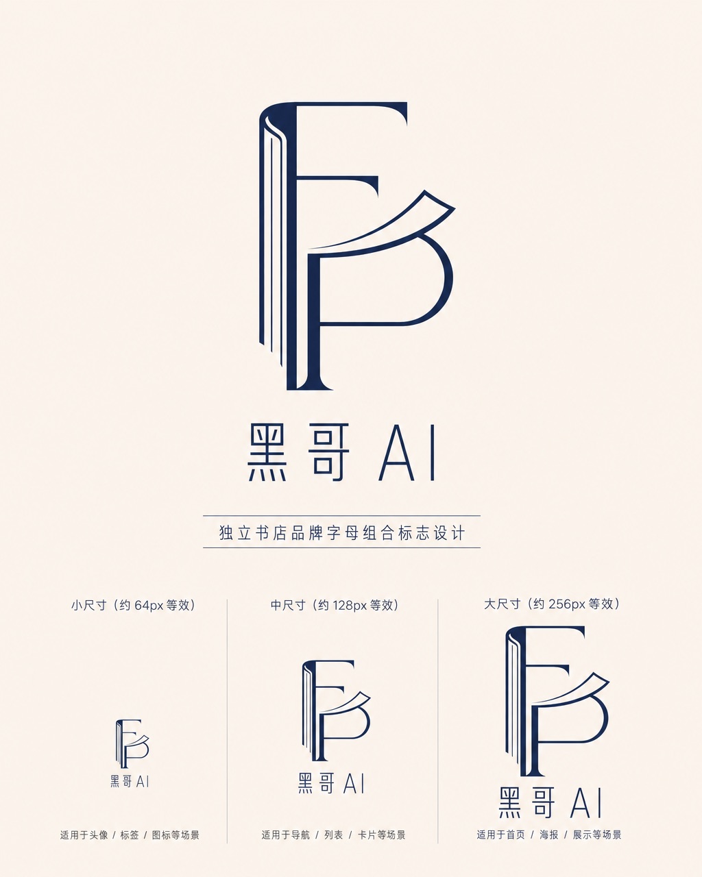
Folded Page Bookshop Monogram
A refined monogram logo design for an indie bookshop named "Folded Page". The monogram interlocks the letters F and P in a clean, geometric negative-space construction — where the…
-
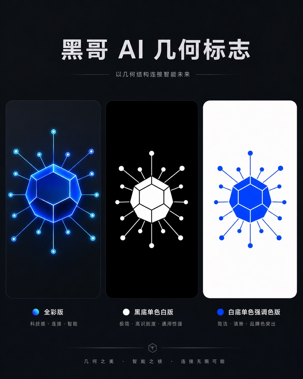
Axon AI Startup Geometric Mark
A polished geometric logomark for an AI startup called "Axon". The mark is a precise dodecahedron-derived hexagonal node with thin connecting lines radiating from each vertex — su…
-
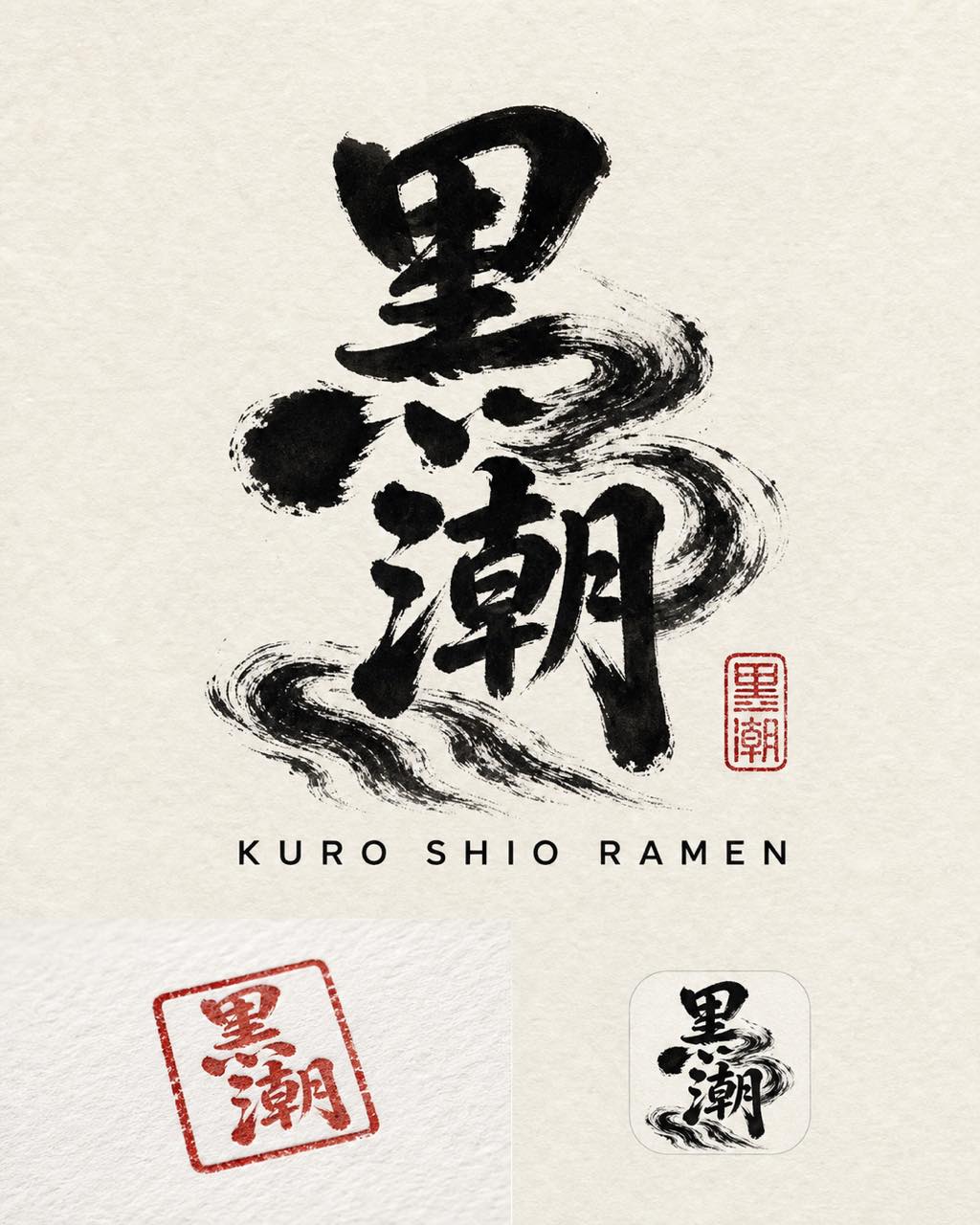
Kuro Shio Ramen Kanji-Influenced Logo
A bold, kanji-influenced logo for a ramen shop called "黒潮" (Kuro Shio — Black Current). The mark fuses the two kanji characters 黒 and 潮 into an interlocking brush-calligraphy comp…