Posters & Editorial
Japanese Matsuri Festival Poster Hotaru
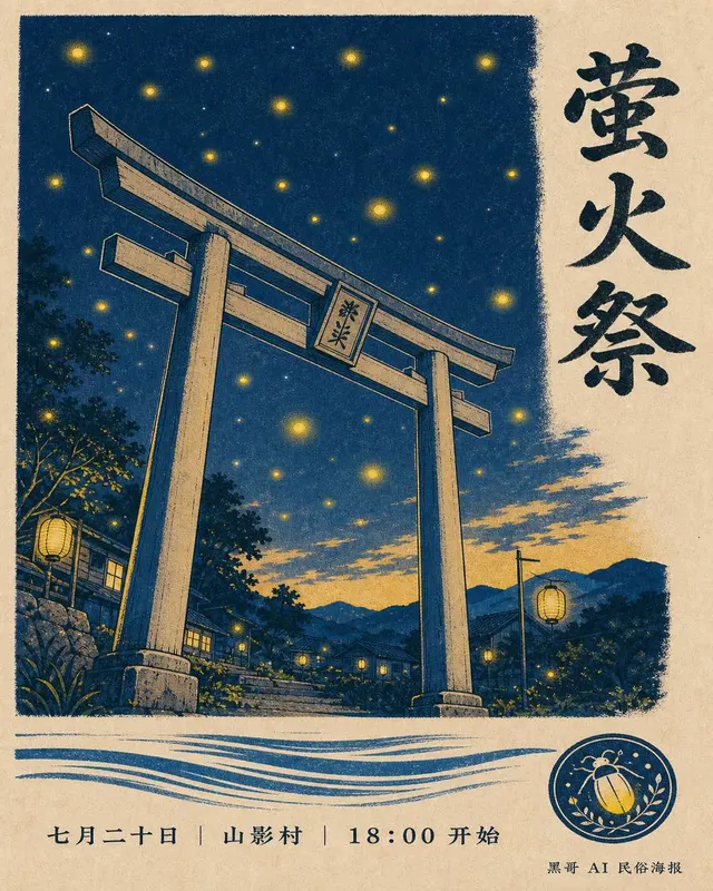
A vertical festival poster for a fictional summer matsuri called "Hotaru-Matsuri" hosted by a small mountain village. B2 portrait format pr…
Japanese ClassicalEditorialMinimalist
Editorial-grade poster prompts with reliable typography.
60 prompts
Poster prompts are the hardest category to write well, and the most useful when they work. The reason: GPT Image-2 is improving fast on typography, but a sloppy poster prompt still produces flat layouts with floating, half-legible text. A tight poster prompt produces something you can hand to a print shop.
The cases in this collection are written with a strict layout grammar. Each prompt names the format (A2 / A3 / theatrical one-sheet), the type hierarchy (display headline, sub-headline, ribbon, footer credits), and the typography family in concrete language ("condensed grotesque sans, weight 700 for the headline, italic serif for the credits"). It also names the color logic — usually one dominant + one accent + one neutral — so the result doesn't drift toward the mid-tone mush that generative models like to default to.
You will see four sub-genres here. Editorial covers borrow from magazine systems: hierarchy first, then imagery. Event posters are deliberately loud, with a single hero element and a strong slab below it. Movie keyart leans cinematic, with the title locked to the bottom third and characters at high contrast. And type-driven posters skip imagery entirely — they treat the headline itself as the visual.
Every prompt quotes the headline text explicitly. If you swap the quoted text for your own copy, the typography usually holds. If you remove the quotes and describe the headline in vague terms, the model invents words. Keep the quotes; change the content inside them.
The Chinese-language poster cases are written with CJK typography in mind — the model handles 楷体, 宋体, 黑体, and 隶书 reasonably well when you name them and pick a tight composition. Mixed-script posters (Chinese headline + English subhead) work, but ask for them explicitly or the model will pick one and drop the other.
Posters & Editorial
A vertical festival poster for a fictional summer matsuri called "Hotaru-Matsuri" hosted by a small mountain village. B2 portrait format pr…
Posters & Editorial
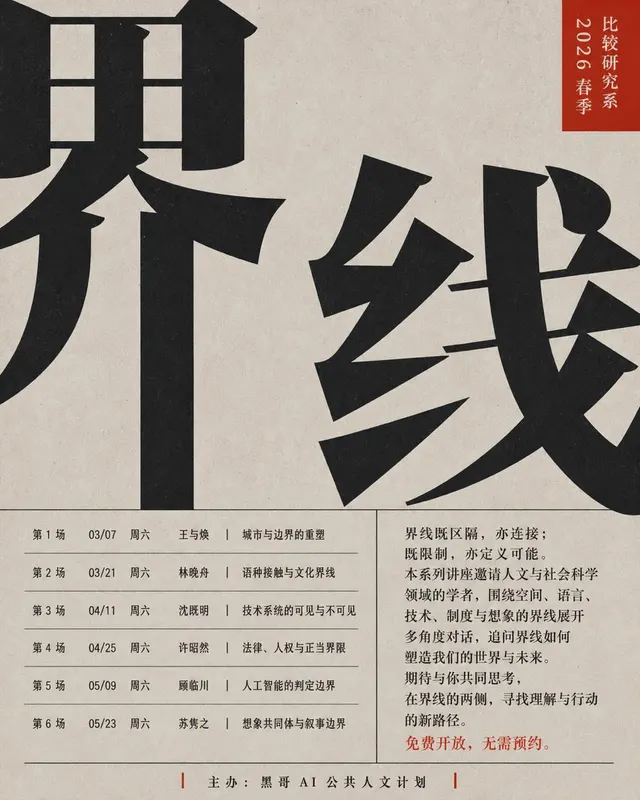
A bold academic lecture series poster for a fictional public-humanities programme titled "Thresholds". Vertical B1 format on warm newsprint…
Posters & Editorial
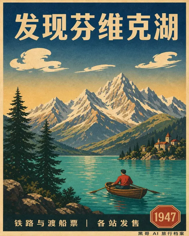
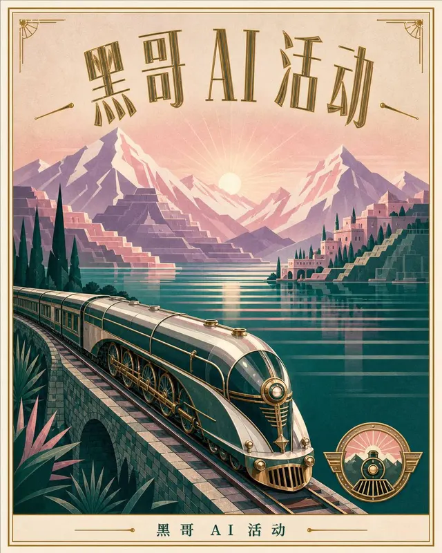
A 1940s-era travel poster in the spirit of mid-century European railway lithographs, vertical 24x36 inch format, advertising a fictional al…
Posters & Editorial
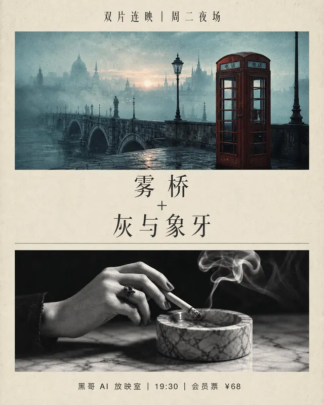
A two-panel art-house cinema double-feature poster, vertical 27x40 inch one-sheet format, split horizontally into upper and lower halves wi…
Posters & Editorial
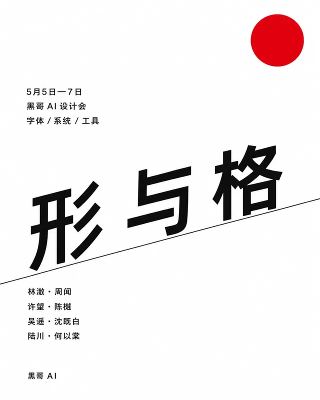
A portrait A1 conference poster in strict Swiss International Style for a fictional design conference. White background. A precise modular…
Posters & Editorial
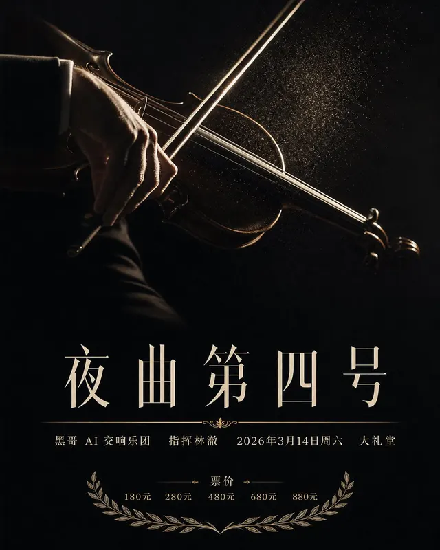
A vertical concert poster, 70x100cm proportions, for a symphony performance. Centered on a deep ink-black background floats a single high-c…
Always quote the exact headline. "Lost in Translation" gives clean type; "a poster headline about being lost in translation" gives gibberish.
Name the format up front: A2 poster, theatrical one-sheet, 24×36 in, etc. Aspect ratio drives every other decision.
Pick one dominant color, one accent, one neutral. More than three colors and the layout starts to mush.
For CJK posters, name the font family (黑体, 宋体, 楷体) and a font weight — vague "Chinese font" prompts collapse into a generic sans.
If the model invents fake "lorem ipsum" filler text in your poster, add "no placeholder text, no lorem ipsum" to the prompt.

Posters & Editorial
A warm holiday market poster for a fictional winter market called "Lantern Square" in an old-town plaza. Vertical 500x700 mm format on slig…
Posters & Editorial
A small-venue jazz concert poster for a fictional quartet named the Avery Mori Four, residency title "Three Rooms". Vertical 12x18 inch for…
Posters & Editorial
A clean modern poster for a fictional independent publishers' book fair titled "Margins". Vertical A1 format on bright white smooth stock.…
Posters & Editorial
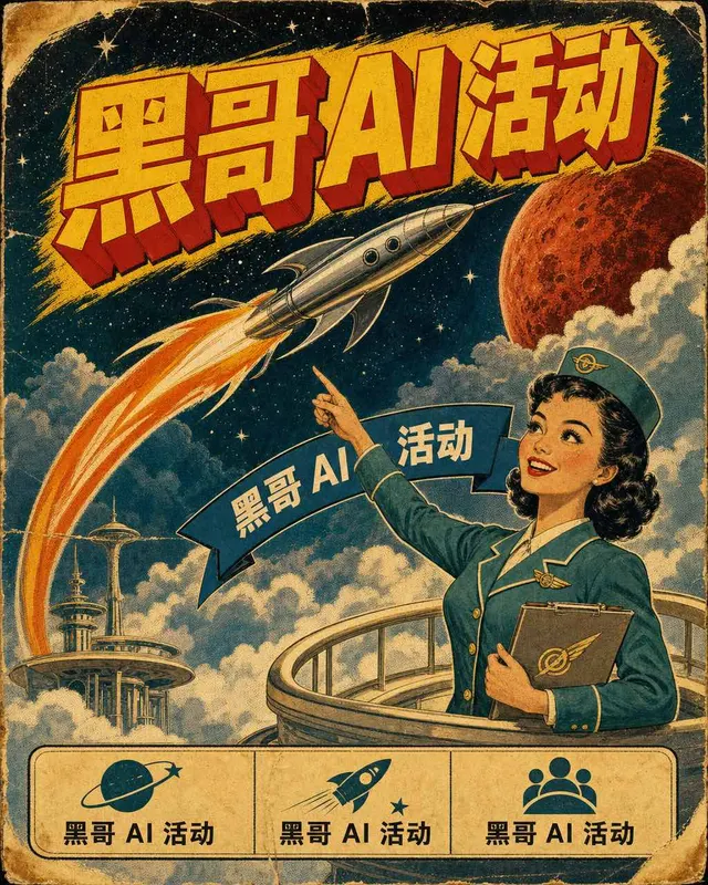
A 1950s pulp sci-fi style poster for an imagined airline-style interplanetary service called "Mars Courier". 17x22 inch vertical format, pa…
Posters & Editorial
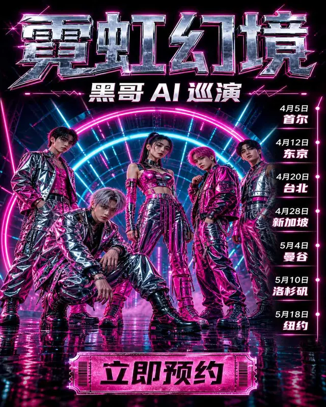
A high-energy concert tour poster for a fictional five-member K-pop group named LOOM, tour title "Neon Mirage 2026". Vertical 24x36 inch fo…
Posters & Editorial
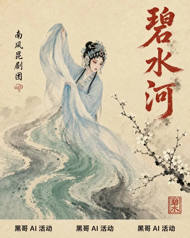
A traditional Chinese opera poster for a fictional new Kunqu staging titled "Jade River". Vertical 700x1000 mm format on warm rice-paper te…
Posters & Editorial
A surrealist solo exhibition poster for a fictional painter named Renske Aalbers, show title "Dream Tariffs". Vertical 24x36 inch format wi…
Posters & Editorial
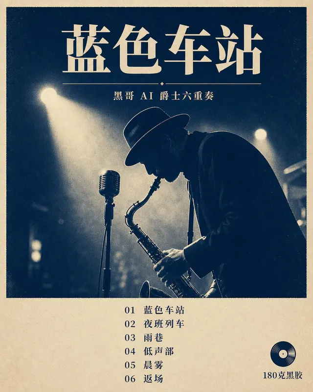
A promotional poster announcing a fictional jazz album reissue on vinyl, titled "Blue Station" by the imagined Otis Lamar Sextet. Vertical…

Posters & Editorial
An exhibition poster for a fictional contemporary art collective show titled "Soft Machines". Square 700x700 mm format. The background is a…
Posters & Editorial
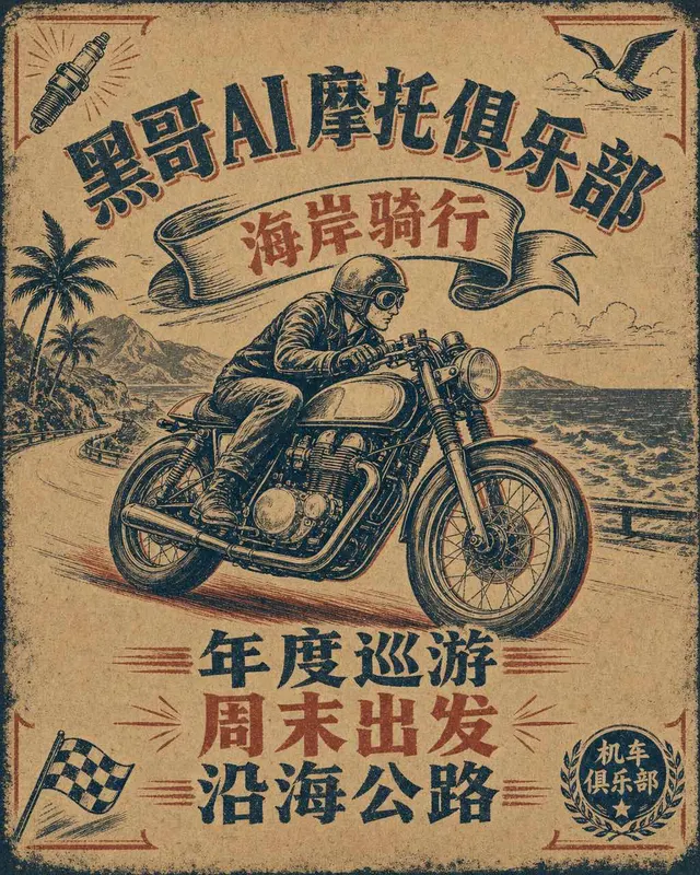
A 1960s-style poster for the fictional Iron Larks motorcycle club annual coast ride. 17x22 inch vertical format printed as if on rough kraf…

Posters & Editorial
An elegant charity gala invitation poster for the fictional Northern Light Foundation annual dinner. Vertical 18x24 inch layout printed in…

Posters & Editorial
A modern software product launch poster for a fictional collaborative note-taking app called Driftnote. Portrait 24x36 inch composition wit…

Posters & Editorial
A large-format corporate brand launch poster announcing a fictional renewable-energy firm called Helios. Vertical A1 layout with a strict t…
Posters & Editorial
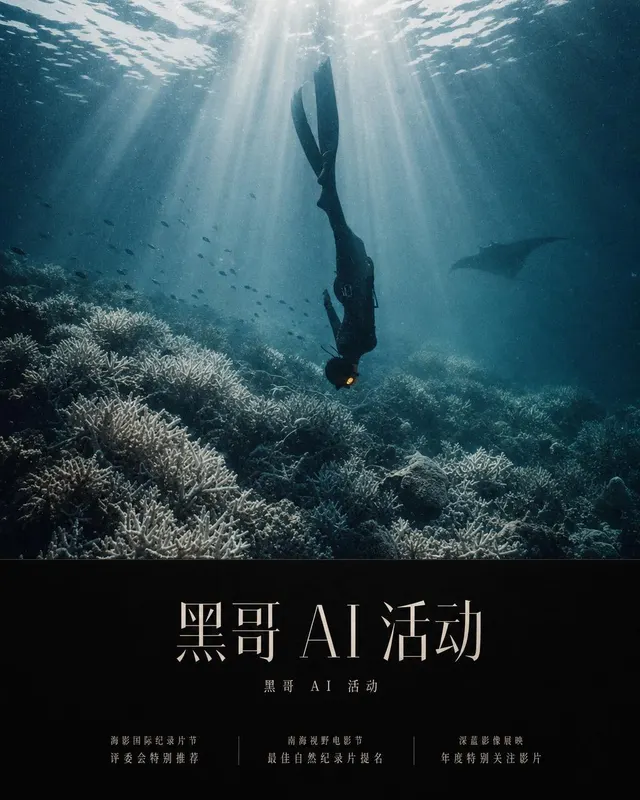
A cinematic environmental documentary key-art poster, 27x40 inch portrait, for a fictional feature titled "WHAT THE REEF REMEMBERS". The im…

Posters & Editorial
A calm modern wellness retreat poster, A2 portrait, for a fictional weekend program called "STILLPINE". The composition is generous and bre…
Posters & Editorial
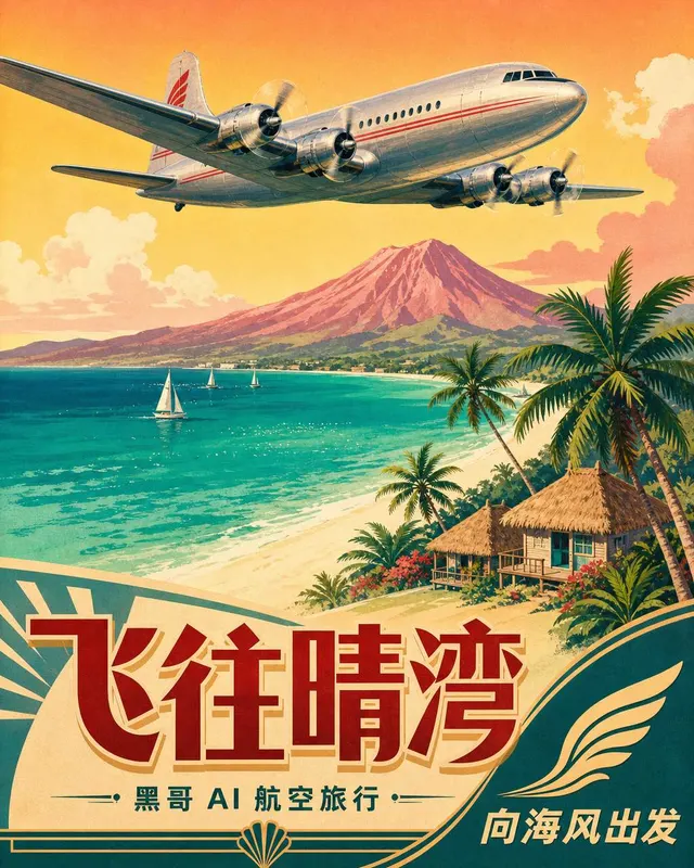
A 1955-style airline travel poster, 25x40 inch portrait, advertising a fictional carrier "AURORA AIRWAYS" to a fictional tropical destinati…

Posters & Editorial
A summer music festival lineup poster, 18x24 inch portrait, in a flat geometric illustration style. The upper two-thirds is a stylised land…
Posters & Editorial
A fan convention key-art poster, 24x36 inch portrait, designed as a tribute to mid-1990s comic book covers but for a fictional original eve…
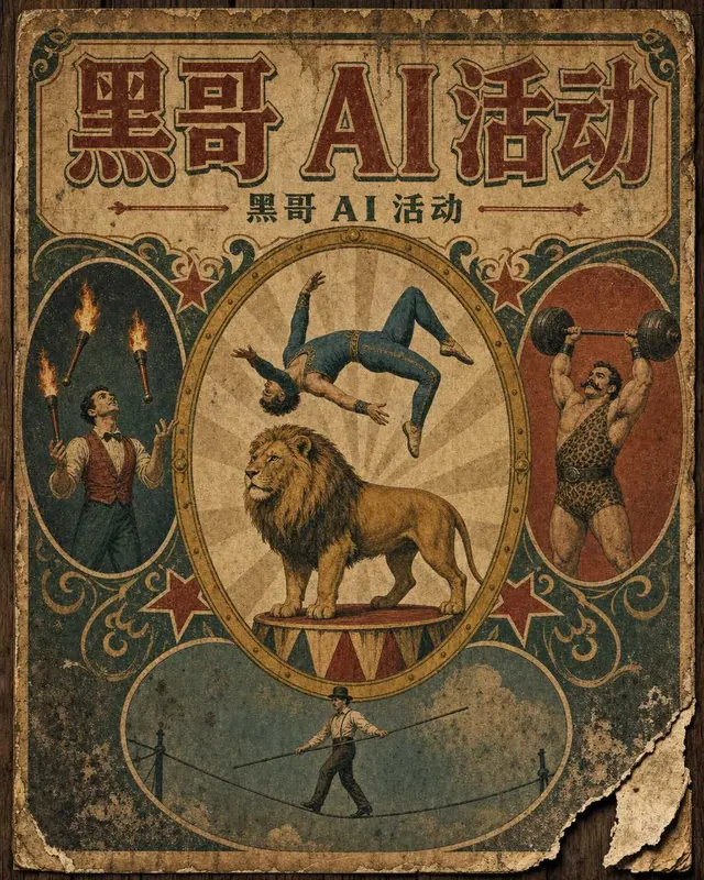
Posters & Editorial
A 1910s-style vintage circus broadside, 28x42 inch portrait, designed as if lithographed on cheap newsprint and pasted on a barn wall. The…

Posters & Editorial
A handmade climate march protest poster, 18x24 inch portrait, designed to be photocopied and carried on a stick. Two-color screen print loo…
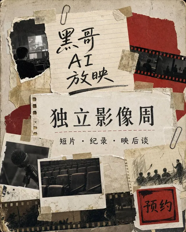
Posters & Editorial
An indie film festival poster, 18x24 inch portrait, designed as a cut-paper collage. Multiple irregular photographic fragments are taped or…
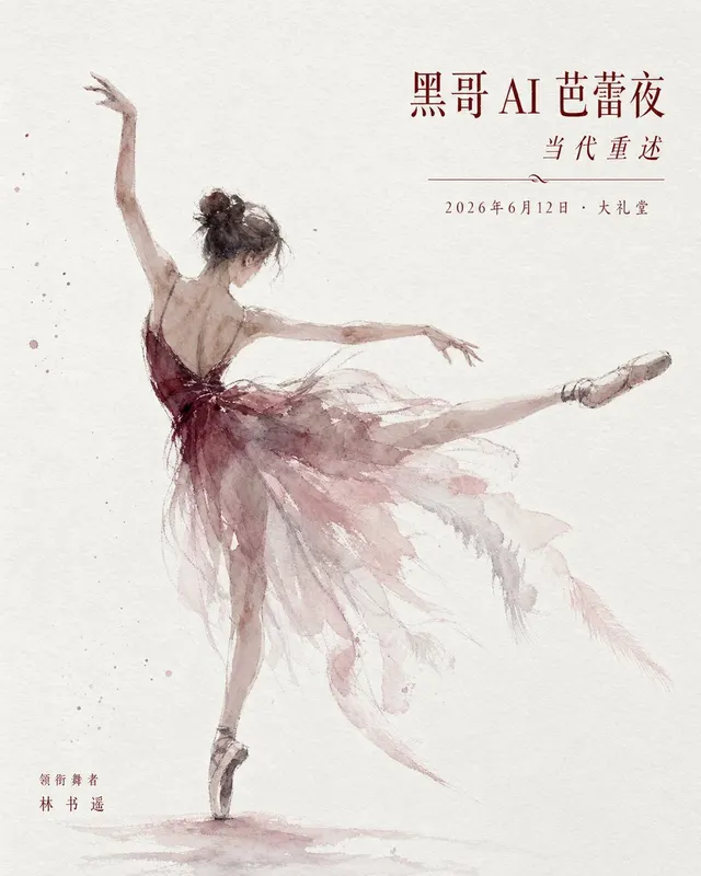
Posters & Editorial
A refined ballet performance poster, A1 portrait, advertising a fictional contemporary reinterpretation of a classical work. The hero image…
Posters & Editorial
A contemporary art biennale poster, B1 portrait format, designed in a rigorous Swiss-modern grid system. The composition is dominated by a…
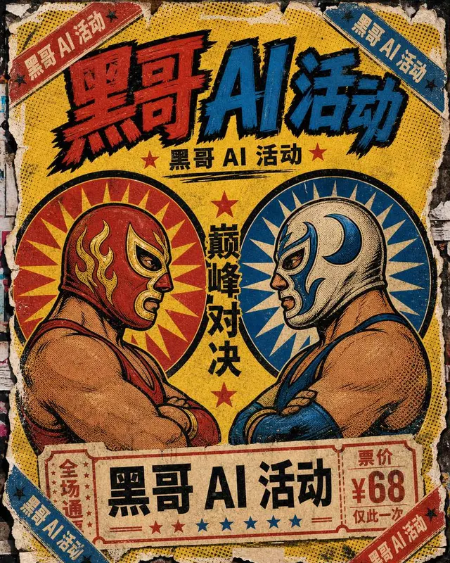
Posters & Editorial
A loud Mexican lucha libre fight-night poster, tabloid 11x17 inch format, in the spirit of street-pasted Mexico City wrestling bills from t…
Posters & Editorial
A brutalist Berlin techno club poster, A2 portrait format, almost entirely matte black with a single high-contrast image: a close-up macro…
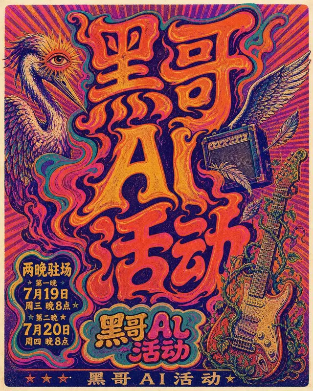
Posters & Editorial
A 1972 psychedelic rock concert poster, 14x22 inch format, screen-printed look advertising a fictional band's two-night residency. The whol…
Posters & Editorial
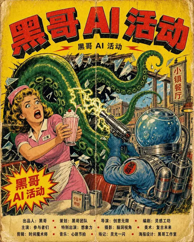
A pulpy 1956 science-fiction B-movie poster, one-sheet 27x41 inch format, with screaming yellow background and a giant green tentacle burst…
Posters & Editorial
A raw electronic-music warehouse-rave poster, vertical A2 format, deliberately rough and underground. Composition: a high-contrast photogra…
Posters & Editorial
A gentle kids theater show poster, vertical A2 format, for a weekend family matinee. Center: a hand-painted gouache illustration of a small…
Posters & Editorial
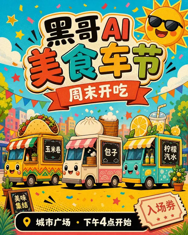
A cheerful summertime food-truck festival poster, vertical 18x24 inch format, in a punchy retro pop-art style. Center: a flat illustration…
Posters & Editorial
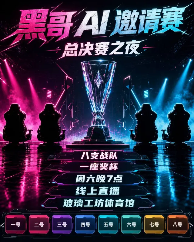
A high-voltage esports tournament poster, vertical 24x36 inch format, for an invitational arena finals. Main image: a low-angle render of a…

Posters & Editorial
A warm podcast launch poster, vertical 18x24 inch format, designed to double as a social-media key visual and a printed flyer for a coffee…
Posters & Editorial
A confident design-systems conference poster, vertical 70x100cm format, advertising a two-day professional event. Composition built from a…

Posters & Editorial
A relaxed natural wine tasting poster, vertical A3 format, for a neighbourhood bottle shop event. Main illustration: a loose watercolor pai…
Posters & Editorial
A discreet gallery opening-night poster, vertical A1, advertising a solo painting show. Layout follows a strict three-column Swiss grid. Le…

Posters & Editorial
A hopeful climate-action march poster, vertical tabloid 11x17 inch format, designed for community printing on recycled paper. Main image: a…

Posters & Editorial
A friendly public science talk poster, A2 vertical format, hosted by a local university astronomy department. Central illustration in clean…
Posters & Editorial
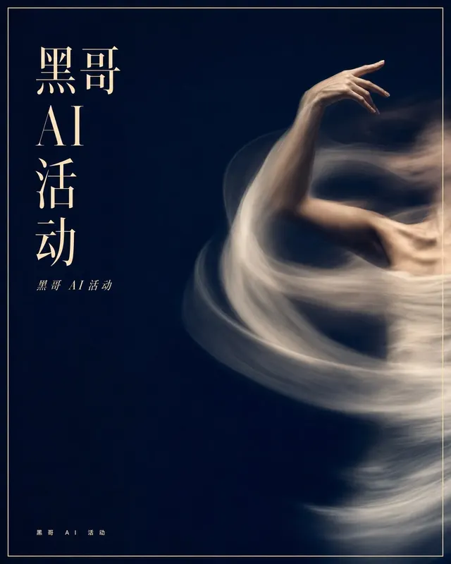
A poetic contemporary dance recital poster, vertical 50x70cm format, focused on a single long-exposure photograph of a dancer's bare arm an…

Posters & Editorial
A bold sports playoff poster celebrating a decisive game, vertical 24x36 inch print. Composition: a single high-shutter studio photograph o…
Posters & Editorial
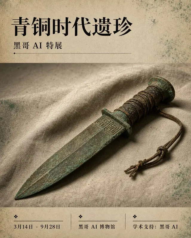
A serious museum exhibition poster, B1 format, advertising a major archaeology show. Center: a single tightly cropped studio photograph of…
Posters & Editorial
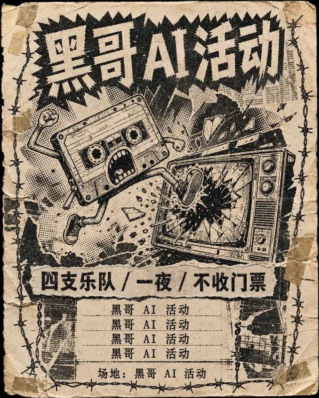
A black-and-white photocopied gig poster for a garage punk show, 18x24 inch flyer aesthetic, looking like it was xeroxed five times then ta…
Posters & Editorial
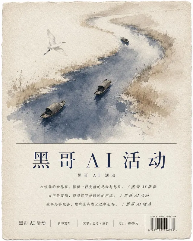
A portrait promotional poster for the release of a fictional literary novel titled "THE QUIET RIVER" by invented author "E. MORANTH". Compo…
Posters & Editorial
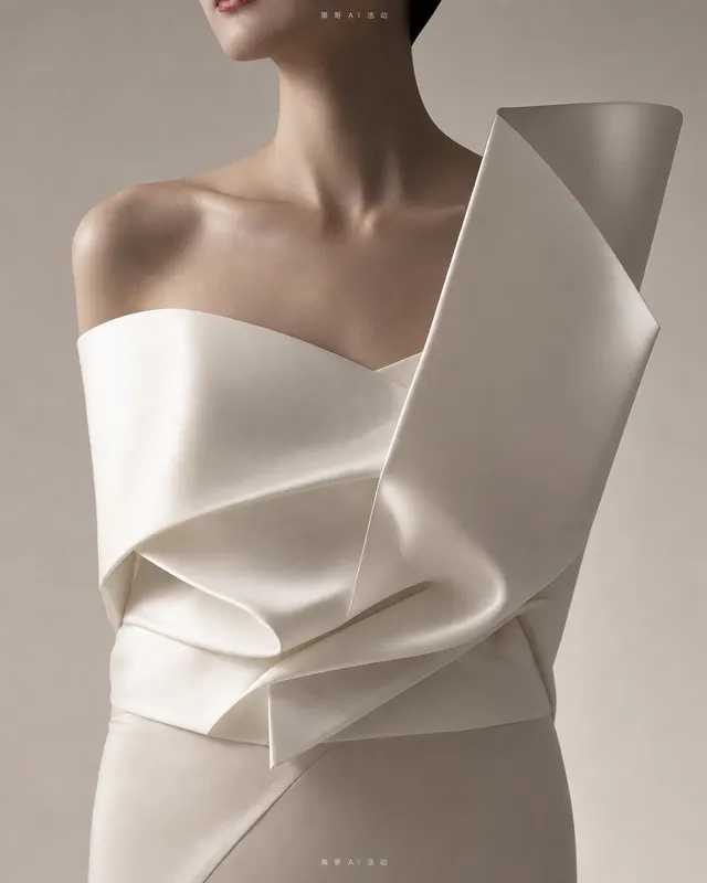
A vertical A0 fashion runway poster for an invented house called "MAISON COROY", debut couture show. A single full-bleed editorial photogra…

Posters & Editorial
A vertical poster for a one-day street food festival called "STEAM & SPICE". A bird's-eye flat illustration depicts a sprawling night marke…

Posters & Editorial
A vertical promotional poster for an underground cyberpunk rave called "NULL/HOUR". Composition: a centered 3D-rendered chrome mask floatin…
Posters & Editorial
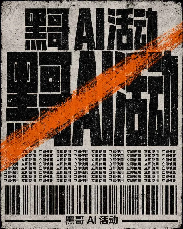
A portrait B2 poster for a one-night academic lecture titled "AGAINST LEGIBILITY". Aggressive brutalist typographic layout, no imagery. Bac…

Posters & Editorial
A vertical civic-style poster promoting a public library reading campaign, drawing on mid-century propaganda-poster compositional energy bu…
Posters & Editorial
A portrait theatre poster for an experimental two-act play titled "THE GLASSHOUSE INTERVIEW". The image is a single staged photograph: an e…

Posters & Editorial
A vertical festival poster bursting with color for a three-day outdoor music festival called "SUNSPILL". Composition: a stylized illustrati…
Posters & Editorial
A vertical travel poster in the style of 1930s European railway promotions, but for an invented destination called "LAKE AURELIA". Flat ill…
Posters & Editorial
A portrait gig poster for a fictional indie four-piece touring small venues. The illustration shows a quiet surreal scene: four young music…
Posters & Editorial
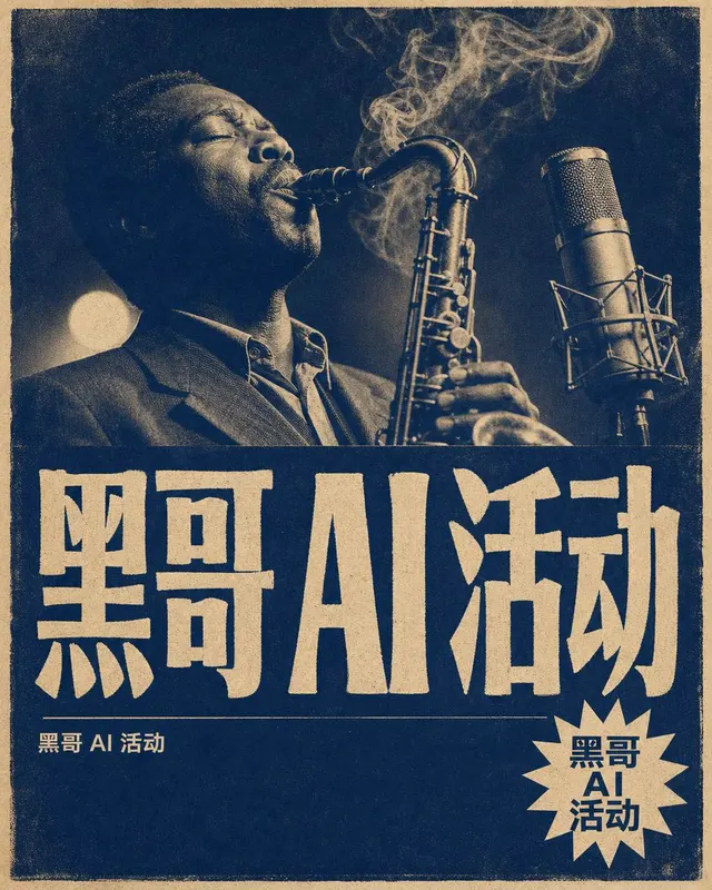
A B2 portrait poster advertising a weekly jazz night at a basement club. Style: 1960s blue-note record-sleeve influence, but invented anew.…
Posters & Editorial
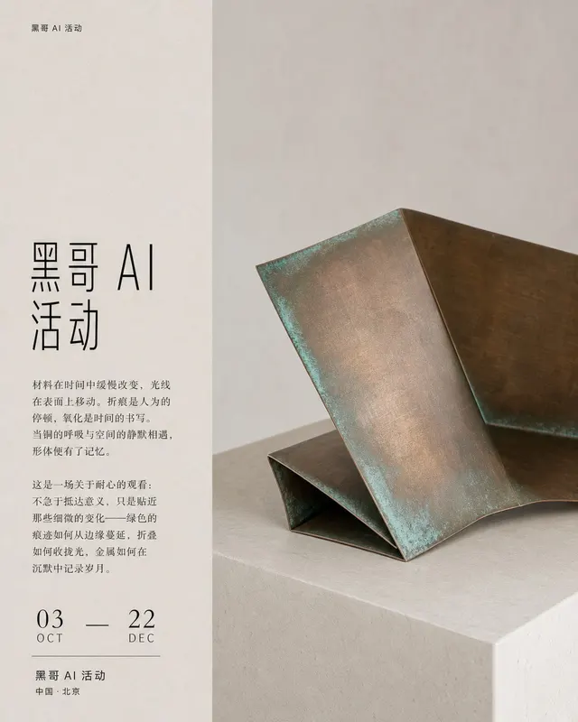
A square A1-scaled exhibition poster for a contemporary sculpture show. Background is warm chalk gray. A single oversized photographic obje…
Posters & Editorial
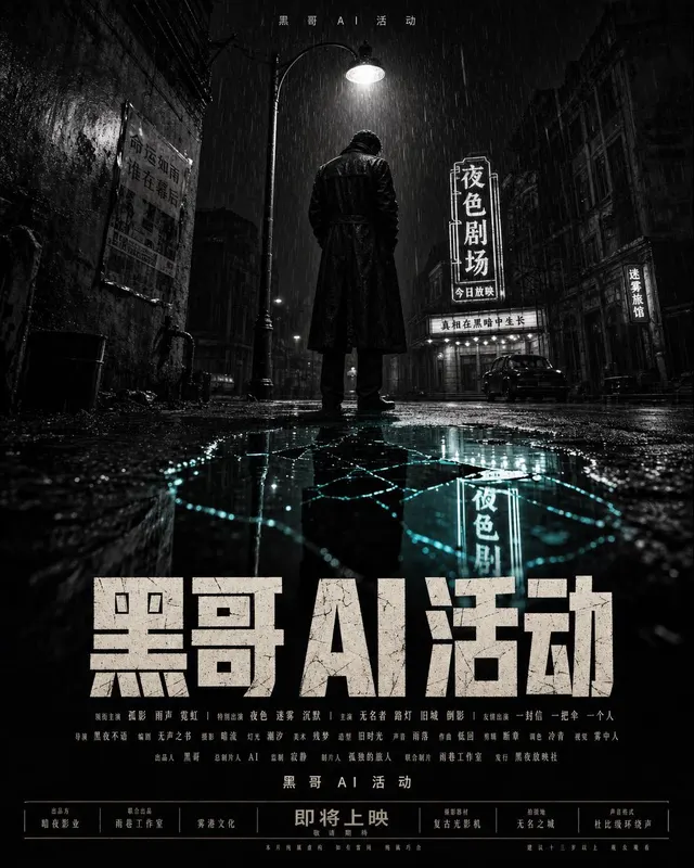
A theatrical one-sheet for a fictional neo-noir film, 27x40 inch portrait ratio. Composition: a low-angle shot of a lone figure in a long c…