Celer Fintech Minimal Geometric Identity
English full prompt
A precise, trust-signalling brand identity sheet for a fintech company called "Celer". The logomark is a compressed equilateral triangle with its interior divided by three concentric arcs — evoking both a signal-strength icon and an upward growth chart — rendered in a gradient from deep sapphire-blue at the base to bright cerulean at the apex. The wordmark "Celer" is set in a refined geometric sans-serif with the e and l sharing a hairline connector stroke, in dark slate on white. The sheet displays the full lockup, a compact square icon for app icon use, the brand color system (sapphire, cerulean, silver, near-black), and a type-scale specimen showing heading/body pairing. Mood: fast, precise, trustworthy, digitally-native.
中文完整提示词
一张精准、传递信任感的品牌识别展示页,用于金融科技公司 「Celer」。标志图形是压缩等边三角形,内部由三条同心弧线分割——既让人联想到信号强度图标,又暗示向上增长曲线——底部深蓝宝石色向顶端明亮天青蓝渐变。字标 「Celer」 以精致几何无衬线字体呈现,e 与 l 共享一条发线连笔,深石板色在白底上。展示全锁版、正方形 App 图标版、品牌色系(蓝宝石、天青蓝、银色、近黑)和标题/正文字体搭配示例。气质快捷、精准、可信、数字原生。
Related cases
-
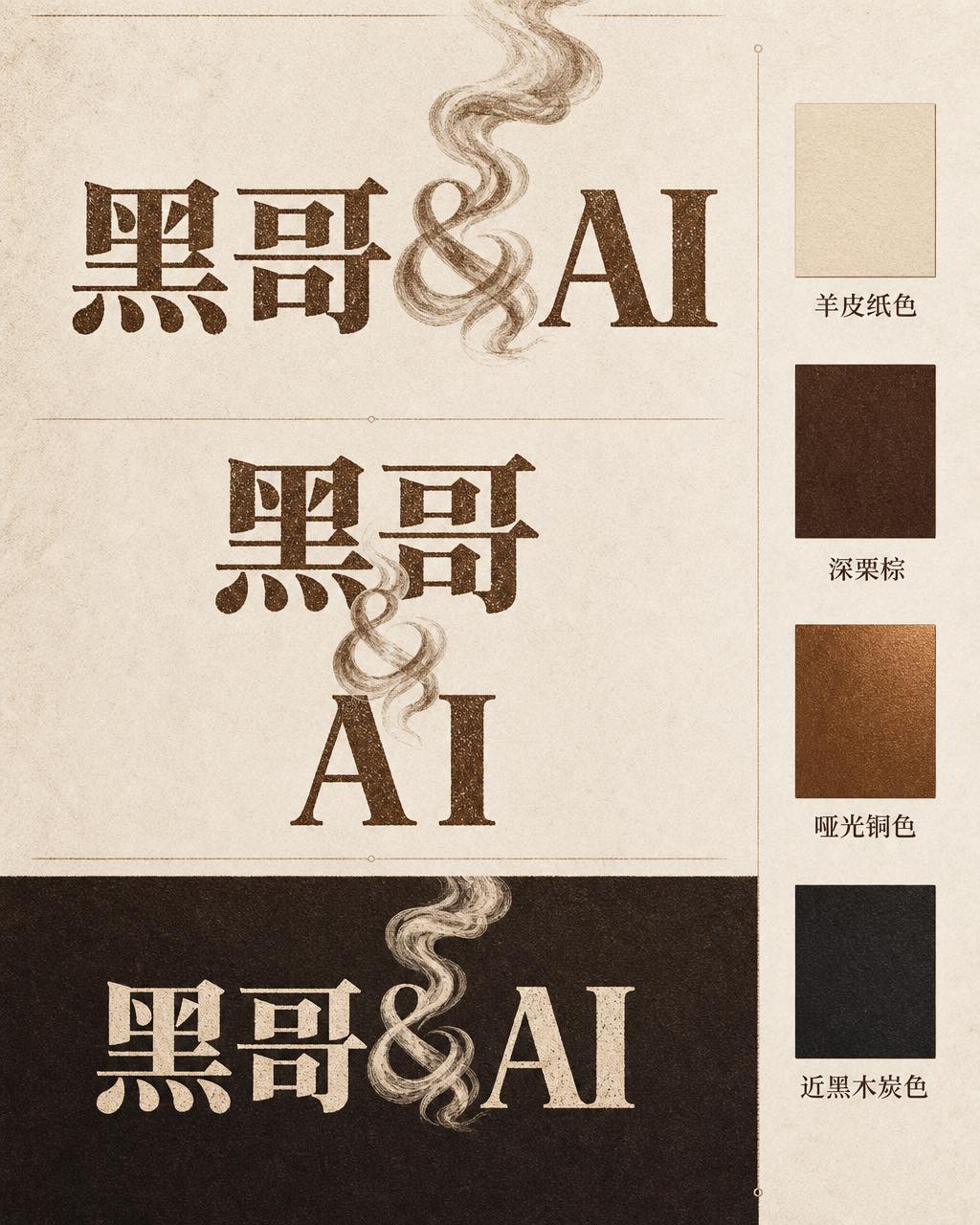
Ember & Roast Coffee Wordmark
A professional brand identity sheet for a specialty coffee roaster called "Ember & Roast". The wordmark is set in a condensed, slightly weathered serif typeface with warm ink-brow…
-
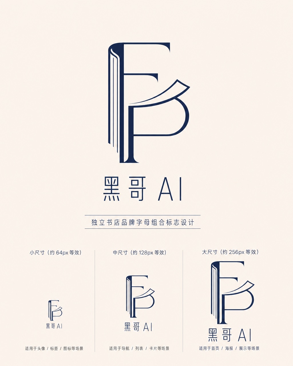
Folded Page Bookshop Monogram
A refined monogram logo design for an indie bookshop named "Folded Page". The monogram interlocks the letters F and P in a clean, geometric negative-space construction — where the…
-
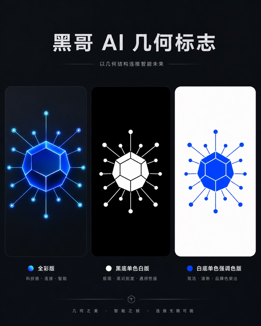
Axon AI Startup Geometric Mark
A polished geometric logomark for an AI startup called "Axon". The mark is a precise dodecahedron-derived hexagonal node with thin connecting lines radiating from each vertex — su…
-
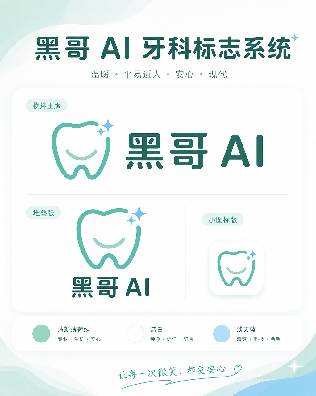
Brightly Dental Clinic Friendly Mark
A warm, approachable logo system for a dental clinic called "Brightly". The icon is a simplified tooth shape with a small smiling arc cut into its base and a single sparkle star a…