Hearing Protection Field Infographic
This is a Infographics & Diagrams AI image prompt case, leaning toward 数据叙事, 主题信息图, 精确标注. Copy the full prompt below and paste it into a free GPT image generator to create your own image with GPT Image-2 — swap the subject, brand, or aspect ratio as needed.
English full prompt
Produce a single finished image, “Hearing Protection,” so the viewer immediately understands clearly explaining the structure, relationships, and actionable cues of “Hearing Protection”. Build the infographic by asking the image to turn transit, headphones, traffic, and office noise into four exposure rooms whose risk area expands with duration, allowing cause, time, stage, or quantity to follow one unmistakable route. Turn transit, headphones, traffic, and office noise into four exposure rooms whose risk area expands alongside duration. In Hearing Protection, situate each variable beside the element it describes: numbers carry sequence, arrows carry direction, scale cues carry magnitude, and tonal steps express relative intensity; omit percentages when no verified quantity is supplied. Present Hearing Protection as dominant scene on the left alongside layered cards on the right, seen by a near-orthographic eye-level or overhead view alongside macro explanation only where needed. Lock the title to “通勤噪声风险刻度” and add only the Chinese labels required for comprehension. Apply sea-salt white, tidal blue, coral pink, and ink black; each light and shadow should explain how crisp vector lines, matte paper grain, translucent overlays, and a one-to-one legend are manufactured, held, or used for Hearing Protection. For Hearing Protection, retain contact point, tool, and finished state on one focal plane and restrained raking key light. Add no unrelated surface treatment: align vector edges, arrow endpoints, legend swatches, and translucent overlays precisely. Set geometric sans serif using monospaced numerals against a bone-white paper field that does not compete, producing a clean editorial-infographic finish. Additional control: subtle occlusion beneath transparent parts; edge highlights appear only at plausible angles. Use natural fabrication medium color supporting one cue color, ensure focus leads from the fabrication medium joint to the finished state, and let the highest-contrast point become the reading entry. Use a 47:19 primary-to-support grid for Hearing Protection, stage the first node near 30 percent of the horizontal span, and divide labels into 6 short groups; preserve continuous negative space so local notes never overtake the primary form. Prevent conflicting arrows, mismatched legends, fabricated statistics, dense microtext, or decorative dashboards. Keep people anonymous and make fingers, occlusion, gravity, and light direction correct. Return one 9:16 final image without variants or a process sheet. Final art direction: clear information design with a coherent visual route and restrained editorial structure. Use this controlled palette as the dominant visual system: #F2EFE7, #27384B, #6D8F89, #C96A43; preserve believable local material colors within it. Preserve the requested text hierarchy and wording as part of the design, but do not invent extra slogans, pseudo-text, logos, or watermarks. Keep one unmistakable primary subject or information route and one readable visual action. Use disciplined negative space and avoid default perfect symmetry. Physical credibility is mandatory: correct gravity, contact shadows, material thickness, tool weight, joint loading, fabric tension, liquid direction, reflections, scale, and occlusion. Create an original visual with no resemblance to a public figure, copyrighted character, existing campaign, or living artist signature style. No unrelated decorative icons, floating objects, duplicated limbs, plastic gloss, waxy skin, synthetic collage artifacts, or AI watermarks. Return exactly one finished image composed for 9:16; no variants, process sheet, split panels, mockup frame, or contact sheet.
中文完整提示词
创作单张成片《通勤噪声风险刻度》,让观者立即理解清晰解释「通勤噪声风险刻度」的架构、关系与行动线索。
以把地铁、耳机、马路和办公室做成四个声压房间,以停留时长决定风险面积搭建整张信息图,因果、时间、空间或数量关系沿一条明确路径展开
把地铁、耳机、马路和办公室做成四个声压房间,以停留时长决定风险面积
把「通勤噪声风险刻度」的各个主题变量明确地放在对应对象旁:编号承担顺序,箭头承担方向,尺度承担量级,相对色阶只表达强弱;缺少可靠数值时不填造百分比。
构图采用左侧主场景加右侧分层卡片。
标题锁定为「通勤噪声风险刻度」,只补充完成理解所需的中文标注。
为「通勤噪声风险刻度」保留接触点、工具和落点处于同一焦平面和克制的斜向主光;不额外增加物料,重点是矢量边缘、箭头端点、图例色块和半透明叠层保留精确对齐。版面以几何黑体配等宽数字落在不抢主对象的骨白纸面,成片呈清爽的编辑信息图质感。补充控制:透明件下的轻微遮影,边缘高光只出现在合理角度;以自然物料色衬托单一提示色,焦点由材料连接点引向最终形态,对比最高的位置就是阅读入口。
「通勤噪声风险刻度」的网格采用 47:19 主辅比例,首要节点落在横向 30% 附近,标签划分为 6 个短组;留白连续,不让局部说明抢走视觉中心。
拒绝箭头相互冲突、图例错配、伪统计、密集小字与装饰性仪表盘,人物维持匿名,手指、遮挡、重力和光源方向必须正确。
成片为单张 9:16,不附过程页或变体。
Related cases
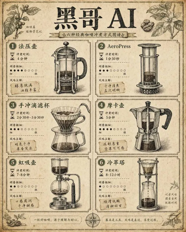
Coffee Brewing Methods Comparison Chart
A vintage-encyclopedia-style infographic comparing six coffee brewing methods arranged in a two-column grid on aged cream paper. Each cell contains a hand-inked cross-section illu…
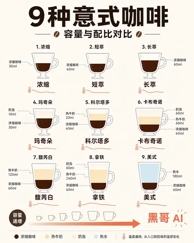
Espresso Drink Ratios Diagram
A clean flat-design infographic illustrating nine espresso-based drinks — espresso, ristretto, lungo, macchiato, cortado, cappuccino, flat white, latte, and americano — as tall ve…
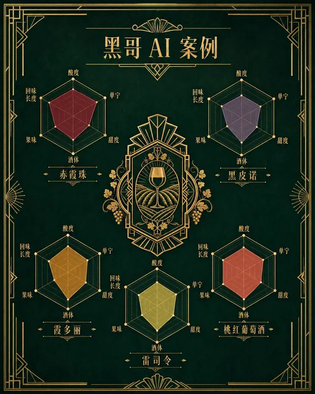
Wine Taste Profile Radar Chart
An art-deco-inspired infographic poster presenting taste-profile radar charts for five classic wines: Cabernet Sauvignon, Pinot Noir, Chardonnay, Riesling, and Rosé. The five hexa…
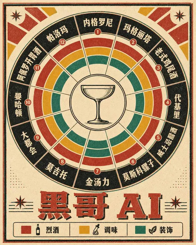
Classic Cocktail Mixing Ratios Wheel
A retro 1960s-style circular infographic — a cocktail mixing ratio wheel — printed on warm ivory card stock with bold offset-printing colors. The wheel is divided into twelve radi…