Loop Packaging Collective Identity Proposal
This is a Brand Identity AI image prompt case, leaning toward 原创标志, 品牌系统, 触点设计. Copy the full prompt below and paste it into a free GPT image generator to create your own image with GPT Image-2 — swap the subject, brand, or aspect ratio as needed.
English full prompt
Create one explicitly usable image titled “Loop Packaging Collective” for building a usable identity system for “Loop Packaging Collective”. Divide the board into mark construction, size testing, and touchpoint implementation; demonstrate Loop Packaging Collective only via return-crate seals and merchant statements, keeping one grid. Let return-crate seals and merchant statements determine the counterforms, corners, and proportions of Loop Packaging Collective; the mark remains legible when reduced or reversed and avoids generic sector emblems. Treat return-crate seals and merchant statements as a working object: reveal where Loop Packaging Collective in uncoated stock, durable ink, embossing, or wayfinding substrate suited to return-crate seals and merchant statements is touched, read, or operated, accompanied by type, symbol, and guidance governed by one scale system. Present Loop Packaging Collective as central cutaway alongside four corner details, seen via an overhead design-board view combined alongside an eye-level touchpoint mockup and restrained perspective. Let “回环包装社|建立「回环包装社」可落地的品牌识别系统” be the textual entry point; secondary language cannot substitute for visual explanation. Maintain a unified color temperature within moss green, terracotta red, straw yellow, and charcoal, using local value contrast to expose the functional parts of uncoated stock, durable ink, embossing, or wayfinding substrate suited to return-crate seals and merchant statements. The visual conditions for Loop Packaging Collective are broad softbox illumination, shallow depth used only to separate the primary form, and a quiet warm-gray ground. Across the primary form, make printing, embossing, stitching, or installation on uncoated stock, durable ink, embossing, or wayfinding substrate suited to return-crate seals and merchant statements physically feasible. Arrange observable language as medium-weight headline together with fine annotations and close the frame together with a restrained, complete identity-presentation finish. Additional control: gradated shadows across folds; silhouettes exclude decorative glow. Use a low-saturation ground supporting the theme color, ensure macro detail and overall use remain mutually readable, and let no second focal point compete together with the central gesture. Do not display existing trademark silhouettes, generic shield-crown-globe devices, arbitrary initials, or decorative chrome rendering; also forbid brand appropriation, copyrighted characters, extra limbs, and causeless floating objects. Return one 3:2 final image without variants or a process sheet. Final art direction: original brand identity presentation board with coherent symbol construction and real application scenes. Use this controlled palette as the dominant visual system: #242B2F, #F0E9DC, #6B8E81, #C66A45; preserve believable local material colors within it. Preserve the requested text hierarchy and wording as part of the design, but do not invent extra slogans, pseudo-text, logos, or watermarks. Keep one unmistakable primary subject or information route and one readable visual action. Use disciplined negative space and avoid default perfect symmetry. Physical credibility is mandatory: correct gravity, contact shadows, material thickness, tool weight, joint loading, fabric tension, liquid direction, reflections, scale, and occlusion. Create an original visual with no resemblance to a public figure, copyrighted character, existing campaign, or living artist signature style. No unrelated decorative icons, floating objects, duplicated limbs, plastic gloss, waxy skin, synthetic collage artifacts, or AI watermarks. Return exactly one finished image composed for 3:2; no variants, process sheet, split panels, mockup frame, or contact sheet.
中文完整提示词
生成一张可当场使用的「回环包装社」,用于建立「回环包装社」可落地的品牌识别系统。
版面按标志生成、尺寸测试、触点落地三段展开;「回环包装社」只示范周转箱封签与商户说明单,各版沿用同一网格
以纸箱折线首尾相接成回形箭头,但避免通用回收三角规定「回环包装社」的负形、边角与比例,再回应周转箱封签与商户说明单的使用方式;反白和缩小均可辨,语气可信、克制、具体
周转箱封签与商户说明单作为工作物件,以适合周转箱封签与商户说明单的无涂布纸、耐用印墨、压印或导视基材呈现「回环包装社」会被触摸、阅读或操作的位置,字体、标志与指引使用同一尺度。
构图采用中心剖面加四角细节。
让「回环包装社|建立「回环包装社」可落地的品牌识别系统」成为文字入口,次级说明不得替代构图本身的解释。
「回环包装社」的视觉条件依次是大面积柔光箱照明、浅景深只用于分离主对象、安静的暖灰背景;让适合周转箱封签与商户说明单的无涂布纸、耐用印墨、压印或导视基材上的印刷、压印、缝制或安装方式合乎现实可行。可见文字按中等字重标题配细号注释编排,并以克制而连贯的品牌提案质感结束。补充控制:折角处渐变的阴影,轮廓不使用装饰性辉光;用低饱和背景托出主题色,近景细节与整体用途来回可读,除核心手势外不设置第二焦点。
不要出现现有商标轮廓、通用盾牌皇冠地球图形、随意字母缩写与纯装饰 3D 镀铬;同时禁止品牌挪用、版权角色、多余肢体和无因悬浮,用于「回环包装社」。
成片为单张 3:2,不附过程页或变体。
Related cases
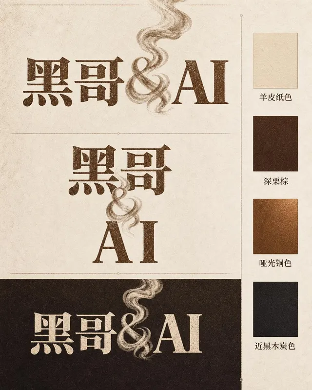
Ember & Roast Coffee Wordmark
A professional brand identity sheet for a specialty coffee roaster called "Ember & Roast". The wordmark is set in a condensed, slightly weathered serif typeface with warm ink-brow…
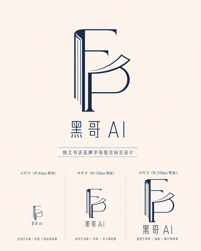
Folded Page Bookshop Monogram
A refined monogram logo design for an indie bookshop named "Folded Page". The monogram interlocks the letters F and P in a clean, geometric negative-space construction — where the…
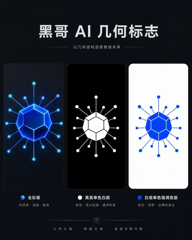
Axon AI Startup Geometric Mark
A polished geometric logomark for an AI startup called "Axon". The mark is a precise dodecahedron-derived hexagonal node with thin connecting lines radiating from each vertex — su…
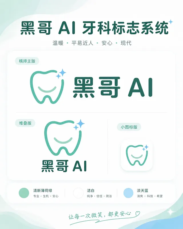
Brightly Dental Clinic Friendly Mark
A warm, approachable logo system for a dental clinic called "Brightly". The icon is a simplified tooth shape with a small smiling arc cut into its base and a single sparkle star a…