供需曲线经济图表
这是一个「信息图与示意图」类别的 AI 生图提示词案例,风格偏向编辑设计、扁平、瑞士风格。复制下方完整提示词,打开免费 GPT 生图工具粘贴,即可用 GPT Image-2 免费出图,并可替换主体、品牌名与画幅。
中文完整提示词
一张简洁的编辑风经济图表,在白色背景上展示供需曲线。两条相交的粗线:深钴蓝向下倾斜的需求曲线与暖赤土色向上倾斜的供给曲线。交叉点标有大实心圆圈,注明 「Equilibrium」,P* 和 Q* 虚线延伸至两轴。两个情景箭头分别标注需求增加与供给减少的方向。Y 轴标 「Demand increases →」,X 轴标 「示例内容」。浅金色标注框写道:「供需曲线经济图表」左上角自信衬线字体标题,10% 灰色网格。
English full prompt
A clean editorial economics chart illustrating supply and demand curves on a crisp white background. Two intersecting curves drawn in thick strokes: a downward-sloping demand curve in deep cobalt and an upward-sloping supply curve in warm terracotta. The intersection point is marked with a large filled circle labeled "Equilibrium" with price (P*) and quantity (Q*) dashed lines extending to both axes. Two scenario arrows: a rightward demand shift labeled "Demand increases →" and a leftward supply shift labeled "Supply decreases ←". Axes in heavy black with "Price" on Y and "Quantity" on X. Callout box in pale gold: "When supply falls and demand rises simultaneously, prices surge faster than either force alone would cause." Grid in faint 10% grey. Title in a confident serif at top-left.
相关案例
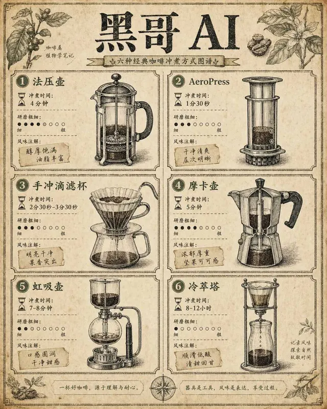
咖啡冲煮方式对比图
一张复古百科全书风格的信息图,在米白色做旧纸张上以两列网格排列六种咖啡冲煮方式对比。每个格子内有手绘钢笔风格剖面插图——法压壶、AeroPress、手冲滴滤杯、摩卡壶、虹吸壶、冷萃塔——配精细交叉阴影线增加立体感。每个设备下方以三行列出:冲煮时间(沙漏图标+文字)、研磨粗细(粗细刻度点)和风味注解(手写标签如 「bo…
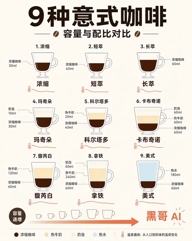
意式浓缩饮品配比示意图
一张简洁扁平风格信息图,将九种意式咖啡饮品——espresso、ristretto、lungo、macchiato、cortado、cappuccino、flat white、latte、americano——以高脚杯/咖啡杯轮廓横排展示。每个容器内用分层色块表示浓缩咖啡(深棕)、牛奶(暖奶油)、奶泡(浅象牙)和水(…

葡萄酒风味雷达图
一张装饰艺术风格的葡萄酒风味雷达图海报,展示五款经典葡萄酒:Cabernet Sauvignon、Pinot Noir、Chardonnay、Riesling 和 Rosé 的味觉雷达图。五个六边形雷达图对称排列在中央装饰徽章周围。每个雷达图有六条轴线——酸度、单宁、甜度、酒体、果味、回味长度——填充半透明多边形展示…

经典鸡尾酒配比转盘图
一张复古1960年代风格的圆形鸡尾酒配比转盘图,印在暖象牙色卡纸上,使用大胆的胶版印刷色彩。转盘分为十二个放射形扇区,每个代表一款经典鸡尾酒:Negroni、Margarita、Old Fashioned、Daiquiri、Whiskey Sour、Moscow Mule、Gin & Tonic、Mojito、Cos…