Supply and Demand Curve Chart
English full prompt
A clean editorial economics chart illustrating supply and demand curves on a crisp white background. Two intersecting curves drawn in thick strokes: a downward-sloping demand curve in deep cobalt and an upward-sloping supply curve in warm terracotta. The intersection point is marked with a large filled circle labeled "Equilibrium" with price (P*) and quantity (Q*) dashed lines extending to both axes. Two scenario arrows: a rightward demand shift labeled "Demand increases →" and a leftward supply shift labeled "Supply decreases ←". Axes in heavy black with "Price" on Y and "Quantity" on X. Callout box in pale gold: "When supply falls and demand rises simultaneously, prices surge faster than either force alone would cause." Grid in faint 10% grey. Title in a confident serif at top-left.
中文完整提示词
一张简洁的编辑风经济图表,在白色背景上展示供需曲线。两条相交的粗线:深钴蓝向下倾斜的需求曲线与暖赤土色向上倾斜的供给曲线。交叉点标有大实心圆圈,注明 「Equilibrium」,P* 和 Q* 虚线延伸至两轴。两个情景箭头分别标注需求增加与供给减少的方向。Y 轴标 「Demand increases →」,X 轴标 「示例内容」。浅金色标注框写道:「供需曲线经济图表」左上角自信衬线字体标题,10% 灰色网格。
Related cases
-
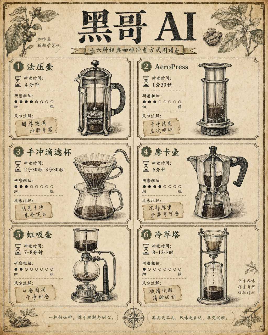
Coffee Brewing Methods Comparison Chart
A vintage-encyclopedia-style infographic comparing six coffee brewing methods arranged in a two-column grid on aged cream paper. Each cell contains a hand-inked cross-section illu…
-
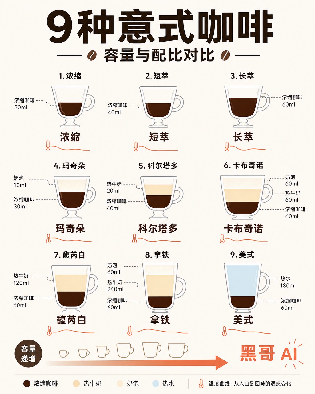
Espresso Drink Ratios Diagram
A clean flat-design infographic illustrating nine espresso-based drinks — espresso, ristretto, lungo, macchiato, cortado, cappuccino, flat white, latte, and americano — as tall ve…
-

Wine Taste Profile Radar Chart
An art-deco-inspired infographic poster presenting taste-profile radar charts for five classic wines: Cabernet Sauvignon, Pinot Noir, Chardonnay, Riesling, and Rosé. The five hexa…
-
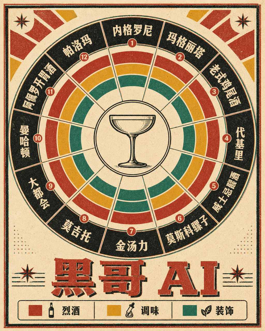
Classic Cocktail Mixing Ratios Wheel
A retro 1960s-style circular infographic — a cocktail mixing ratio wheel — printed on warm ivory card stock with bold offset-printing colors. The wheel is divided into twelve radi…