Veritas Press Editorial Identity System
English full prompt
A rigorous, editorial-press identity for an independent publishing house called "Veritas Press". The identity is built on pure typographic logic. The logo is the word "VERITAS" set in a single bold weight of a narrow classical serif with optical adjustments at corners — a colophon-style mark where the V's apex sits exactly on a thin baseline rule that extends to bleed left and right. Below the rule, "PRESS" in the same typeface at 40% the scale, centered. No symbol, no icon — pure type as mark. The full sheet shows the logo on white, the logo reversed in white on midnight-black, and a letterhead application showing the heading set in the same serif with generous leading and a flush-left ragged-right paragraph of body text in a complementary humanist serif. Brand color: single spot — a deep vermilion-red for accents and rule lines only. Mood: principled, uncompromising, intellectually serious.
中文完整提示词
一套严谨、编辑气质的品牌识别系统,用于名为「维里塔斯出版社」的独立出版社。品牌识别建立在纯粹的排版逻辑之上。标志以单一加粗字重的窄古典衬线字体排印「维里塔斯出版社」字样,呈现书尾版权章气质;V 字顶尖精确对齐一条细基线规线,向左右延伸。规线下方,同款字体以 40% 大小居中排印「出版」。无图形,无图标,纯文字构成标志。展示页包括白底标志版、午夜黑底白字反色版,以及信头应用;标题使用相同衬线体,正文段落左齐右参差,并用互补人文衬线字体排印。品牌色为单一深朱红色,仅用于强调和规线。气质原则性、不妥协、知识分子的严肃。
Related cases
-
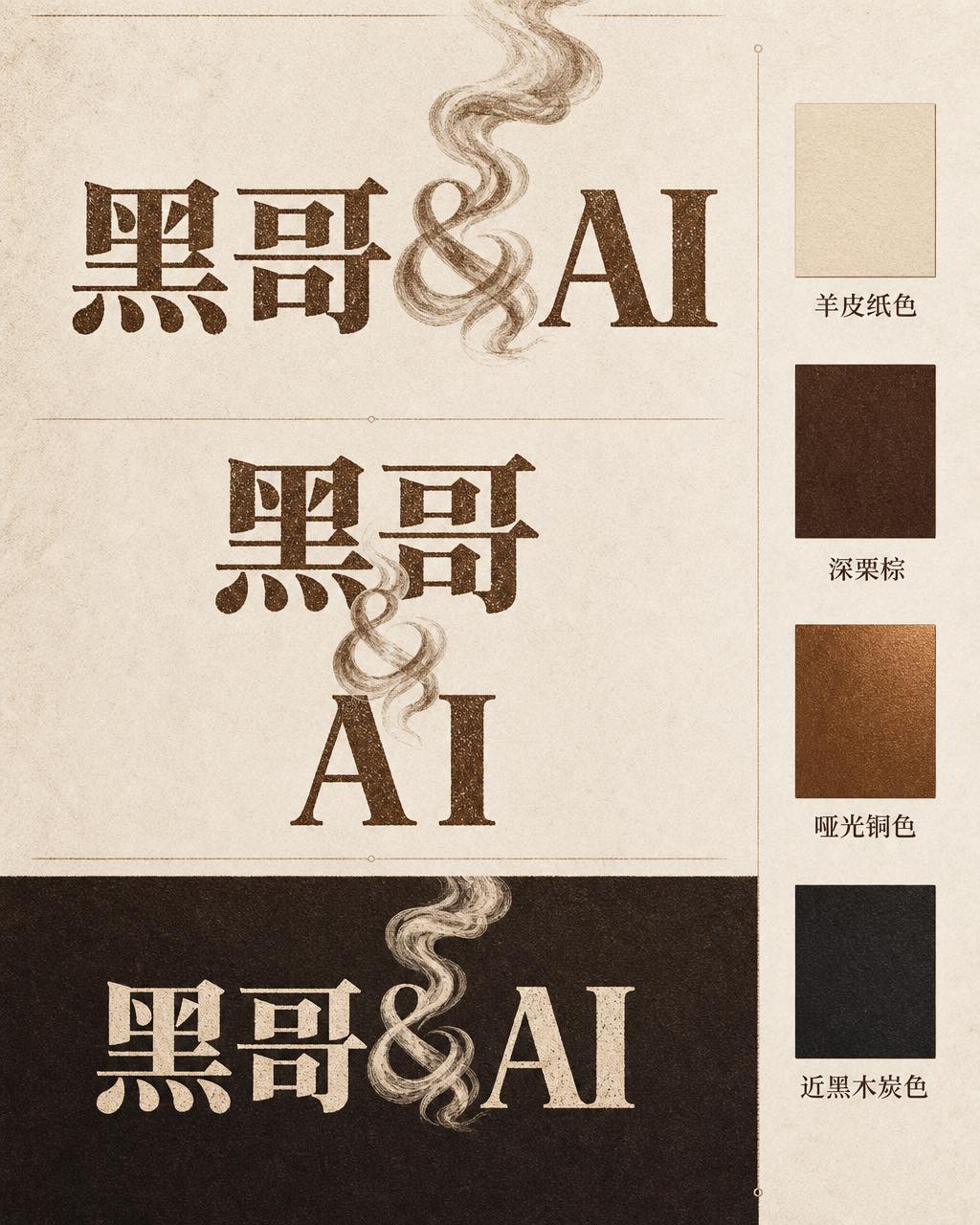
Ember & Roast Coffee Wordmark
A professional brand identity sheet for a specialty coffee roaster called "Ember & Roast". The wordmark is set in a condensed, slightly weathered serif typeface with warm ink-brow…
-
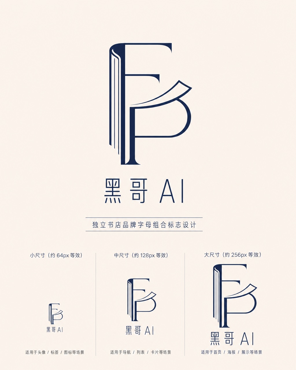
Folded Page Bookshop Monogram
A refined monogram logo design for an indie bookshop named "Folded Page". The monogram interlocks the letters F and P in a clean, geometric negative-space construction — where the…
-

Axon AI Startup Geometric Mark
A polished geometric logomark for an AI startup called "Axon". The mark is a precise dodecahedron-derived hexagonal node with thin connecting lines radiating from each vertex — su…
-

Brightly Dental Clinic Friendly Mark
A warm, approachable logo system for a dental clinic called "Brightly". The icon is a simplified tooth shape with a small smiling arc cut into its base and a single sparkle star a…