Programming Languages Popularity Ring Chart
This is a Infographics & Diagrams AI image prompt case, leaning toward Minimalist, Flat, Dark Mode. Copy the full prompt below and paste it into a free GPT image generator to create your own image with GPT Image-2 — swap the subject, brand, or aspect ratio as needed.
English full prompt
A square data-visualization tile showing a multi-layer ring chart of programming language popularity for a fictional 2025 developer survey. Dark graphite background, faint dot grid. The chart has two concentric rings. The outer ring is divided into ten color-coded segments labelled with language names and percentage: "JavaScript 28%", "Python 24%", "TypeScript 14%", "Java 9%", "C# 6%", "Go 5%", "Rust 5%", "Kotlin 4%", "Swift 3%", "Other 2%". The inner ring groups them by paradigm with thinner labels: "Web", "Data and ML", "Systems", "Mobile". A clean key at the top-right lists each language with a color swatch and a tiny trend arrow (up, down, flat). The headline above the rings reads "Languages Devs Actually Used, 2025". Below the rings, a single line of source attribution reads "Source: fictional survey, n = 12 480". Typeface is a precise geometric sans-serif, all percentages aligned in tabular figures, color palette built from cyan, magenta, lime, amber, violet against the dark base, two-pixel separators between ring segments.
中文完整提示词
一张方形数据可视化图,呈现 2025 虚构开发者调查的多层环形图。深石墨色背景,淡点阵。两层同心环:外环按十种语言色块分段,并标百分比 「JavaScript 28%」、「Python 24%」、「TypeScript 14%」、「Java 9%」、「C# 6%」、「Go 5%」、「Rust 5%」、「Kotlin 4%」、「Swift 3%」、「Other 2%」。内环以更细字按范式分组:「Web」、「Data and ML」、「Systems」、「Languages Devs Actually Used, 2025」。右上角图例每行配色块与小箭头(升、降、平)。环上方标题 「编程语言流行度环形图」,下方一行 "Source: fictional survey, n = 12 480"。几何无衬线,百分比用等宽数字对齐,配色青、品、青柠、琥珀、紫,分段两像素细线。
Related cases
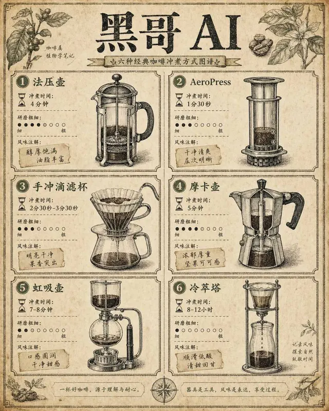
Coffee Brewing Methods Comparison Chart
A vintage-encyclopedia-style infographic comparing six coffee brewing methods arranged in a two-column grid on aged cream paper. Each cell contains a hand-inked cross-section illu…
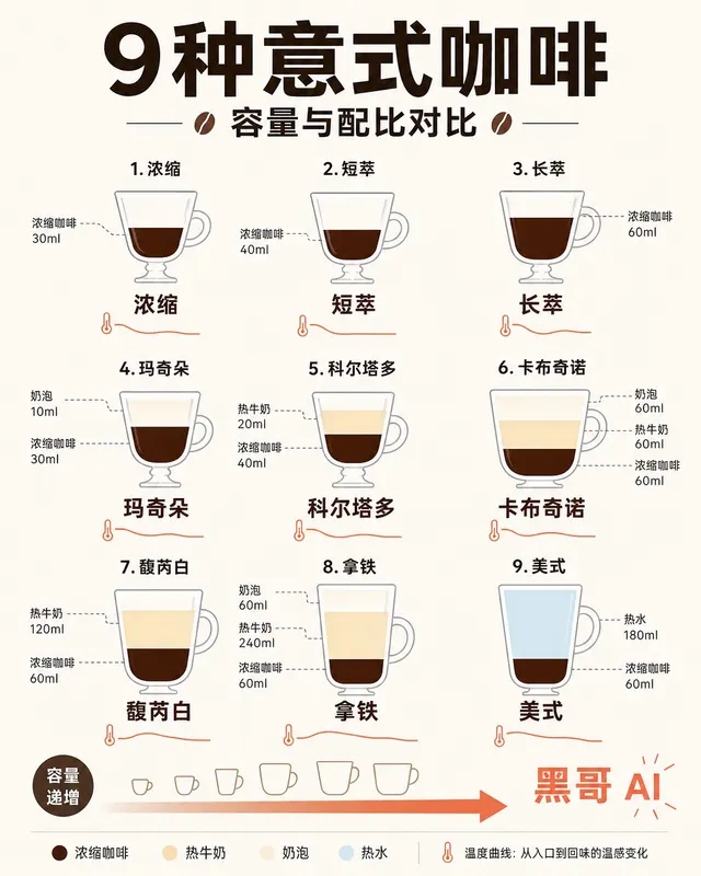
Espresso Drink Ratios Diagram
A clean flat-design infographic illustrating nine espresso-based drinks — espresso, ristretto, lungo, macchiato, cortado, cappuccino, flat white, latte, and americano — as tall ve…
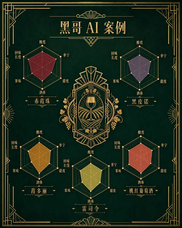
Wine Taste Profile Radar Chart
An art-deco-inspired infographic poster presenting taste-profile radar charts for five classic wines: Cabernet Sauvignon, Pinot Noir, Chardonnay, Riesling, and Rosé. The five hexa…
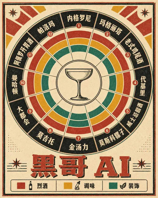
Classic Cocktail Mixing Ratios Wheel
A retro 1960s-style circular infographic — a cocktail mixing ratio wheel — printed on warm ivory card stock with bold offset-printing colors. The wheel is divided into twelve radi…