Calm Grain Oat-Milk Bottle Label
English full prompt
A confident, editorially-voiced bottle label design for an oat-milk brand called "Calm Grain". The label is designed for a 1-litre slim Tetra Pak carton, portrait orientation. The dominant design element is pure typography — the brand name "CALM GRAIN" in a large, blunt, slightly irregular slab-serif covers the upper two-thirds of the front panel in warm oat-beige, printed on a deep forest-green background. A thin overline rule in pale gold sits above the wordmark. Below, a single short sentence in a small humanist sans-serif reads "Oat drink. No drama. Just grain." in pale cream. A minimal graphic of three stacked oat grains in outline-only style sits at the bottom-left corner. The mood is self-aware, quietly funny, and confidently anti-fussy — the oat milk that doesn't need a mood board.
中文完整提示词
一款自信、具编辑腔调的瓶标设计,用于名为 「Calm Grain」 的燕麦奶品牌。为 1 升细长利乐砖纸盒竖版设计。主设计元素是纯粹的排版——品牌名 「Calm Grain」 以粗犷、略显不规则的粗板衬线字体(暖燕麦米色)大面积覆盖正面上三分之二,印在深森林绿底上。字标上方是淡金色细发线。下方以小号人文无衬线字体浅奶油色印短句 「Calm Grain」 左下角是三粒堆叠燕麦粒的纯轮廓线简图。气质自我意识强、带一丝幽默、自信无堆砌——那种不需要情绪板的燕麦奶。
Related cases
-
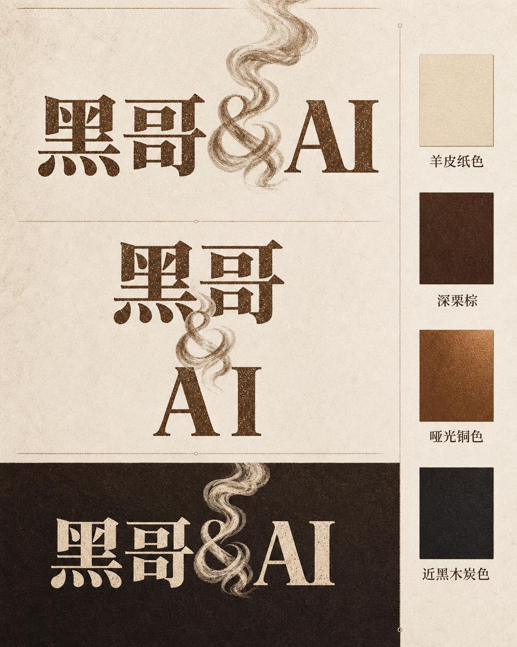
Ember & Roast Coffee Wordmark
A professional brand identity sheet for a specialty coffee roaster called "Ember & Roast". The wordmark is set in a condensed, slightly weathered serif typeface with warm ink-brow…
-
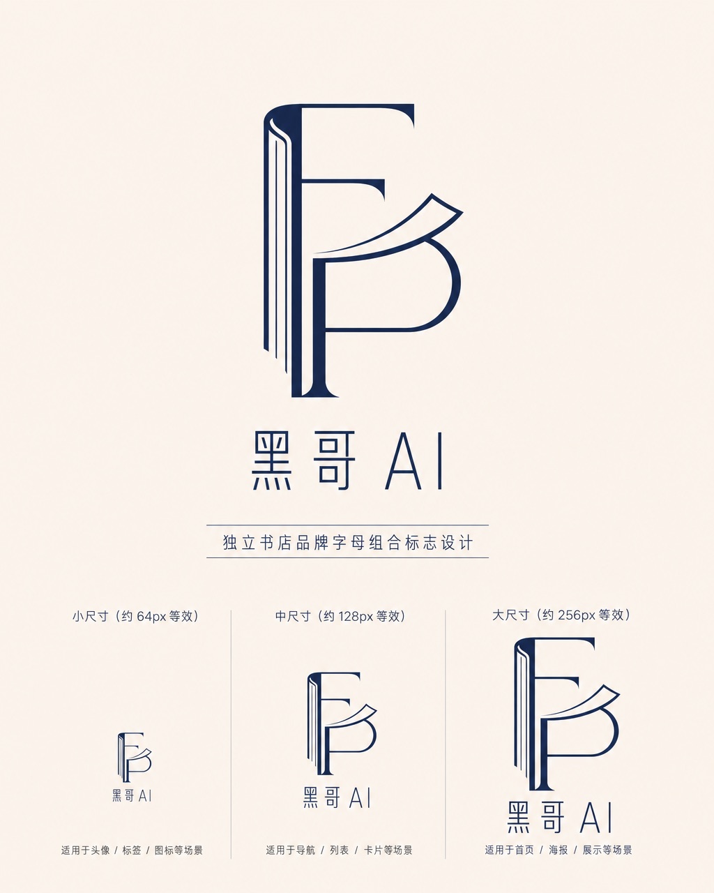
Folded Page Bookshop Monogram
A refined monogram logo design for an indie bookshop named "Folded Page". The monogram interlocks the letters F and P in a clean, geometric negative-space construction — where the…
-
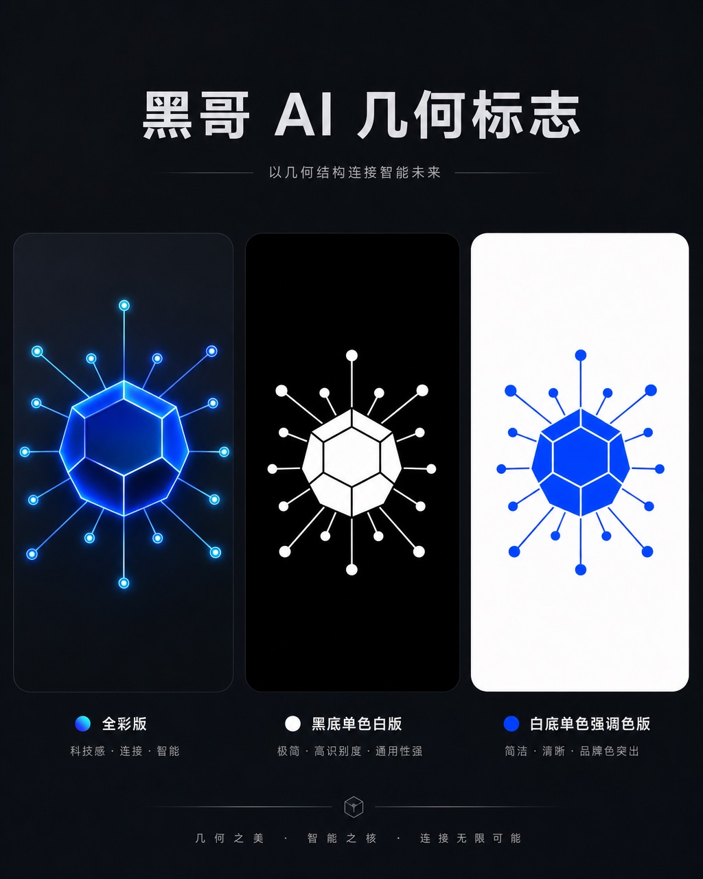
Axon AI Startup Geometric Mark
A polished geometric logomark for an AI startup called "Axon". The mark is a precise dodecahedron-derived hexagonal node with thin connecting lines radiating from each vertex — su…
-
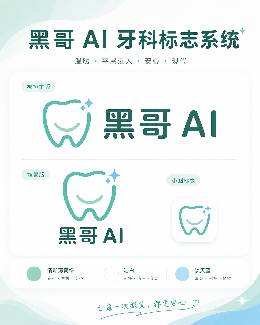
Brightly Dental Clinic Friendly Mark
A warm, approachable logo system for a dental clinic called "Brightly". The icon is a simplified tooth shape with a small smiling arc cut into its base and a single sparkle star a…