Meridian Real Estate Elegant Serif Mark
English full prompt
An elegant, high-trust identity system for a real estate agency called "Meridian". The logomark is a precise M letterform in a tall, optically-corrected classical serif, where the two inner diagonal strokes of the M meet at the baseline at a very shallow angle — evoking both the peak of a roofline and the perpendicular of a north compass needle. Rendered in polished midnight-bronze on warm cream, with a hairline overline and underline flanking the M. The wordmark "MERIDIAN" follows in equally spaced, small-caps classical serif below. The sheet shows the primary lockup, a single-color embossed business card simulation on heavy cotton stock, and a digital dark-mode version on near-black. Brand colors: midnight-bronze, warm cream, and stone-grey. Mood: aspirational, established, discerning.
中文完整提示词
一套优雅、高信任度的品牌识别系统,用于名为 「Meridian」 的房地产公司。标志图形是高挑、经光学校正的古典衬线字体 M 字形,M 的两条内斜笔画以极浅角度交汇于基线——同时令人联想到屋脊线峰和正北指南针垂线。以抛光午夜青铜色渲染在暖奶油色上,M 上下各有细发线。字标 「Meridian」 以等间距古典衬线小型大写字体紧随其下。展示主版、厚棉纸上单色压凸名片模拟版和近黑底深色模式数字版。品牌色:午夜青铜、暖奶油和石灰岩灰。气质:上进、稳重、有品味。
Related cases
-
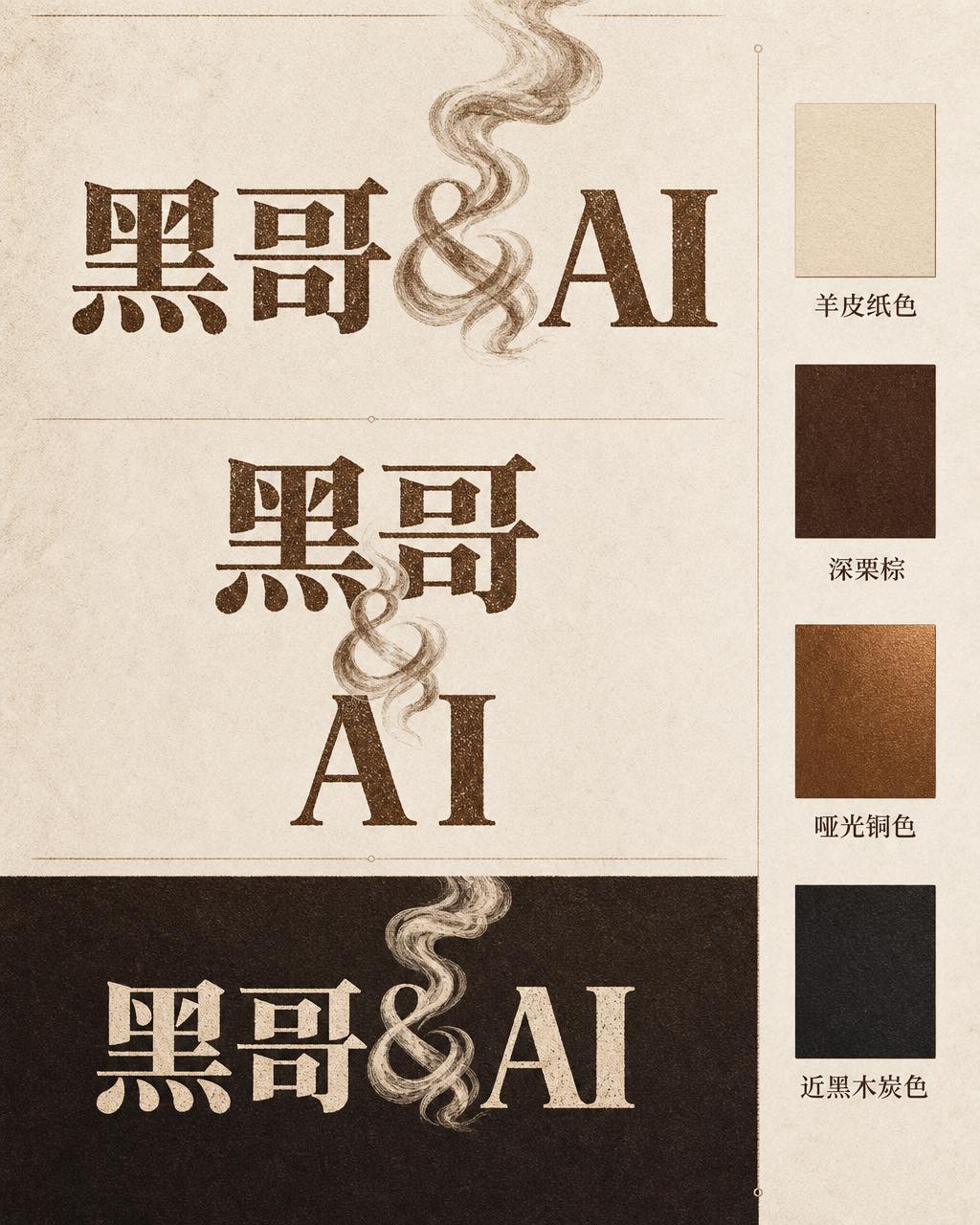
Ember & Roast Coffee Wordmark
A professional brand identity sheet for a specialty coffee roaster called "Ember & Roast". The wordmark is set in a condensed, slightly weathered serif typeface with warm ink-brow…
-
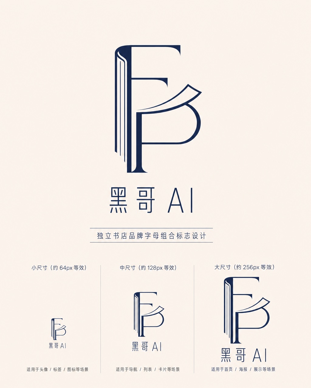
Folded Page Bookshop Monogram
A refined monogram logo design for an indie bookshop named "Folded Page". The monogram interlocks the letters F and P in a clean, geometric negative-space construction — where the…
-
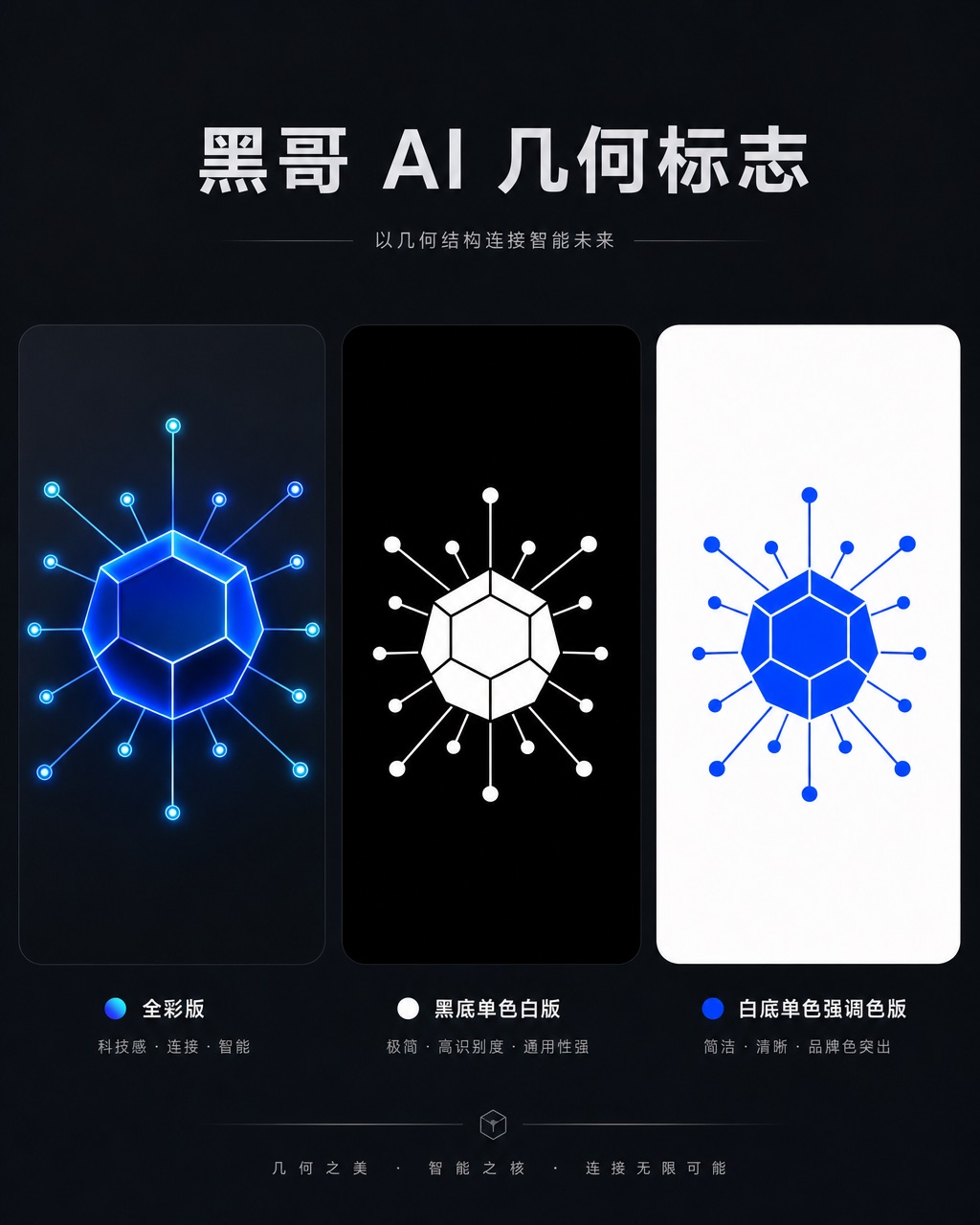
Axon AI Startup Geometric Mark
A polished geometric logomark for an AI startup called "Axon". The mark is a precise dodecahedron-derived hexagonal node with thin connecting lines radiating from each vertex — su…
-
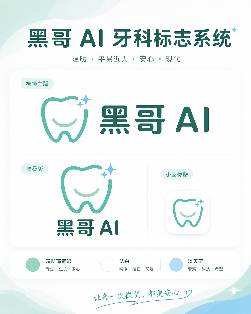
Brightly Dental Clinic Friendly Mark
A warm, approachable logo system for a dental clinic called "Brightly". The icon is a simplified tooth shape with a small smiling arc cut into its base and a single sparkle star a…