Deer Trail Eco Guides Identity Proposal
This is a Brand Identity AI image prompt case, leaning toward 原创标志, 品牌系统, 触点设计. Copy the full prompt below and paste it into a free GPT image generator to create your own image with GPT Image-2 — swap the subject, brand, or aspect ratio as needed.
English full prompt
Make one highly finished “Deer Trail Eco Guides” image centered on building a usable identity system for “Deer Trail Eco Guides”. Connect the Deer Trail Eco Guides symbol, wordmark, reversed form, reduction, and guide scarves and low-impact route cards on one restrained page, moving from recognition rule to real use. Design an original core mark for Deer Trail Eco Guides, deriving its geometry from the service task and guide scarves and low-impact route cards; preserve a distinctive silhouette at small size and a restrained voice. When applying Deer Trail Eco Guides to guide scarves and low-impact route cards, retain seams, impressions, or fasteners inherent to uncoated stock, durable ink, embossing, or wayfinding substrate suited to guide scarves and low-impact route cards; align mark, name, and guidance copy to one module. Stage Deer Trail Eco Guides as top-down flat lay accompanied by a numbered path, seen using an overhead design-board view combined accompanied by an eye-level touchpoint mockup and restrained perspective. Build the type hierarchy around “鹿踪生态导览|建立「鹿踪生态导览」可落地的品牌识别系统,” keeping support labels within two lines and away from the central evidence. Apply brick red, peacock blue, sandstone, and cool white; each individual light and shadow should explain how uncoated stock, durable ink, embossing, or wayfinding substrate suited to guide scarves and low-impact route cards are manufactured, held, or used. Begin the detail treatment of Deer Trail Eco Guides by requiring that you make printing, embossing, stitching, or installation on uncoated stock, durable ink, embossing, or wayfinding substrate suited to guide scarves and low-impact route cards physically feasible. Keep a near-orthographic and legible spatial relationship, apply rear-side rim light using gentle frontal fill, pair the image using headline near the hero and notes beside their objects, and reduce the background to a work surface using limited use marks for a restrained, complete identity-presentation finish. Additional control: shadows extending using the load direction; occlusion follows the true front-to-back order. Use weight contrast establishing reading order, ensure the eye enters using the title and reaches the visual anchor directly, and let the local bright hue indicate operation direction only. Do not permit existing trademark silhouettes, generic shield-crown-globe devices, arbitrary initials, or decorative chrome rendering; physics, text, and character identity stay consistent across the entire visual field for Deer Trail Eco Guides. Return one 9:16 final image without variants or a process sheet. Final art direction: original brand identity presentation board with coherent symbol construction and real application scenes. Use this controlled palette as the dominant visual system: #242B2F, #F0E9DC, #6B8E81, #C66A45; preserve believable local material colors within it. Preserve the requested text hierarchy and wording as part of the design, but do not invent extra slogans, pseudo-text, logos, or watermarks. Keep one unmistakable primary subject or information route and one readable visual action. Use disciplined negative space and avoid default perfect symmetry. Physical credibility is mandatory: correct gravity, contact shadows, material thickness, tool weight, joint loading, fabric tension, liquid direction, reflections, scale, and occlusion. Create an original visual with no resemblance to a public figure, copyrighted character, existing campaign, or living artist signature style. No unrelated decorative icons, floating objects, duplicated limbs, plastic gloss, waxy skin, synthetic collage artifacts, or AI watermarks. Return exactly one finished image composed for 9:16; no variants, process sheet, split panels, mockup frame, or contact sheet.
中文完整提示词
制作一张高完成度的「鹿踪生态导览」,核心任务为建立「鹿踪生态导览」可落地的品牌识别系统。
用一张克制提案页串联「鹿踪生态导览」的标志、字标、反白、缩放和导览围巾与低干扰路线卡,阅读顺序从识别走向使用
为「鹿踪生态导览」设计原创核心标志:鹿蹄印逐渐简化为路线等高线,末端留出安静区域;图形从导览围巾与低干扰路线卡的服务操作自然生长,缩小后仍有独特轮廓,语气保留可信、克制、具体
把「鹿踪生态导览」应用到导览围巾与低干扰路线卡时,保留适合导览围巾与低干扰路线卡的无涂布纸、耐用印墨、压印或导视基材的接缝、压痕或固定件;标志、名称和提示沿连贯模块对齐。
构图:俯视平铺加编号路径。
文字层级以「鹿踪生态导览|建立「鹿踪生态导览」可落地的品牌识别系统」为首,辅助标签控制在两行内,不遮挡核心对象证据。
配色采用砖红、孔雀蓝、沙岩色与冷白,适合导览围巾与低干扰路线卡的无涂布纸、耐用印墨、压印或导视基材保持可信质感。
不得出现现有商标轮廓、通用盾牌皇冠地球图形、随意字母缩写与纯装饰 3D 镀铬;成片物理、文字和人物身份在全部区域确保一致。
成片为单张 9:16,不附过程页或变体。
Related cases
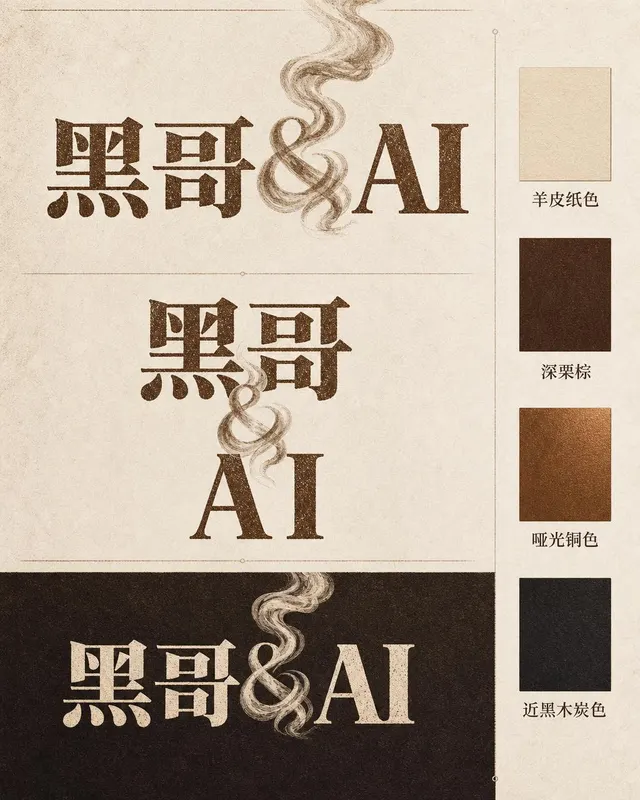
Ember & Roast Coffee Wordmark
A professional brand identity sheet for a specialty coffee roaster called "Ember & Roast". The wordmark is set in a condensed, slightly weathered serif typeface with warm ink-brow…
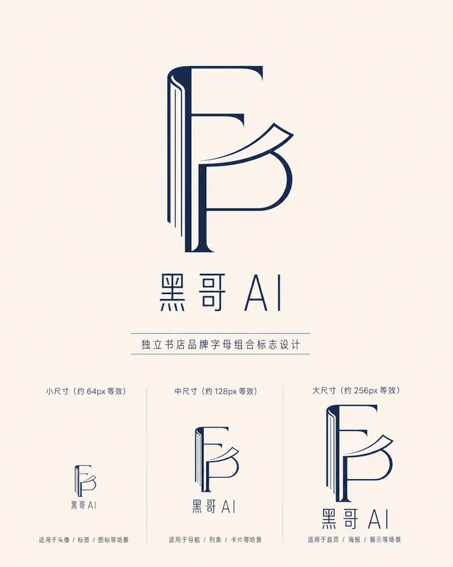
Folded Page Bookshop Monogram
A refined monogram logo design for an indie bookshop named "Folded Page". The monogram interlocks the letters F and P in a clean, geometric negative-space construction — where the…

Axon AI Startup Geometric Mark
A polished geometric logomark for an AI startup called "Axon". The mark is a precise dodecahedron-derived hexagonal node with thin connecting lines radiating from each vertex — su…

Brightly Dental Clinic Friendly Mark
A warm, approachable logo system for a dental clinic called "Brightly". The icon is a simplified tooth shape with a small smiling arc cut into its base and a single sparkle star a…