Glimmer Accessible Cinema Identity Proposal
This is a Brand Identity AI image prompt case, leaning toward 原创标志, 品牌系统, 触点设计. Copy the full prompt below and paste it into a free GPT image generator to create your own image with GPT Image-2 — swap the subject, brand, or aspect ratio as needed.
English full prompt
Create an independent “Glimmer Accessible Cinema” composition that concentrates on building a usable identity system for “Glimmer Accessible Cinema”. One identity board shows the primary mark, horizontal lockup, monochrome version, minimum size, and caption receivers and seat-number signs; do not replace the system using merchandise. Begin together with the real task performed at caption receivers and seat-number signs, distill it into one recognizable mark for Glimmer Accessible Cinema, and control stroke weight and counterform for the smallest version. Complete caption receivers and seat-number signs in uncoated stock, durable ink, embossing, or wayfinding substrate suited to caption receivers and seat-number signs, making the printing or installation of Glimmer Accessible Cinema explicit. Separate name from service information as deriving their direction and spacing from one rule. Frame Glimmer Accessible Cinema as central cutaway using four corner details, seen through an overhead design-board view combined using an eye-level touchpoint mockup and restrained perspective. Use “微光无障碍影院|建立「微光无障碍影院」可落地的品牌识别系统” as the sole prominent line, keeping local annotations brief, accurate, and connected. Restrict color to night blue, luminous cyan, lime green, and silver gray; use credible light to reveal the thickness, edges, contact, and wear of uncoated stock, durable ink, embossing, or wayfinding substrate suited to caption receivers and seat-number signs. Limit the background of Glimmer Accessible Cinema to a quiet ground within the main palette; handle depth as a crisp main object alongside the background one level quieter and illuminate it with directional light following the operation. Most importantly, make printing, embossing, stitching, or installation on uncoated stock, durable ink, embossing, or wayfinding substrate suited to caption receivers and seat-number signs physically feasible. Use headline near the hero and notes beside their objects and finish alongside a restrained, complete identity-presentation finish. Additional control: cast shadows consistent with the scene time; handmade edges retain subtle irregularity. Use still zones contrasting alongside action lines, ensure focus travels one way along the arrow or action, and let no second focal point compete alongside the central action. Do not let existing trademark silhouettes, generic shield-crown-globe devices, arbitrary initials, or decorative chrome rendering weaken the subject; reject unrelated interfaces, decorative neon, false data, and imitation of living artists for Glimmer Accessible Cinema. Return one 3:2 final image without variants or a process sheet. Final art direction: original brand identity presentation board with coherent symbol construction and real application scenes. Use this controlled palette as the dominant visual system: #242B2F, #F0E9DC, #6B8E81, #C66A45; preserve believable local material colors within it. Preserve the requested text hierarchy and wording as part of the design, but do not invent extra slogans, pseudo-text, logos, or watermarks. Keep one unmistakable primary subject or information route and one readable visual action. Use disciplined negative space and avoid default perfect symmetry. Physical credibility is mandatory: correct gravity, contact shadows, material thickness, tool weight, joint loading, fabric tension, liquid direction, reflections, scale, and occlusion. Create an original visual with no resemblance to a public figure, copyrighted character, existing campaign, or living artist signature style. No unrelated decorative icons, floating objects, duplicated limbs, plastic gloss, waxy skin, synthetic collage artifacts, or AI watermarks. Return exactly one finished image composed for 3:2; no variants, process sheet, split panels, mockup frame, or contact sheet.
中文完整提示词
生成独立成片「微光无障碍影院」,视觉内容集中表现建立「微光无障碍影院」可落地的品牌识别系统。
同一品牌板呈现主标志、横版、单色版、最小尺寸和字幕接收器与座位编号牌应用,不用周边陈列代替系统设计
从字幕接收器与座位编号牌的合乎现实动势出发,把字幕方框向一侧打开,开口与影院光束相连提炼成「微光无障碍影院」标志;控制笔画与负形,使最小版本仍传达可信、克制、具体
用适合字幕接收器与座位编号牌的无涂布纸、耐用印墨、压印或导视基材完成字幕接收器与座位编号牌,表现「微光无障碍影院」的印刷或安装细节;名称与服务信息分层,但方向和间距来自一条规则。
构图:中心剖面加四角细节。
唯一醒目文案为「微光无障碍影院|建立「微光无障碍影院」可落地的品牌识别系统」,局部标注维持短、准、可对应。
配色采用夜蓝、荧光青、酸橙绿与银灰,适合字幕接收器与座位编号牌的无涂布纸、耐用印墨、压印或导视基材保持可信质感。
不要让现有商标轮廓、通用盾牌皇冠地球图形、随意字母缩写与纯装饰 3D 镀铬破坏视觉中心,拒绝无关 UI、装饰性霓虹、假数据和在世艺术家模仿。
成片为单张 3:2,不附过程页或变体。
Related cases
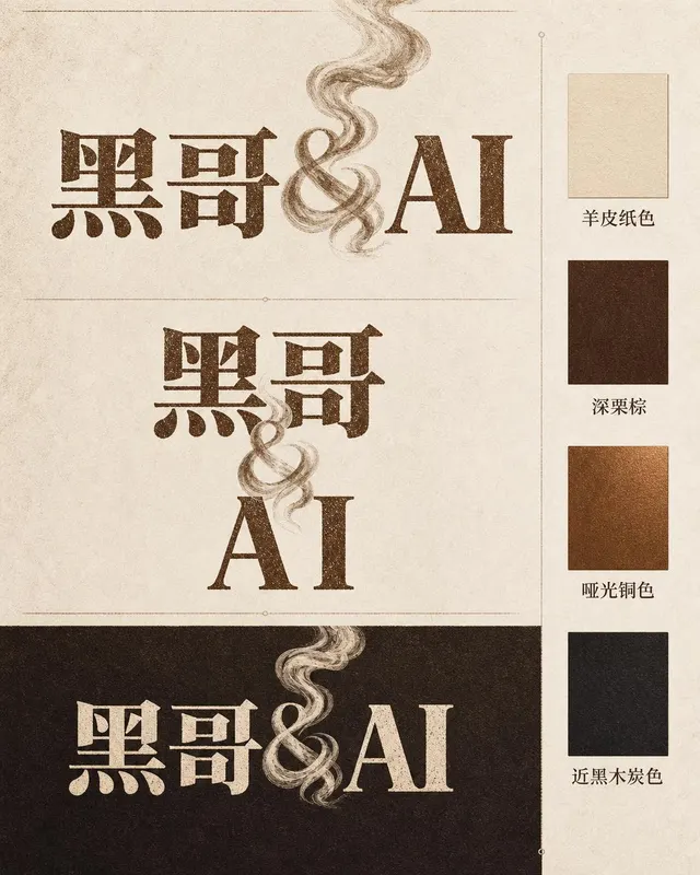
Ember & Roast Coffee Wordmark
A professional brand identity sheet for a specialty coffee roaster called "Ember & Roast". The wordmark is set in a condensed, slightly weathered serif typeface with warm ink-brow…
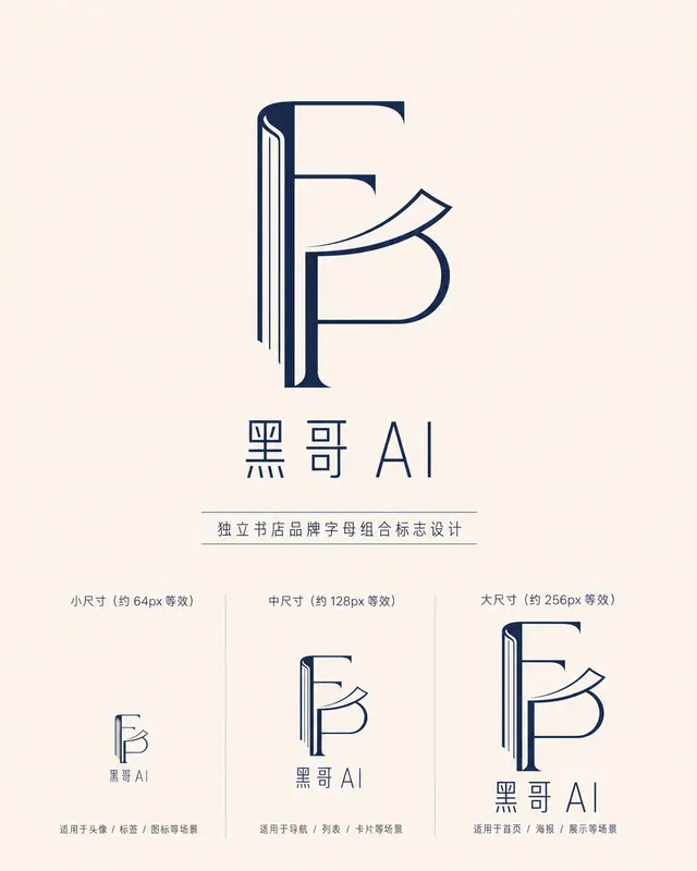
Folded Page Bookshop Monogram
A refined monogram logo design for an indie bookshop named "Folded Page". The monogram interlocks the letters F and P in a clean, geometric negative-space construction — where the…
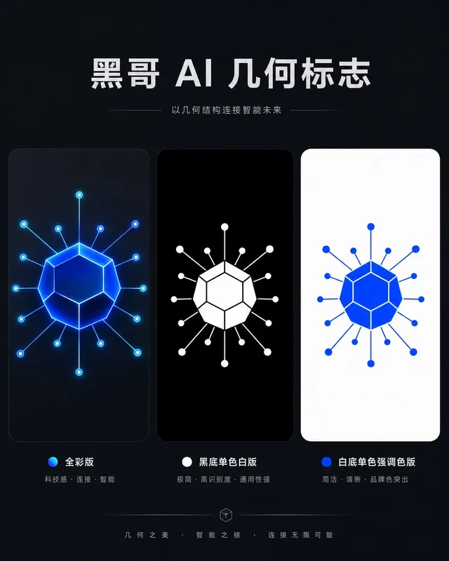
Axon AI Startup Geometric Mark
A polished geometric logomark for an AI startup called "Axon". The mark is a precise dodecahedron-derived hexagonal node with thin connecting lines radiating from each vertex — su…
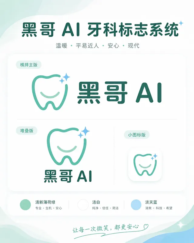
Brightly Dental Clinic Friendly Mark
A warm, approachable logo system for a dental clinic called "Brightly". The icon is a simplified tooth shape with a small smiling arc cut into its base and a single sparkle star a…