Frequency Podcast Wave Logo
English full prompt
A sleek logo system for a podcast network called "Frequency". The icon is a waveform abstracted into exactly five vertical bars of progressively increasing and then decreasing height — forming a smooth mountain silhouette — with the two outermost bars subtly curved inward like the ears of a stylised headphone arc. The bars are rendered in a gradient sweep from deep violet on the left to warm coral on the right. The wordmark "FREQUENCY" is set in a wide-tracked geometric sans-serif in dark charcoal, all caps. The sheet shows the horizontal lockup, the square icon-only version suitable for podcast cover art (3000×3000), and a dark-mode reversed version. Clean, dynamic, audio-forward.
中文完整提示词
一套简洁的标志系统,用于名为 「Frequency」 的播客网络。图标是五根竖条抽象化的音频波形,高度从中央最高呈山形渐变,最外侧两根竖条微微向内弯曲如耳机弧线。竖条以从深紫到温暖珊瑚的渐变扫描渲染。字标 「Frequency」 以宽字距几何无衬线体呈现,深木炭色全大写。展示横排版、适合播客封面的正方形图标版(3000×3000)和深色模式反色版。简洁、动感、以声音为核心。
Related cases
-
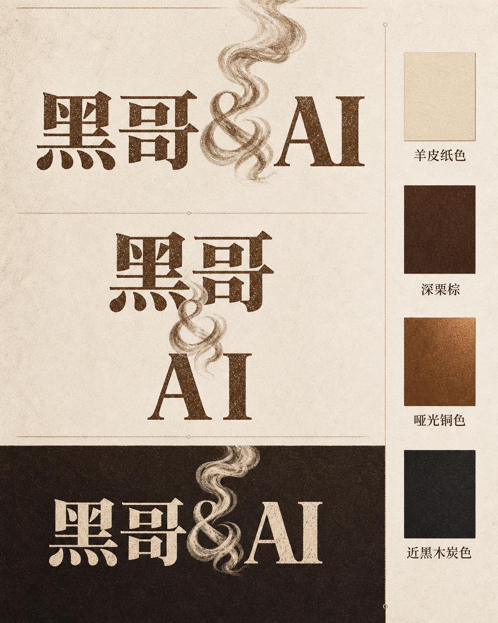
Ember & Roast Coffee Wordmark
A professional brand identity sheet for a specialty coffee roaster called "Ember & Roast". The wordmark is set in a condensed, slightly weathered serif typeface with warm ink-brow…
-
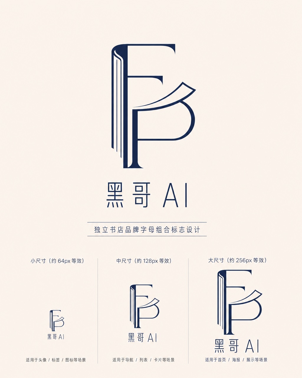
Folded Page Bookshop Monogram
A refined monogram logo design for an indie bookshop named "Folded Page". The monogram interlocks the letters F and P in a clean, geometric negative-space construction — where the…
-
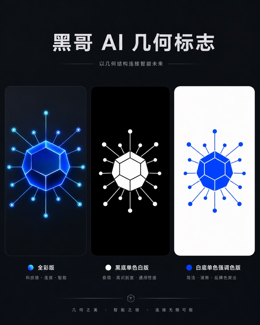
Axon AI Startup Geometric Mark
A polished geometric logomark for an AI startup called "Axon". The mark is a precise dodecahedron-derived hexagonal node with thin connecting lines radiating from each vertex — su…
-
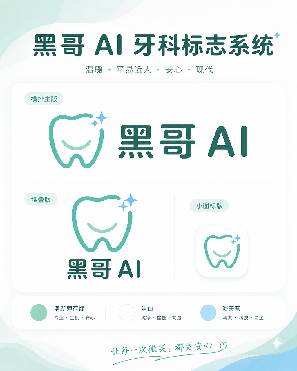
Brightly Dental Clinic Friendly Mark
A warm, approachable logo system for a dental clinic called "Brightly". The icon is a simplified tooth shape with a small smiling arc cut into its base and a single sparkle star a…