Framework Comparison Table Chart
This is a Infographics & Diagrams AI image prompt case, leaning toward Swiss, Flat, Geometric. Copy the full prompt below and paste it into a free GPT image generator to create your own image with GPT Image-2 — swap the subject, brand, or aspect ratio as needed.
English full prompt
A crisp Swiss-grid comparison table infographic contrasting five frontend frameworks on a white background. Rows: React, Vue, Angular, Svelte, Solid. Columns: Learning Curve, Bundle Size, Performance, Ecosystem, TypeScript Support. Each cell contains a coloured dot scale (1–5 filled circles) in a consistent teal-to-coral spectrum. Row headers in bold 11pt left-aligned; column headers in 9pt small caps with a thin separator line above. Alternating row shading in 4% warm grey. A "Best for" footer row below each framework name in italic light type. Callout box in pale lime at bottom-right: "No framework wins every column — choosing wisely means knowing which columns matter most for your project." Title in confident condensed black at top. Sub-heading: "2026 snapshot — community survey data".
中文完整提示词
一张简洁的瑞士网格对比表格信息图,白色背景,对比五种前端框架:React、Vue、Angular、Svelte、Solid。列标题:学习曲线、包体积、性能、生态系统、TypeScript 支持。各单元格以 1–5 实心圆点的青色至珊瑚色渐变评分。行标题粗体 11pt 左对齐,列标题 9pt 小型大写带细分隔线,行交替 4% 暖灰底色,各框架名称下方斜体细体 「Best for」 注释行。右下角浅绿色标注框写道:「框架对比表格图」顶部自信压缩黑体标题,副标题注明 「2026 snapshot — community survey data」。
Related cases
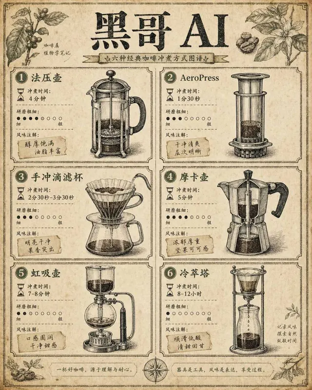
Coffee Brewing Methods Comparison Chart
A vintage-encyclopedia-style infographic comparing six coffee brewing methods arranged in a two-column grid on aged cream paper. Each cell contains a hand-inked cross-section illu…
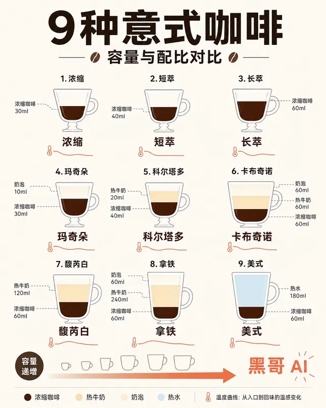
Espresso Drink Ratios Diagram
A clean flat-design infographic illustrating nine espresso-based drinks — espresso, ristretto, lungo, macchiato, cortado, cappuccino, flat white, latte, and americano — as tall ve…
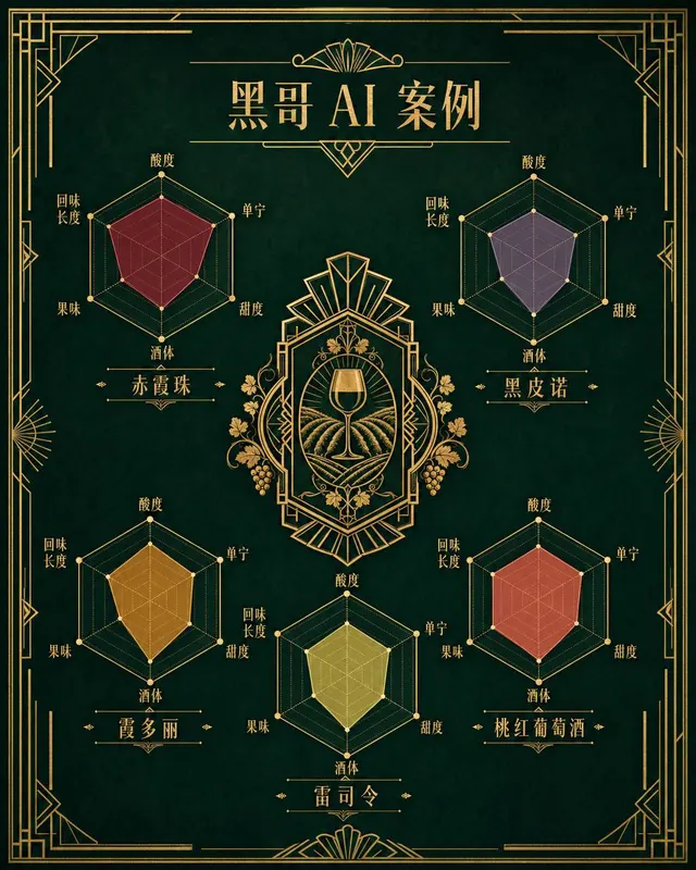
Wine Taste Profile Radar Chart
An art-deco-inspired infographic poster presenting taste-profile radar charts for five classic wines: Cabernet Sauvignon, Pinot Noir, Chardonnay, Riesling, and Rosé. The five hexa…
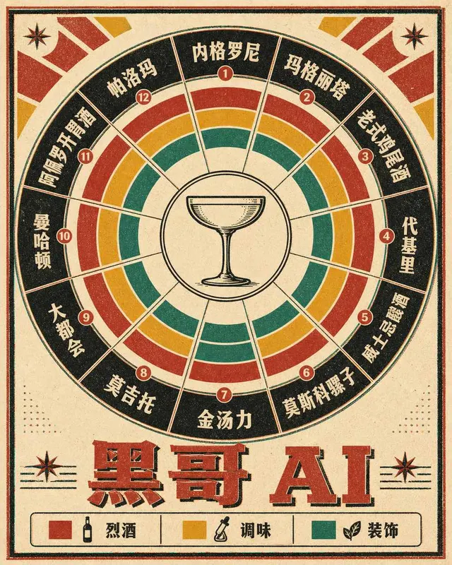
Classic Cocktail Mixing Ratios Wheel
A retro 1960s-style circular infographic — a cocktail mixing ratio wheel — printed on warm ivory card stock with bold offset-printing colors. The wheel is divided into twelve radi…