照片发布决策树
这是一个「信息图与示意图」类别的 AI 生图提示词案例,风格偏向数据叙事、主题信息图、精确标注。复制下方完整提示词,打开免费 GPT 生图工具粘贴,即可用 GPT Image-2 免费出图,并可替换主体、品牌名与画幅。
中文完整提示词
输出一张「照片发布决策树」,使直观解释「照片发布决策树」的架构、关系与行动线索无需额外解释即可读懂。
以把发布照片的决定画成树状路口,人物可识别度、地点暴露和同意状态决定分支搭建整张信息图,因果、时间、空间或数量关系沿一条明确路径展开
把发布照片的决定画成树状路口,人物可识别度、地点暴露和同意状态决定分支
把「照片发布决策树」的各项主题变量当场放在对应对象旁:编号承担顺序,箭头承担方向,尺度承担量级,相对色阶只表达强弱;缺少可靠数值时不填造百分比。
以三段纵向叙事构图,按接近正交的平视或俯视图,必要局部用微距示意取景。
让「照片发布决策树」成为文字入口,次级说明不得替代构图本身的解释。
砖红、孔雀蓝、沙岩色与冷白构成全部色域;让侧光明确呈现清晰矢量线、哑光纸纹、半透明叠色与可逐项对应的图例的可信工艺和受力状态。
先以低反差纪实光线照亮「照片发布决策树」,再用主体清晰、背景退后一级建立层级;表面要求是矢量边缘、箭头端点、图例色块和半透明叠层确保精确对齐。中等字重标题配细号注释置于低饱和冷灰底面之上,确保清爽的编辑信息图质感。补充控制:透明件下的轻微遮影,边缘高光只出现在合理角度;以自然表面工艺色衬托单一提示色,焦点锁定人物手势与工具接触处,一枚小色块承担确认作用。
规避箭头相互冲突、图例错配、伪统计、密集小字与装饰性仪表盘,人物保留匿名,手指、遮挡、重力和光源方向必须正确。
成片为单张 1:1,不附过程页或变体。
English full prompt
Output one “Children’s Online Privacy” image that makes clearly explaining the structure, relationships, and actionable cues of “Children’s Online Privacy” understandable without external explanation. Build the infographic by asking the image to draw photo sharing as a branching road decided by recognizability, location exposure, and consent, allowing cause, time, location, or quantity to follow one unmistakable route. Draw photo sharing as a branching road decided by recognizability, location exposure, and consent. In Children’s Online Privacy, place each variable beside the element it describes: numbers carry sequence, arrows carry direction, scale cues carry magnitude, and tonal steps express relative intensity; omit percentages when no verified quantity is supplied. Compose Children’s Online Privacy as three-stage vertical narrative, seen through a near-orthographic eye-level or overhead view alongside macro explanation only where needed. Let “照片发布决策树” be the textual entry point; secondary language cannot substitute for visual explanation. Brick red, peacock blue, sandstone, and cool white defines the gamut; raking light reveals the real craft and load state of crisp vector lines, matte paper grain, translucent overlays, and a one-to-one legend. Light Children’s Online Privacy with low-contrast documentary light, then establish hierarchy through a crisp primary form accompanied by the background one level quieter. For all apparent surfaces, align vector edges, arrow endpoints, legend swatches, and translucent overlays precisely. Set medium-weight headline accompanied by fine annotations on a low-saturation cool-gray ground and preserve a clean editorial-infographic finish. Additional control: subtle occlusion beneath transparent parts; edge highlights appear only at plausible angles. Use natural surface color supporting one cue color, ensure focus locks on the gesture-tool contact, and let one small swatch perform the confirmation role. Remove conflicting arrows, mismatched legends, fabricated statistics, dense microtext, or decorative dashboards. Retain people anonymous and make fingers, occlusion, gravity, and light direction correct. Return one 1:1 final image without variants or a process sheet. Final art direction: clear information design with a coherent visual route and restrained editorial structure. Use this controlled palette as the dominant visual system: #F2EFE7, #27384B, #6D8F89, #C96A43; preserve believable local material colors within it. Preserve the requested text hierarchy and wording as part of the design, but do not invent extra slogans, pseudo-text, logos, or watermarks. Keep one unmistakable primary subject or information route and one readable visual action. Use disciplined negative space and avoid default perfect symmetry. Physical credibility is mandatory: correct gravity, contact shadows, material thickness, tool weight, joint loading, fabric tension, liquid direction, reflections, scale, and occlusion. Create an original visual with no resemblance to a public figure, copyrighted character, existing campaign, or living artist signature style. No unrelated decorative icons, floating objects, duplicated limbs, plastic gloss, waxy skin, synthetic collage artifacts, or AI watermarks. Return exactly one finished image composed for 1:1; no variants, process sheet, split panels, mockup frame, or contact sheet.
相关案例
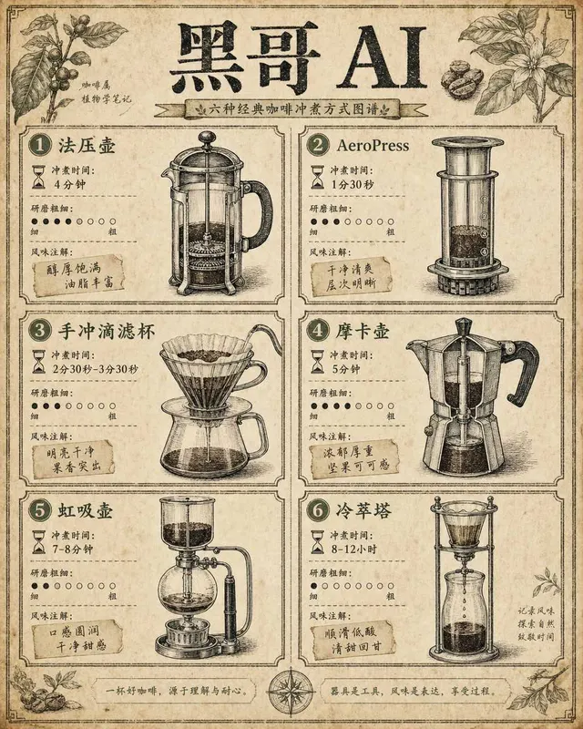
咖啡冲煮方式对比图
一张复古百科全书风格的信息图,在米白色做旧纸张上以两列网格排列六种咖啡冲煮方式对比。每个格子内有手绘钢笔风格剖面插图——法压壶、AeroPress、手冲滴滤杯、摩卡壶、虹吸壶、冷萃塔——配精细交叉阴影线增加立体感。每个设备下方以三行列出:冲煮时间(沙漏图标+文字)、研磨粗细(粗细刻度点)和风味注解(手写标签如 「bo…
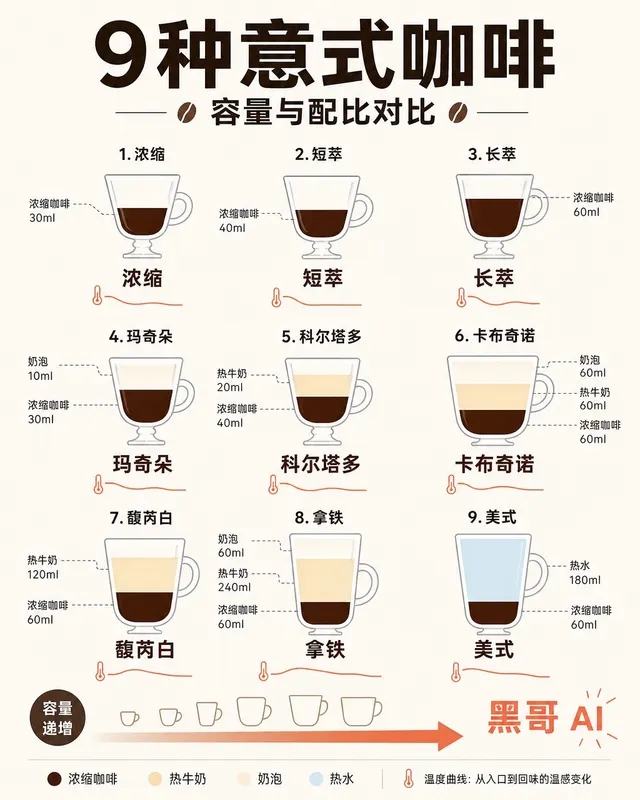
意式浓缩饮品配比示意图
一张简洁扁平风格信息图,将九种意式咖啡饮品——espresso、ristretto、lungo、macchiato、cortado、cappuccino、flat white、latte、americano——以高脚杯/咖啡杯轮廓横排展示。每个容器内用分层色块表示浓缩咖啡(深棕)、牛奶(暖奶油)、奶泡(浅象牙)和水(…
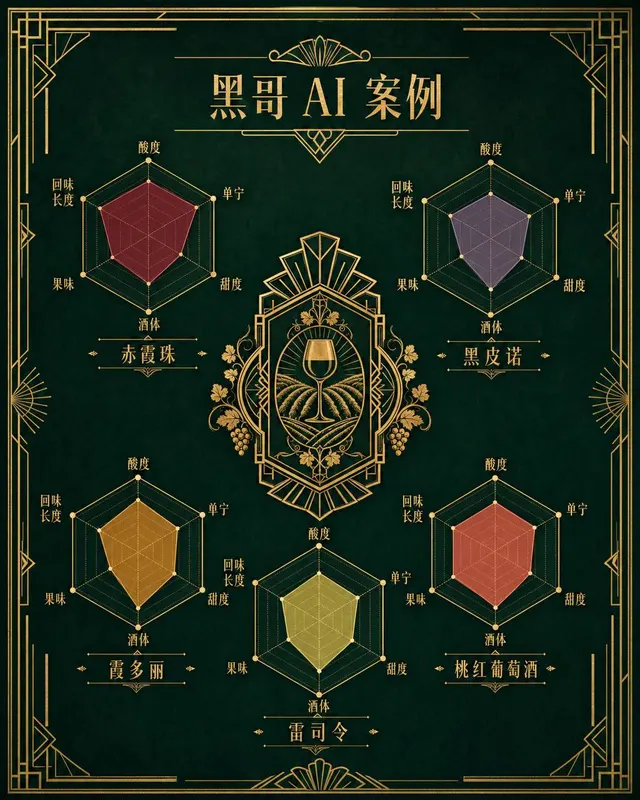
葡萄酒风味雷达图
一张装饰艺术风格的葡萄酒风味雷达图海报,展示五款经典葡萄酒:Cabernet Sauvignon、Pinot Noir、Chardonnay、Riesling 和 Rosé 的味觉雷达图。五个六边形雷达图对称排列在中央装饰徽章周围。每个雷达图有六条轴线——酸度、单宁、甜度、酒体、果味、回味长度——填充半透明多边形展示…
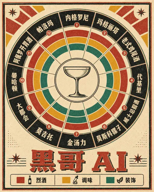
经典鸡尾酒配比转盘图
一张复古1960年代风格的圆形鸡尾酒配比转盘图,印在暖象牙色卡纸上,使用大胆的胶版印刷色彩。转盘分为十二个放射形扇区,每个代表一款经典鸡尾酒:Negroni、Margarita、Old Fashioned、Daiquiri、Whiskey Sour、Moscow Mule、Gin & Tonic、Mojito、Cos…