拉面馆汉字风格标志
中文完整提示词
生成一张 4:5 竖版 1024x1280 的粗犷中式书法风拉面馆标志展示页,品牌名替换为「黒潮 拉面」。主标志将中文「黑」与「潮」两个大字以浓墨书法互锁融合,「黑」字笔画自然流入「潮」字水流笔势。主标志以纯墨黑绘在温暖象牙米纸上,笔画末端有意墨晕。下方以极简现代中文无衬线体排印「KURO SHIO RAMEN 拉面」。画面同时展示红色印泥方章小版,章内文字「黑潮」,以及小尺寸圆形图标版。整体深沉、自信、手作匠心。所有可见文字必须为中文,不出现日文假名、英文、真实品牌、水印或外部标志。
English full prompt
A bold, kanji-influenced logo for a ramen shop called "黒潮" (Kuro Shio — Black Current). The mark fuses the two kanji characters 黒 and 潮 into an interlocking brush-calligraphy composition, with the strokes of 黒 (black) bleeding into the flowing water-strokes of 潮 (tide/current). Rendered in pure sumi-ink black on warm ivory rice paper with deliberate ink feathering at stroke endings. Below the kanji composition, the romanised name "KURO SHIO RAMEN" is set in a minimal modern sans-serif as a counterpoint. The sheet also shows the mark stamped in red seal-ink (hanko style) on white, and a small favicon version. The mood is deeply umami — dark, confident, and rooted in Japanese craft.
相关案例
-
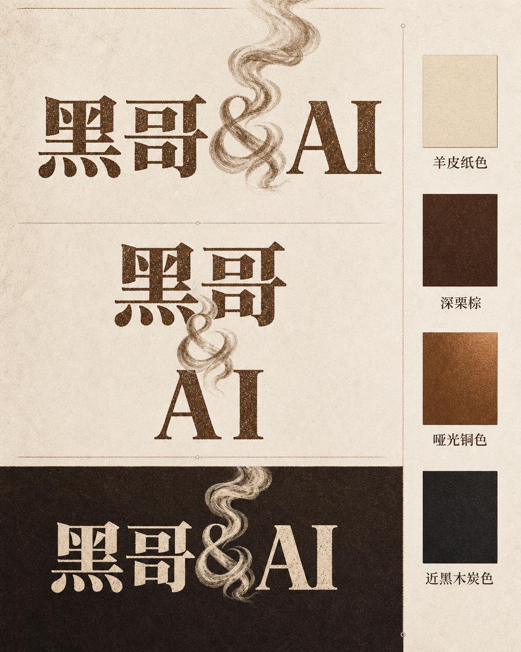
咖啡烘焙品牌字体标志
一张专业品牌识别展示页,品牌名称为 「Ember & Roast」。主字标使用压缩、略带做旧感的衬线字体,字色为暖棕色,底色奶白。与号(&)设计成一缕卷曲的烘焙烟雾。构图展示主要横排版本、紧凑堆叠版本以及深浓缩咖啡棕底色的反色单色版。旁侧附品牌色卡:羊皮纸色、深栗棕、哑光铜色和近黑木炭色。整体气质温暖、手工感十足,如…
-
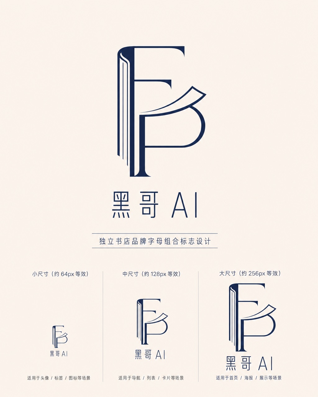
独立书店字母组合标志
一款精致的字母组合标志,用于名为 「Folded Page」 的独立书店。F 与 P 两字母以几何负空间方式互锁——F 的竖笔画化为翻开书脊,P 的曲线化为半空中翻动的页面。单色午夜蓝印在米白底上,品牌全名 「Folded Page」 以窄人文无衬线字体排于下方。展示三种尺寸版本(64px、128px、256px 等…
-
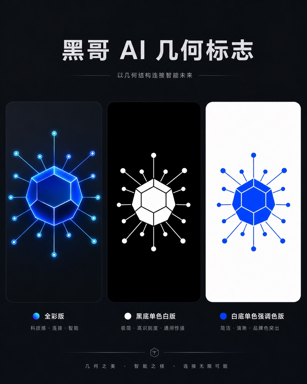
AI 初创公司几何图形标志
一款精致几何标志,用于名为 「Axon」 的 AI 初创公司。图形是十二面体衍生的六边形节点,每个顶点辐射出细连接线,将神经网络图抽象为一个完整独立的形状。以电钴蓝渲染,深石板灰底上带有微弱内发光。字标 "AXON" 以紧凑全大写几何无衬线字体居下,字距均等。展示全彩版、黑底单色白版和白底单色强调色版。气质自信、前瞻…
-
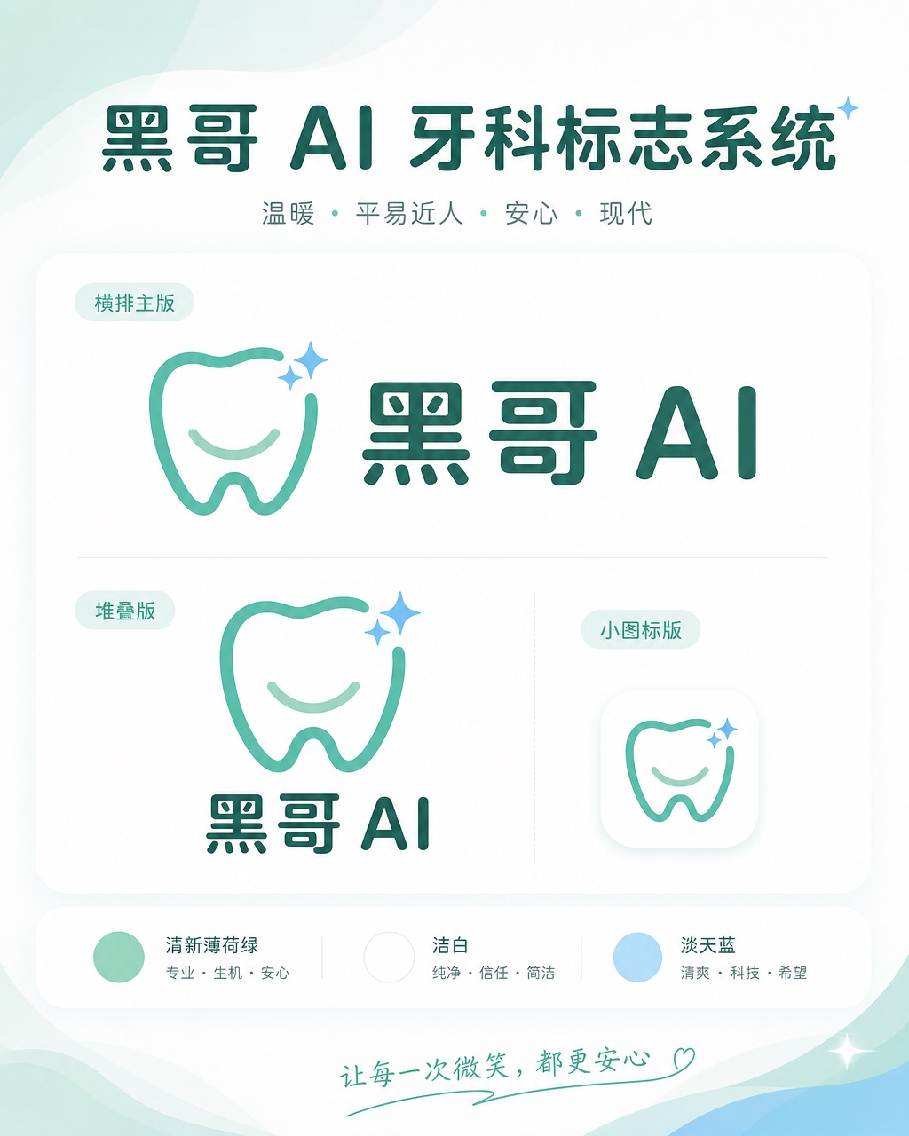
牙科诊所亲切品牌标志
一套温暖、平易近人的标志系统,用于名为 「Brightly」 的牙科诊所。图标是简化的牙齿形状,底部刻有微笑弧线,右上角有一颗小闪星——友好但不幼稚。色调:清新薄荷绿与洁白,辅以淡天蓝。横排全锁版将图标置于字标 「Brightly」 左侧,字体为圆润友好的无衬线体,字端柔和。展示横排主版、堆叠版和 favicon 尺…