Campus Device Repair
This is a UI Mockups AI image prompt case, leaning toward UI, Infographic. Copy the full prompt below and paste it into a free GPT image generator to create your own image with GPT Image-2 — swap the subject, brand, or aspect ratio as needed.
English full prompt
Design the 16:9 “Campus Device Repair” repair ticket queue around one job: “比对报修设备.” Organize the page through a page skeleton of pending and completed work in two columns, moving from pending objects to evidence and then to the final action, keeping selection, evidence source, and next action in one view. Lead with 「报修设备 19」「待复核 4」「完成率 79%」, allowing every value to drill down to objects. Write “报修设备 19 / 待检查”“报修设备 22 / 处理中”“报修设备 25 / 等待回访” directly in the object list, with state text at the start and updated time at the end. Let the operator compare old and new records before “比对报修设备.” Success includes operator and time, while failure preserves every edit. Cache evidence while offline and require a version choice when connectivity returns. The empty list offers a 报修设备 creation action and pending-state filter. Use sandstone, ink black, and lake blue, clear Simplified Chinese sans-serif type, and tabular numerals, clear Simplified Chinese sans-serif type, and tabular numerals. Express state through text, icon, and color, with touch targets at least forty-four pixels. Do not imitate real platforms or devices, and include no identifiable portraits, traceable addresses, floating 3D icons, or irrelevant charts. Output only the interface. Connect the updated count directly to the changed object for “Campus Device Repair” after the operator chooses the action “比对报修设备”. The empty state offers one relevant first action and a short example tied to this service. Final art direction: original product interface design with clear hierarchy and credible interaction states. Use this controlled palette as the dominant visual system: #172B3A, #E8F0EE, #6DA58D, #D79A46; preserve believable local material colors within it. Preserve the requested text hierarchy and wording as part of the design, but do not invent extra slogans, pseudo-text, logos, or watermarks. Keep one unmistakable primary subject or information route and one readable visual action. Use disciplined negative space and avoid default perfect symmetry. Physical credibility is mandatory: correct gravity, contact shadows, material thickness, tool weight, joint loading, fabric tension, liquid direction, reflections, scale, and occlusion. Create an original visual with no resemblance to a public figure, copyrighted character, existing campaign, or living artist signature style. No unrelated decorative icons, floating objects, duplicated limbs, plastic gloss, waxy skin, synthetic collage artifacts, or AI watermarks. Return exactly one finished image composed for 16:9; no variants, process sheet, split panels, mockup frame, or contact sheet.
中文完整提示词
把「校园设备报修」设计成 16:9 的维修工单队列,首要工作是“比对报修设备”。页面按待办与已完成左右分栏组织,当前选择、证据来源和下一步动作处于同一视野。首屏用「报修设备 19」「待复核 4」「完成率 79%」说明现状,并让每个数字都能下钻到对象。对象清单直接写“报修设备 19/待检查”“报修设备 22/处理中”“报修设备 25/等待回访”,行尾显示更新时间,行首保留状态文字。让操作者在一屏内比较原记录和新记录,再执行“比对报修设备”。成功状态包含姓名与时间,失败状态保留所有编辑,适配报修设备的现场操作。把离线证据暂存在设备内,连接恢复时要求选择版本,不打断报修设备记录。报修设备为空时显示创建入口,待处理状态可独立过滤。配色采用砂岩、墨黑与湖蓝,字体为清晰中文无衬线和等宽数字。状态由文字、图标与颜色共同表达,触控目标至少 44 像素,适配报修设备的现场操作。不要套用真实平台或设备外观,也不出现真人头像、可追溯地址、漂浮 3D 图标和无关图表;只输出界面本体。
Related cases
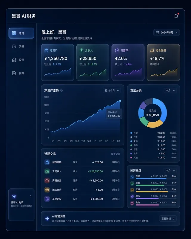
Dark Finance Dashboard Glassmorphism
A pixel-perfect desktop web app mockup of a personal finance dashboard rendered in glassmorphism style. The layout uses a dark navy background (#0D1117) with frosted-glass panels…
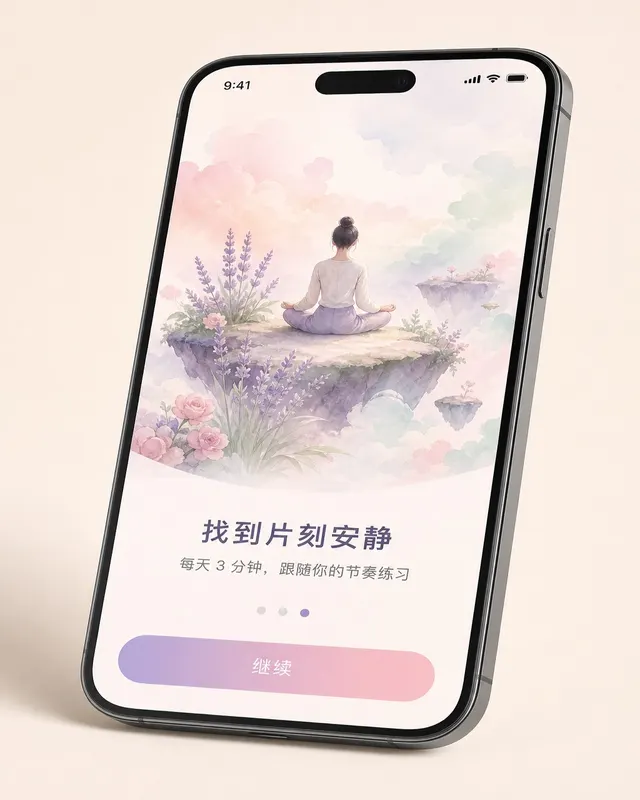
iOS Meditation App Onboarding
A pixel-perfect iOS 17 onboarding screen for a meditation app, shown in iPhone 15 Pro device frame at natural perspective with a slight tilt. The screen is the third of five steps…
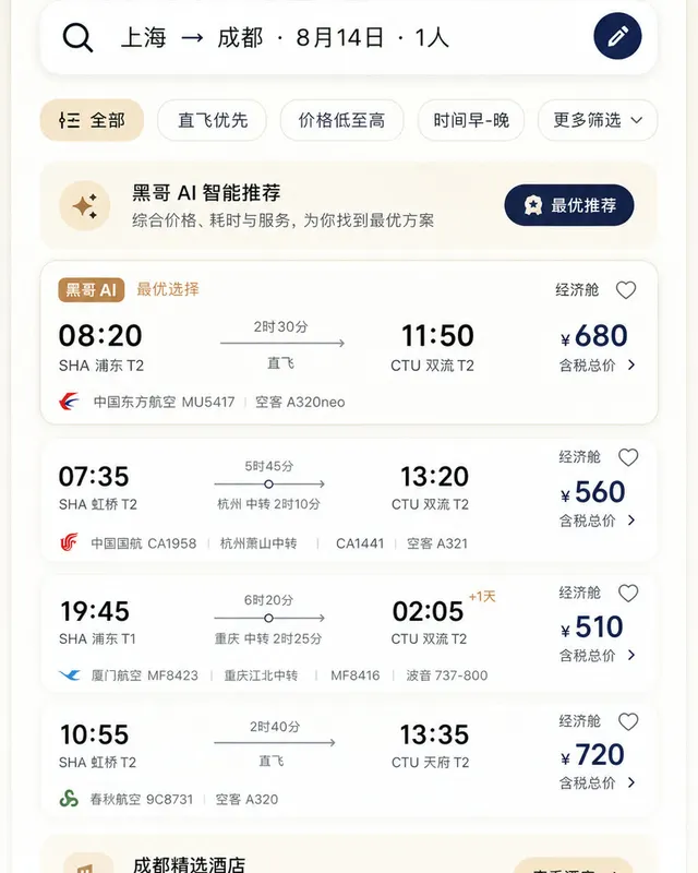
Material 3 Travel Booking App
A pixel-perfect Android mockup following Material Design 3 guidelines for a flight and hotel booking app in light mode. The screen shows a search-results list for flights from Tok…
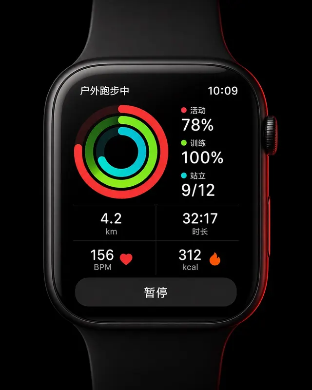
Apple Watch Workout Ring Screen
A pixel-perfect smartwatch UI mockup displayed on a 45mm square watch face with rounded corners and a black OLED background. The screen shows an active outdoor run workout. Three…