A/B Test Conversion Funnel Analysis
This is a Scientific & Academic Figures AI image prompt case, leaning toward Flat, Minimalist. Copy the full prompt below and paste it into a free GPT image generator to create your own image with GPT Image-2 — swap the subject, brand, or aspect ratio as needed.
English full prompt
A side-by-side conversion funnel comparison chart for an A/B test, styled as a clean data-science report figure. Two funnel diagrams sit side-by-side, labelled "Variant A" (left, in cobalt blue) and "Variant B" (right, in coral). Each funnel has five stages drawn as progressively narrower trapezoid bars stacked vertically: 1 "Impression" (widest), 2 "Click-through", 3 "Sign-up", 4 "Onboarding Complete", 5 "Purchase" (narrowest). Each bar shows an absolute user count in bold white text centred on the bar, and a conversion rate percentage on the right side in 9 pt grey italic. Drop-off percentages between stages are shown as small grey annotations on the outside of the funnel with downward arrows. Statistical significance banner at the bottom: a green badge reading "p = 0.032 (Significant at α = 0.05)" appears between the two funnels. A simple bar chart inset at top-right shows the lift of Variant B over A for the Purchase stage: "+18.4% lift" in bold. Grid lines on x-axis only, muted grey. Overall chart has white background, clean border, title label "Funnel Analysis: 14-day cohort" in 11 pt bold at the top.
中文完整提示词
一张 A/B 测试转化漏斗对比图,数据科学报告风格。左侧 「Variant A」(钴蓝)与右侧 「Variant B」(珊瑚色)两个漏斗并排,各含五级梯形条:1 「Impression」(最宽)、2 "Click-through"、3 「立即使用」、4 「Click-through」、5 「Sign-up」(最窄)。每级白色粗体绝对用户数,右侧 9pt 灰色斜体转化率,漏斗外侧灰色下箭头标注流失率。两漏斗间底部绿色徽章 "p = 0.032 (Significant at α = 0.05)"。右上角小柱状图:Variant B 相对 A 在购买阶段 「Funnel Analysis: 14-day cohort」。仅 x 轴灰色网格线,白色背景,顶部粗体标题 「A/B 测试转化漏斗分析图」。
Related cases
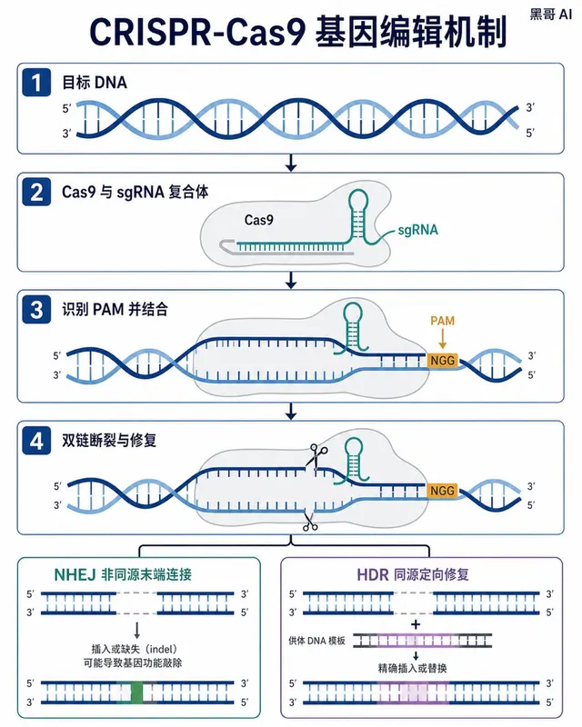
CRISPR-Cas9 Gene Editing Mechanism
A Nature-journal-quality flat vector diagram illustrating the CRISPR-Cas9 gene-editing mechanism. The composition is horizontal, spanning roughly A4 landscape, divided into four s…
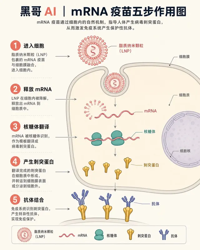
mRNA Vaccine Cellular Action
A textbook-flat isometric infographic showing the step-by-step action of an mRNA vaccine inside a human cell. The scene is rendered in a soft clinical palette: off-white backgroun…
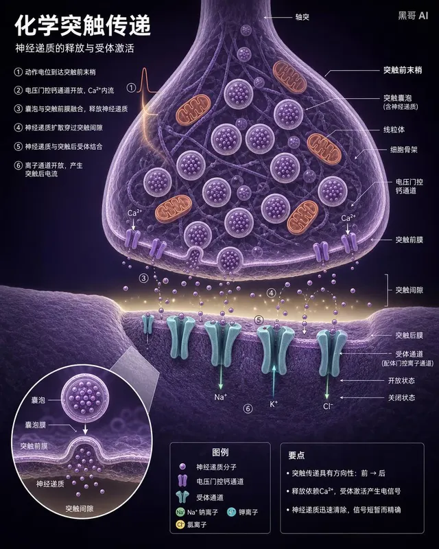
Neuron Synapse Cross-Section
A precise anatomical cross-section illustration of a chemical synapse between two neurons, rendered in the style of a high-end neuroscience textbook. Viewpoint: close-up transvers…
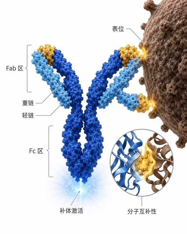
Antibody-Antigen Binding Diagram
A clean scientific illustration of an IgG antibody binding to a surface antigen on a pathogen, suitable for an immunology lecture slide. The antibody is rendered in a semi-3D ribb…