瑞士风格应用设置页
中文完整提示词
生成一张 1024x1280 像素、4:5 竖版瑞士国际主义版式手机设置页。纯白背景,8 列网格,红色 2px 横线分隔区块。分区标题为小号红字中文:「账号」「通知」「隐私」「外观」,设置行 16px 黑字。通知区包含「免打扰时间:晚上10点至早上7点」。顶部左侧红色返回箭头,标题「设置」,极简无卡片背景。所有可见文字必须是简体中文,不出现英文时间、英文分区、真实系统标志、水印或乱码。
English full prompt
A pixel-perfect mobile app settings screen designed in strict Swiss International Typographic Style. The layout is built on a rigid 8-column grid. Background is pure white. All text is Helvetica Neue — section headers in 11px uppercase red (#E3000B), body settings rows in 16px medium black. A bold red horizontal rule (2px) separates major sections. Settings groups include: ACCOUNT (Profile, Email, Password), NOTIFICATIONS (Push Alerts toggle, Email Digest toggle, Do Not Disturb time picker showing "10 PM – 7 AM"), PRIVACY (Location Access, Data Sharing), APPEARANCE (toggle row with "Dark Mode" label and a system toggle). Toggle elements are minimal — iOS-style but recolored with the red accent. Right-side chevrons are thin (1px stroke). No card backgrounds — everything is flat rows on white. A red back-arrow in the top-left corner. The overall composition feels like a Müller-Brockmann grid study applied to a phone screen.
相关案例
-
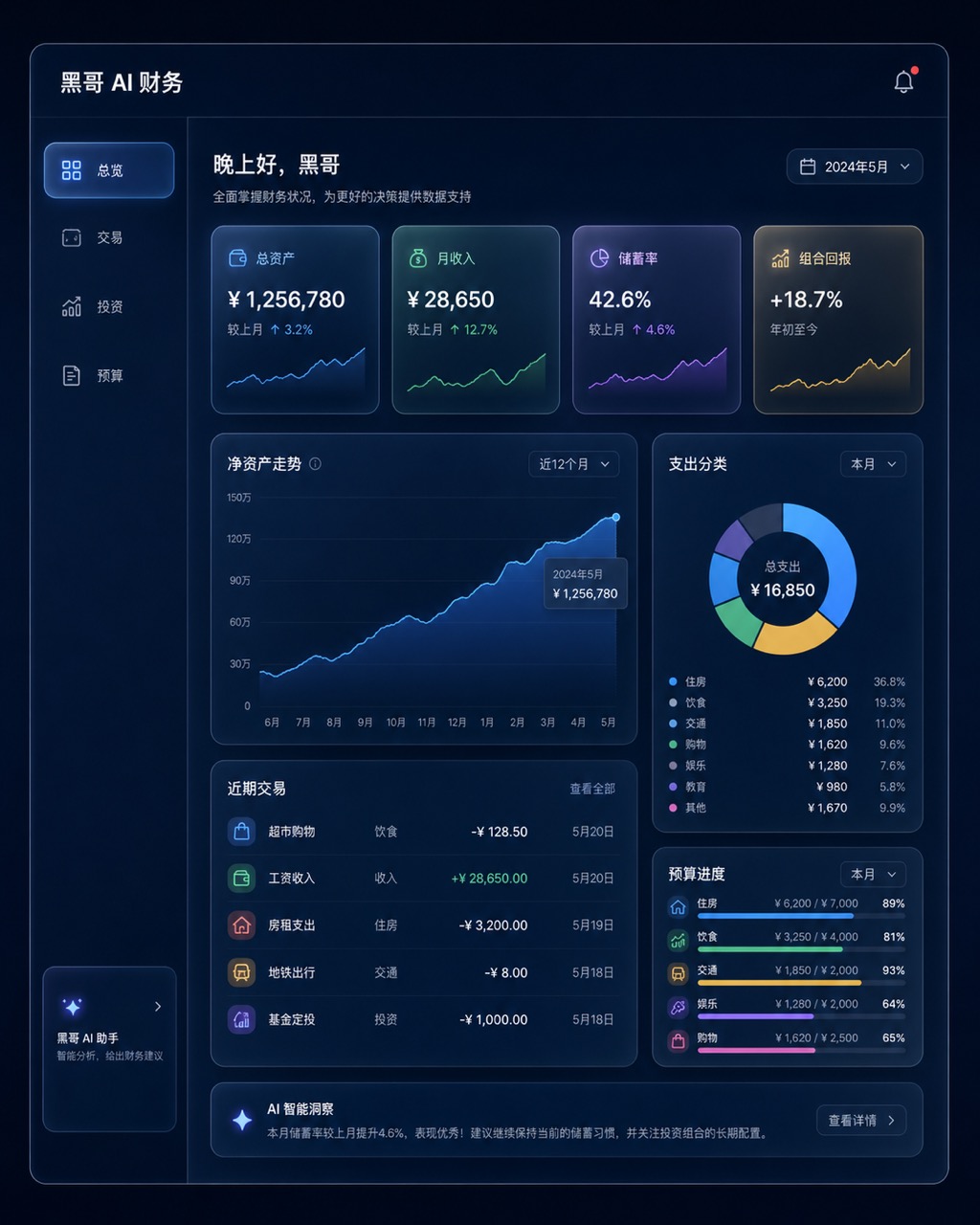
暗色金融仪表盘玻璃拟态
一张桌面端 Web 应用财务仪表盘的像素级精准 mockup,采用玻璃拟态风格。深海军蓝背景,每张卡片为磨砂玻璃效果,带细白色描边和内发光阴影。左侧边栏含 总览、交易、投资、预算 导航。主区域展示 12 个月净资产折线面积图(青绿渐变紫),四个 KPI 卡片(「总资产」、「月收入」、「储蓄率」、「组合回报」),以及支…
-
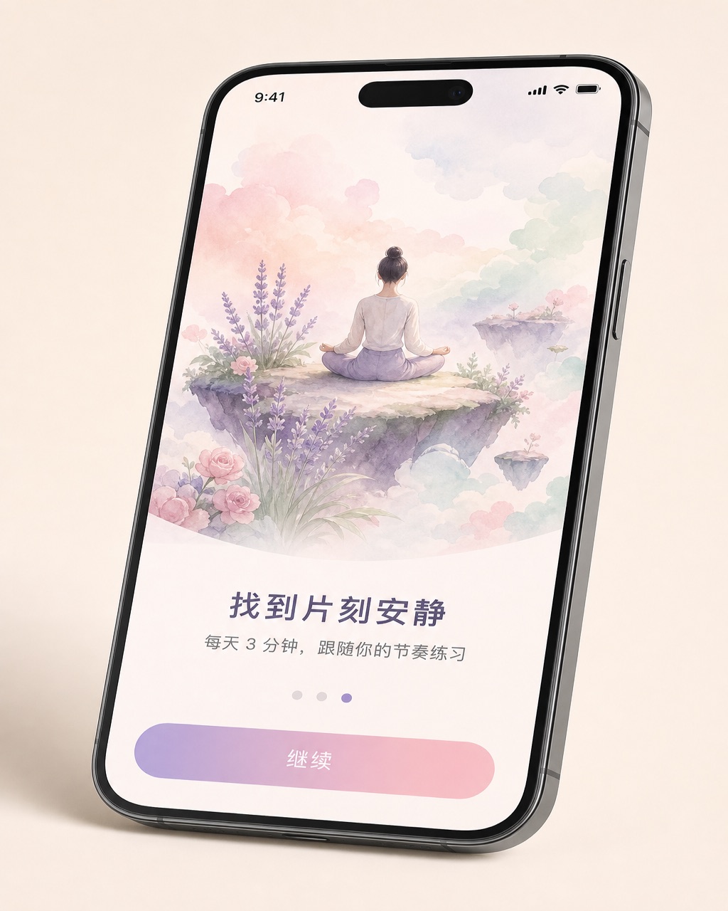
iOS 冥想应用引导页
一张 无品牌现代手机样机 机框内的 现代移动系统 冥想 App 第三步引导页像素级 mockup,设备有轻微透视倾斜。上方 60% 为水彩风格插画:一人盘坐在浮岛上,薰衣草、玫瑰粉、薄荷绿柔和云朵环绕。插画下方粗体标题 「找到片刻安静」,副标题 「每天 3 分钟,跟随你的节奏练习」,分页圆点(第三个填充薰衣草色),底…
-
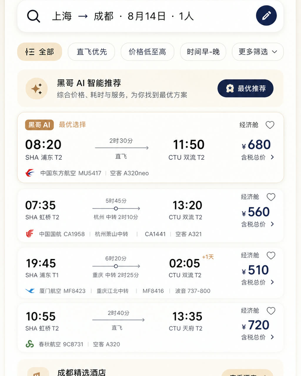
Material 3 旅行预订应用
一张遵循 Material Design 3 规范的 现代移动系统 机票与酒店预订 App 浅色模式像素级 mockup。顶部 M3 搜索栏显示 「上海 → 成都 · 8月14日 · 1人」,筛选芯片行,多张航班卡片展示出发/到达时间、中转信息、时长与价格。底部导航栏四个图标,主色为暖沙色搭配深靛蓝强调色,12dp…
-
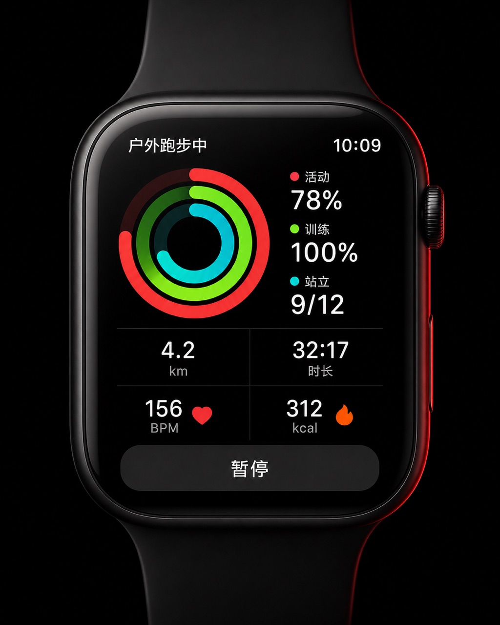
智能手表运动环形界面
一张 45mm 圆角方形智能手表 UI 像素级 mockup,纯黑 OLED 屏。屏幕显示户外跑步中:三圈同心活动环(红色 Move 78%、青绿 Exercise 100%、青色 Stand 9/12),下方 2×2 数据网格显示 "4.2 km"、"32:17"、"156 BPM"、"312 kcal",底部暂停…