博物馆触觉导览
这是一个「UI 模拟界面」类别的 AI 生图提示词案例,风格偏向UI、Realistic。复制下方完整提示词,打开免费 GPT 生图工具粘贴,即可用 GPT Image-2 免费出图,并可替换主体、品牌名与画幅。
中文完整提示词
生成「博物馆触觉导览」协作接力看板,画幅 3:2,供现场人员完成“更新触觉站点”。首屏采用贡献者列表、任务接力、留言证据、交接回执承载明细;阅读从待处理对象推进到证据,再抵达操作区,让“更新触觉站点”保持主路径。数据区写出「触觉站点 24」「待复核 5」「完成率 78%」,总数、待办和完成情况能够互相核对。主区域出现“触觉站点 24/新提交”“触觉站点 27/协作中”“触觉站点 30/完成核验”三条记录,证据缩略图与负责人分别可见。把前值、后值、证据与说明集中在详情中;完成“更新触觉站点”后记录操作者,缺项则在原位提示。网络不可用时进入安全缓存,恢复后再合并版本。若没有触觉站点,页面提供明确起步动作和状态筛选。视觉限制在夜蓝、雾灰与琥珀,用中文无衬线建立层级,数值改用等宽体;图标不能代替状态文字,主要控件保持 44 像素热区,适配触觉站点的现场操作。移除品牌、真实账号、地点和拟物 3D 徽章,保持「博物馆触觉导览」的工具属性;不要显示设计软件、注释板或手机样机。
English full prompt
Create a “Tactile Museum Guide” collaboration relay board in a 3:2 frame so field staff can perform the Chinese action “更新触觉站点.” Use markers anchored to real positions, moving from pending objects to evidence and then to the final action; reading moves from pending object to evidence and then to the action area. Write 「触觉站点 24」「待复核 5」「完成率 78%」 in the data region so totals, pending work, and completion can be reconciled. Show “触觉站点 24 / 新提交”“触觉站点 27 / 协作中”“触觉站点 30 / 完成核验” as three primary records, keeping evidence thumbnails and owners distinct. Keep previous value, new value, evidence, and explanation in one detail area. Completion records the operator, while missing data is flagged in place. Use a safe offline queue and merge only after comparing versions. If no 触觉站点 exists, present a clear first action and status filter. Restrict the visual system to night blue, mist gray, and amber, clear Simplified Chinese sans-serif type, and tabular numerals. Use Chinese sans-serif hierarchy and tabular numerals; never let icons replace state labels, and keep forty-four-pixel targets. Remove brands, real accounts, locations, and 3D badges. Do not show design software, annotation boards, or phone mockups. Show the transition from pending to complete in situ for “Tactile Museum Guide” after the operator chooses the action “更新触觉站点”. Filter results announce the new count in text and keep the selected filter exposed above the list. Final art direction: original product interface design with clear hierarchy and credible interaction states. Use this controlled palette as the dominant visual system: #172B3A, #E8F0EE, #6DA58D, #D79A46; preserve believable local material colors within it. Preserve the requested text hierarchy and wording as part of the design, but do not invent extra slogans, pseudo-text, logos, or watermarks. Keep one unmistakable primary subject or information route and one readable visual action. Use disciplined negative space and avoid default perfect symmetry. Physical credibility is mandatory: correct gravity, contact shadows, material thickness, tool weight, joint loading, fabric tension, liquid direction, reflections, scale, and occlusion. Create an original visual with no resemblance to a public figure, copyrighted character, existing campaign, or living artist signature style. No unrelated decorative icons, floating objects, duplicated limbs, plastic gloss, waxy skin, synthetic collage artifacts, or AI watermarks. Return exactly one finished image composed for 3:2; no variants, process sheet, split panels, mockup frame, or contact sheet.
相关案例
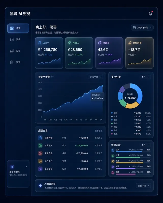
暗色金融仪表盘玻璃拟态
一张桌面端 Web 应用财务仪表盘的像素级精准 mockup,采用玻璃拟态风格。深海军蓝背景,每张卡片为磨砂玻璃效果,带细白色描边和内发光阴影。左侧边栏含 总览、交易、投资、预算 导航。主区域展示 12 个月净资产折线面积图(青绿渐变紫),四个 KPI 卡片(「总资产」、「月收入」、「储蓄率」、「组合回报」),以及支…
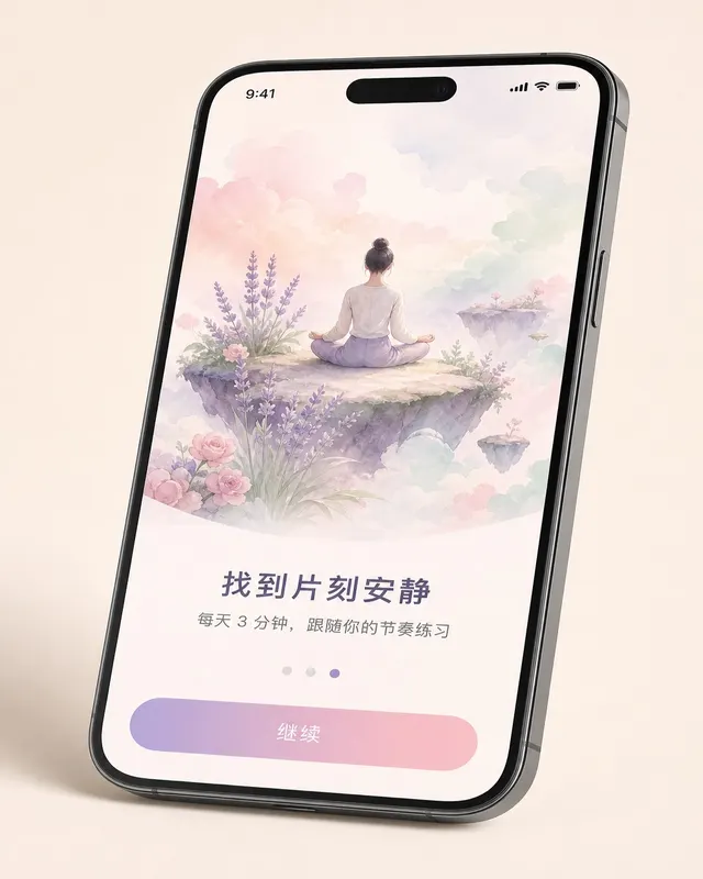
iOS 冥想应用引导页
一张 无品牌现代手机样机 机框内的 现代移动系统 冥想 App 第三步引导页像素级 mockup,设备有轻微透视倾斜。上方 60% 为水彩风格插画:一人盘坐在浮岛上,薰衣草、玫瑰粉、薄荷绿柔和云朵环绕。插画下方粗体标题 「找到片刻安静」,副标题 「每天 3 分钟,跟随你的节奏练习」,分页圆点(第三个填充薰衣草色),底…
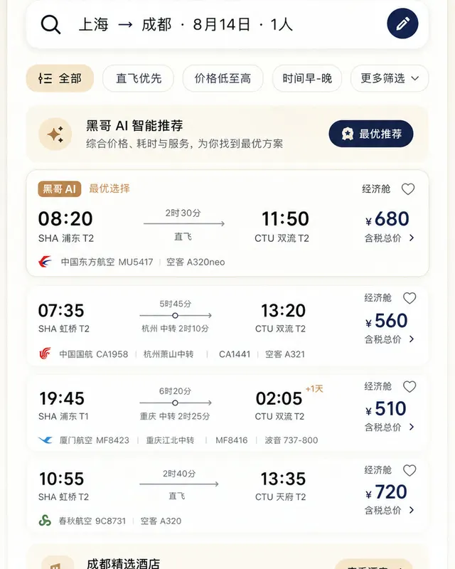
Material 3 旅行预订应用
一张遵循 Material Design 3 规范的 现代移动系统 机票与酒店预订 App 浅色模式像素级 mockup。顶部 M3 搜索栏显示 「上海 → 成都 · 8月14日 · 1人」,筛选芯片行,多张航班卡片展示出发/到达时间、中转信息、时长与价格。底部导航栏四个图标,主色为暖沙色搭配深靛蓝强调色,12dp…
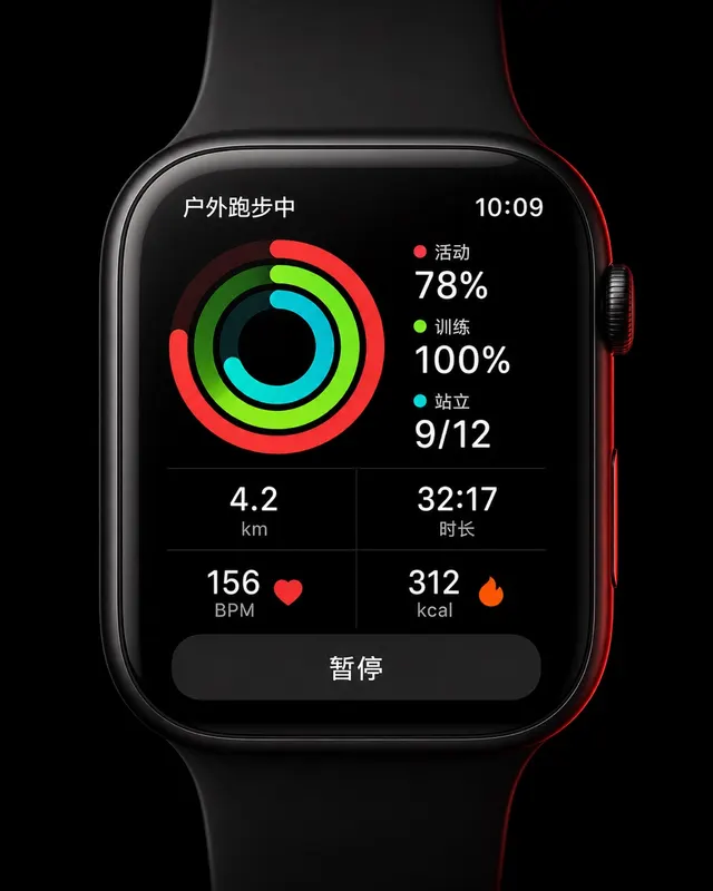
智能手表运动环形界面
一张 45mm 圆角方形智能手表 UI 像素级 mockup,纯黑 OLED 屏。屏幕显示户外跑步中:三圈同心活动环(红色 Move 78%、青绿 Exercise 100%、青色 Stand 9/12),下方 2×2 数据网格显示 "4.2 km"、"32:17"、"156 BPM"、"312 kcal",底部暂停…