纸舟儿童邮局品牌识别提案
这是一个「品牌识别」类别的 AI 生图提示词案例,风格偏向原创标志、品牌系统、触点设计。复制下方完整提示词,打开免费 GPT 生图工具粘贴,即可用 GPT Image-2 免费出图,并可替换主体、品牌名与画幅。
中文完整提示词
围绕建立「纸舟儿童邮局」可落地的品牌识别系统生成「纸舟儿童邮局」,构图必须可就地发布。
「纸舟儿童邮局」品牌板只保留核心标志、横式组合、单色稿、最小稿和儿童邮袋与街头投递柱,主次面积明确
围绕信封口像小船,邮戳点成为一串城市探索坐标建立「纸舟儿童邮局」的核心图形,让它在儿童邮袋与街头投递柱上兼具识别与提示;单色远看仍保留可信、克制、具体
为「纸舟儿童邮局」在儿童邮袋与街头投递柱上设置可生产的适合儿童邮袋与街头投递柱的无涂布纸、耐用印墨、压印或导视基材工艺,区分识别区和服务区,同时共享图形语言与留白节奏。
构图采用对角线推进构图。
排版围绕「纸舟儿童邮局|建立「纸舟儿童邮局」可落地的品牌识别系统」展开,不加入署名、水印、链接或无法阅读的填充字。
「纸舟儿童邮局」采用高位柔光与低强度补光,核心对象清晰、背景退后一级;让适合儿童邮袋与街头投递柱的无涂布纸、耐用印墨、压印或导视基材上的印刷、压印、缝制或安装方式可信可行。文字选择人文黑体配克制行距,背景为低反射浅色底面,整体完成为克制而连贯的品牌提案质感。补充控制:边缘柔和的自然投影,轮廓不使用装饰性辉光;用低饱和背景托出主题色,焦点沿箭头或动作方向单向移动,唯一强调只落在决定性节点。
不要出现现有商标轮廓、通用盾牌皇冠地球图形、随意字母缩写与纯装饰 3D 镀铬;同时禁止品牌挪用、版权角色、多余肢体和无因悬浮,用于「纸舟儿童邮局」。
成片为单张 16:9,不附过程页或变体。
English full prompt
Build “Paper Boat Children’s Post” around building a usable identity system for “Paper Boat Children’s Post”, together with a finish suitable for immediate publication. Retain the Paper Boat Children’s Post board to five items: core mark, horizontal lockup, monochrome artwork, minimum-size artwork, and children’s mail bags and street posting pillars; establish decisive hierarchy. Make the Paper Boat Children’s Post mark perform recognition and guidance on children’s mail bags and street posting pillars; monochrome, reduced, and distant versions retain one restrained character. Specify a manufacturable uncoated stock, durable ink, embossing, or wayfinding substrate suited to children’s mail bags and street posting pillars process for Paper Boat Children’s Post on children’s mail bags and street posting pillars; separate recognition from service guidance and simultaneously sharing graphic language and negative-space rhythm. Frame Paper Boat Children’s Post as diagonal progression composition, seen by an overhead design-board view combined together with an eye-level touchpoint mockup and restrained perspective. Organize typography around “纸舟儿童邮局|建立「纸舟儿童邮局」可落地的品牌识别系统” without credits, watermarks, links, or unreadable filler. Distribute plum violet, smoke gray, copper gold, and cream across hero element, setting, and guidance layers at the same time as lighting the texture and structure of uncoated stock, durable ink, embossing, or wayfinding substrate suited to children’s mail bags and street posting pillars. Give Paper Boat Children’s Post high soft light together with low-intensity fill and a crisp main object together with the background one level quieter; make printing, embossing, stitching, or installation on uncoated stock, durable ink, embossing, or wayfinding substrate suited to children’s mail bags and street posting pillars physically feasible. Choose humanist sans serif together with restrained leading over a pale low-reflection ground, completing the image together with a restrained, complete identity-presentation finish. Additional control: natural cast shadows together with soft edges; silhouettes exclude decorative glow. Use a low-saturation ground supporting the theme color, ensure focus travels one way along the arrow or gesture, and let the sole accent sits on the decisive node. Do not reveal existing trademark silhouettes, generic shield-crown-globe devices, arbitrary initials, or decorative chrome rendering; also forbid brand appropriation, copyrighted characters, extra limbs, and causeless floating objects. Return one 16:9 final image without variants or a process sheet. Final art direction: original brand identity presentation board with coherent symbol construction and real application scenes. Use this controlled palette as the dominant visual system: #242B2F, #F0E9DC, #6B8E81, #C66A45; preserve believable local material colors within it. Preserve the requested text hierarchy and wording as part of the design, but do not invent extra slogans, pseudo-text, logos, or watermarks. Keep one unmistakable primary subject or information route and one readable visual action. Use disciplined negative space and avoid default perfect symmetry. Physical credibility is mandatory: correct gravity, contact shadows, material thickness, tool weight, joint loading, fabric tension, liquid direction, reflections, scale, and occlusion. Create an original visual with no resemblance to a public figure, copyrighted character, existing campaign, or living artist signature style. No unrelated decorative icons, floating objects, duplicated limbs, plastic gloss, waxy skin, synthetic collage artifacts, or AI watermarks. Return exactly one finished image composed for 16:9; no variants, process sheet, split panels, mockup frame, or contact sheet.
相关案例
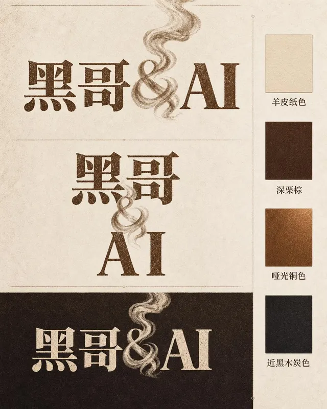
咖啡烘焙品牌字体标志
一张专业品牌识别展示页,品牌名称为 「Ember & Roast」。主字标使用压缩、略带做旧感的衬线字体,字色为暖棕色,底色奶白。与号(&)设计成一缕卷曲的烘焙烟雾。构图展示主要横排版本、紧凑堆叠版本以及深浓缩咖啡棕底色的反色单色版。旁侧附品牌色卡:羊皮纸色、深栗棕、哑光铜色和近黑木炭色。整体气质温暖、手工感十足,如…
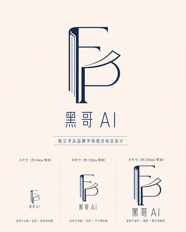
独立书店字母组合标志
一款精致的字母组合标志,用于名为 「Folded Page」 的独立书店。F 与 P 两字母以几何负空间方式互锁——F 的竖笔画化为翻开书脊,P 的曲线化为半空中翻动的页面。单色午夜蓝印在米白底上,品牌全名 「Folded Page」 以窄人文无衬线字体排于下方。展示三种尺寸版本(64px、128px、256px 等…
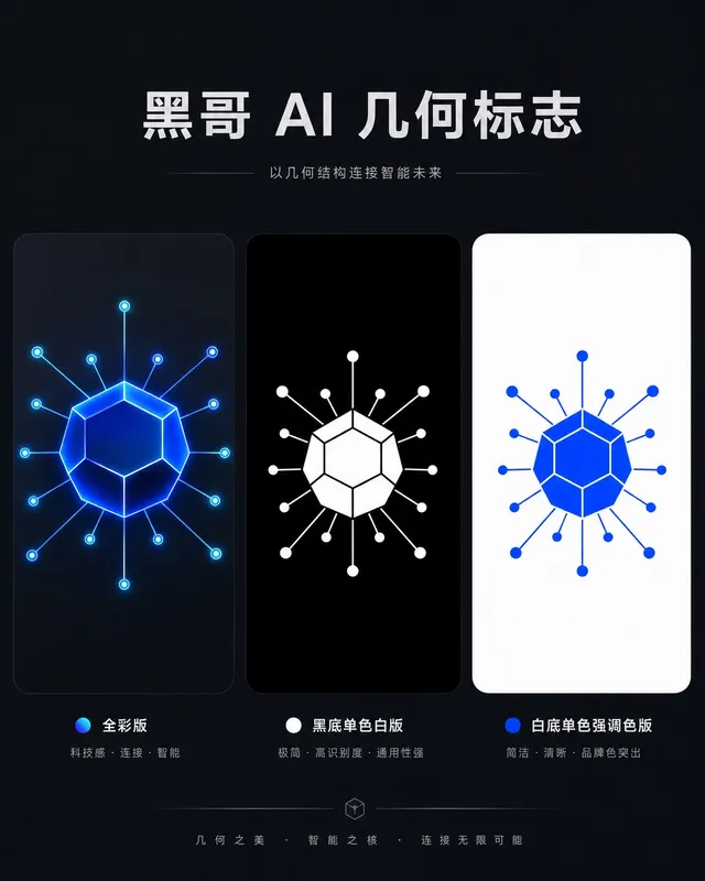
AI 初创公司几何图形标志
一款精致几何标志,用于名为 「Axon」 的 AI 初创公司。图形是十二面体衍生的六边形节点,每个顶点辐射出细连接线,将神经网络图抽象为一个完整独立的形状。以电钴蓝渲染,深石板灰底上带有微弱内发光。字标 "AXON" 以紧凑全大写几何无衬线字体居下,字距均等。展示全彩版、黑底单色白版和白底单色强调色版。气质自信、前瞻…
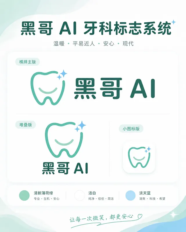
牙科诊所亲切品牌标志
一套温暖、平易近人的标志系统,用于名为 「Brightly」 的牙科诊所。图标是简化的牙齿形状,底部刻有微笑弧线,右上角有一颗小闪星——友好但不幼稚。色调:清新薄荷绿与洁白,辅以淡天蓝。横排全锁版将图标置于字标 「Brightly」 左侧,字体为圆润友好的无衬线体,字端柔和。展示横排主版、堆叠版和 favicon 尺…