火车窗景速写
这是一个「海报与编辑设计」类别的 AI 生图提示词案例,风格偏向Poster、Illustration。复制下方完整提示词,打开免费 GPT 生图工具粘贴,即可用 GPT Image-2 免费出图,并可替换主体、品牌名与画幅。
中文完整提示词
生成一张「火车窗景速写」海报,画幅 1:1,用于一场小型公共文化活动。围绕“火车窗连续切出四段速写”组织全部叙事,材料厚度与接触面清楚可见,不能靠降低透明度融合。主视觉和排版共同服从偏心竖构图,不要把文字贴在图像之外,让“火车窗连续切出四段速写”保持第一视觉中心。海报只保留四组文字:「火车窗景速写」「让公共空间拥有温度」「旧水厂北厅」「提前十分钟签到」,标题仅允许一处边缘遮挡。次级物件限定为导向箭头、手写纸条和材料样本,只为“火车窗连续切出四段速写”提供尺度参照。通过木刻线条与暖白棉纸表现工艺先后,整体色组为炭黑、象牙白、铜绿与珊瑚粉。带遮光罩的顶灯建立画面体积,接缝附近保留最清楚的落影,背景保持安静。裁切区外不保留陈列场景,文字完整。禁止真实品牌、公众人物、现成 IP、设备外壳与镜面立体标题,保持「火车窗景速写」的公共活动语气。
English full prompt
Create a “Train Window Sketch Day” poster in a 1:1 frame for a small public culture event. Organize the narrative around a train window cutting the passing view into four consecutive sketches, exposing material thickness and the contact surface instead of reducing opacity. Make image and typography share an asymmetric vertical composition; do not park text outside the artwork. Keep only four copy groups: “Train Window Sketch Day,” “Bring warmth to shared space,” “the north hall of the former waterworks,” and “check in ten minutes early.” The hero may cover one stroke edge only. Restrict secondary objects to directional arrows, handwritten slips, and material samples. Use woodcut linework on warm cotton paper to show process order and charcoal, ivory, verdigris, and coral pink as the complete color system. Build volume with a hooded overhead lamp, keeping the clearest shadow near the seam and the background quiet. Show no presentation environment beyond the trim. Exclude real brands, public figures, existing IP, device shells, and mirrored dimensional headlines. For the final rendering, make the subject change state without losing its original identity: a train window cutting the passing view into four consecutive sketches. Keep the source object recognizable at the point where it changes, and reveal one seam that explains the construction. At thumbnail size, the silhouette should still communicate the event before any small copy is read. Final art direction: editorial poster design with a disciplined grid and material-aware composition. Use this controlled palette as the dominant visual system: #F2EBDD, #243447, #C65D48, #D6A14B; preserve believable local material colors within it. Preserve the requested text hierarchy and wording as part of the design, but do not invent extra slogans, pseudo-text, logos, or watermarks. Keep one unmistakable primary subject or information route and one readable visual action. Use disciplined negative space and avoid default perfect symmetry. Physical credibility is mandatory: correct gravity, contact shadows, material thickness, tool weight, joint loading, fabric tension, liquid direction, reflections, scale, and occlusion. Create an original visual with no resemblance to a public figure, copyrighted character, existing campaign, or living artist signature style. No unrelated decorative icons, floating objects, duplicated limbs, plastic gloss, waxy skin, synthetic collage artifacts, or AI watermarks. Return exactly one finished image composed for 1:1; no variants, process sheet, split panels, mockup frame, or contact sheet.
相关案例
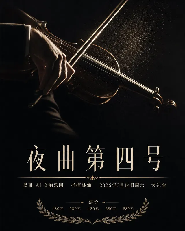
交响乐音乐会海报
生成一张 4:5 竖版「交响乐音乐会海报」案例图,所属分类为「海报设计」。纵向交响乐海报,黑底,单张轮廓光照亮的小提琴弓特写,下方为骨白色大号衬线标题 夜曲第四号。画面需要完整呈现上述主体、构图、配色、材质、光线和整体风格;可见文字以自然简体中文为主,必要的技术缩写、代码、变量名、学术符号、单位、拉丁物种名或装饰性外…
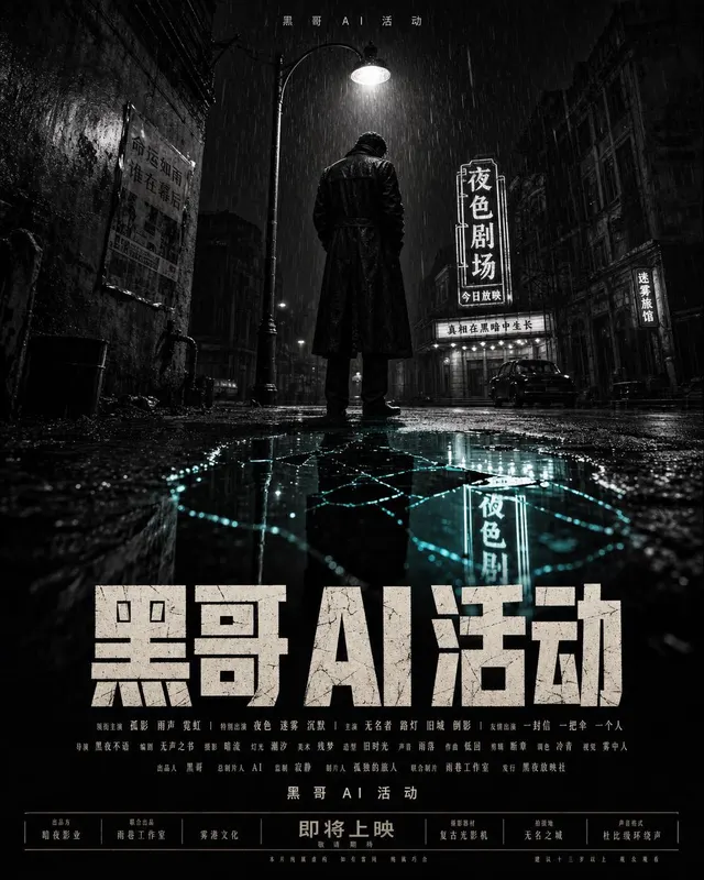
新黑色侦探电影海报
一张虚构新黑色电影的剧院级单页海报,27x40 英寸纵向比例。构图:低角度,孤独身影身穿长风衣立于一盏路灯下,背影出镜,脚边水洼反射破碎的中英文霓虹招牌。画面为高反差黑白,仅水洼高光处带一丝低饱和湖青色调。空气中细雨成线,质感如 1/30 秒快门。顶部细体无衬线标语 「ROOM 1107」。下三分之一为标题 「ROO…
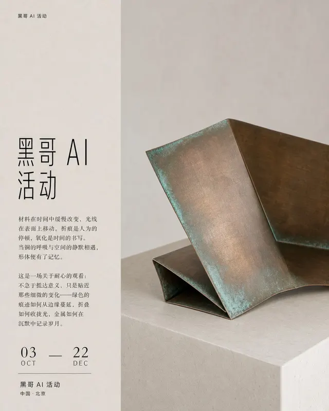
当代艺术展览海报
一张方形 A1 当代雕塑展览海报。背景为温暖粉笔灰。右侧三分之二是一张大幅静物:一片折叠生铜薄板置于浅色基座上,折痕处可见柔和湖绿色氧化锈迹,由均匀北窗自然光照亮,无强阴影。左侧三分之一为严谨的字体栏。自上而下:极小的画廊字标 「MUSEUM OF MATERIAL」,留出大量垂直空白,再放展览标题 「MUSEUM…
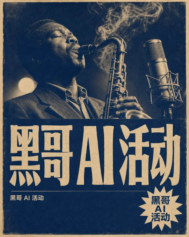
地下爵士之夜海报
一张地下爵士俱乐部周更夜场的 B2 纵向海报。风格:1960 年代蓝调唱片封套气质,但完全原创。上半部分为单张双色调照片,深海军蓝与赭奶白:一位黑人萨克斯手正在吹奏,闭目仰头靠近老式电容麦克风,烟雾缓缓飘向上方画面边缘。高光带柔和光晕,可见明显银盐颗粒。下半部分超大手绘风格压缩展示衬线标题 「BLUE ROOM SE…