补丁巷社区修补站品牌识别
这是一个「品牌识别」类别的 AI 生图提示词案例,风格偏向品牌手册、社区服务、可持续。复制下方完整提示词,打开免费 GPT 生图工具粘贴,即可用 GPT Image-2 免费出图,并可替换主体、品牌名与画幅。
中文完整提示词
生成一张 16:9 横版原创中文品牌识别系统展示板,品牌名为「补丁巷」,定位是社区衣物、小家电和木器修补站,核心主张「让东西多用几年」。左侧深色品牌故事区展示主标志:由针脚、插头和燕尾榫抽象组成一个可连续延展的方形符号,旁边是清晰中文标准字「补丁巷」和英文小字 PATCH LANE。解释标志的三段构成逻辑,但不要堆叠长文。右侧浅色规范区依次展示安全留白、最小尺寸、单色版、错误用法、暖炭黑、亚麻白、修补橙、工具蓝四组色板,以及一套统一的服务图标:衣物缝补、电器检测、家具修复、零件交换、预约、取件。下方展示真实应用触点:可重复使用的维修标签、牛皮纸零件袋、工作围裙、门店搪瓷牌、工具箱贴纸、预约小程序首页和修好后的物品交接卡。材质强调旧物再用的可信触感,包含帆布、再生纸、搪瓷和磨砂金属;版式像成熟设计机构的品牌手册,网格严谨、留白充分、中文可读。禁止科技公司感、AI 星芒、黑紫渐变、现成品牌相似符号、虚构奖项、二维码、乱码、水印。
English full prompt
Create a 16:9 landscape original Chinese brand identity system board for a community repair hub named “补丁巷,” with the English descriptor “PATCH LANE.” The service repairs clothing, small appliances, and wooden household items. Its core promise is “让东西多用几年,” meaning “help things last a few more years.” On the left, use a dark brand-story panel featuring an original square symbol built from three abstract ideas: a sewing stitch, an electrical plug, and a dovetail wood joint. The symbol should be modular and capable of forming a repeating pattern. Pair it with a clear Chinese wordmark and small English descriptor. Explain the three-part construction logic with concise labels rather than long paragraphs. On the right, create a light standards panel showing safe space, minimum size, monochrome versions, incorrect-use examples, and a four-color palette: warm charcoal, linen white, repair orange, and tool blue. Include a unified service icon set for clothing repair, appliance testing, furniture restoration, parts exchange, appointment booking, and pickup. Along the bottom, show realistic brand touchpoints: reusable repair tags, recycled kraft parts envelopes, a work apron, an enamel storefront sign, toolbox stickers, a mini-program booking screen, and a handover card attached to a repaired object. Materials should communicate trusted reuse through canvas, recycled paper, enamel, and matte metal. Use a disciplined agency-style brand-guideline grid with generous whitespace and accurate Chinese typography. No generic technology-company look, AI sparkle symbols, black-purple gradients, resemblance to existing brand marks, invented awards, QR codes, gibberish, logos from real companies, or watermarks. Final art direction: original brand identity presentation board with coherent symbol construction and real application scenes. Use this controlled palette as the dominant visual system: #242B2F, #F0E9DC, #6B8E81, #C66A45; preserve believable local material colors within it. Preserve the requested text hierarchy and wording as part of the design, but do not invent extra slogans, pseudo-text, logos, or watermarks. Keep one unmistakable primary subject or information route and one readable visual action. Use disciplined negative space and avoid default perfect symmetry. Physical credibility is mandatory: correct gravity, contact shadows, material thickness, tool weight, joint loading, fabric tension, liquid direction, reflections, scale, and occlusion. Create an original visual with no resemblance to a public figure, copyrighted character, existing campaign, or living artist signature style. No unrelated decorative icons, floating objects, duplicated limbs, plastic gloss, waxy skin, synthetic collage artifacts, or AI watermarks. Return exactly one finished image composed for 16:9; no variants, process sheet, split panels, mockup frame, or contact sheet.
相关案例
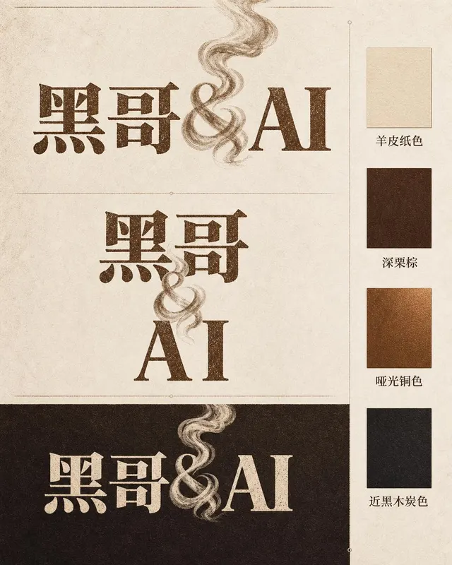
咖啡烘焙品牌字体标志
一张专业品牌识别展示页,品牌名称为 「Ember & Roast」。主字标使用压缩、略带做旧感的衬线字体,字色为暖棕色,底色奶白。与号(&)设计成一缕卷曲的烘焙烟雾。构图展示主要横排版本、紧凑堆叠版本以及深浓缩咖啡棕底色的反色单色版。旁侧附品牌色卡:羊皮纸色、深栗棕、哑光铜色和近黑木炭色。整体气质温暖、手工感十足,如…
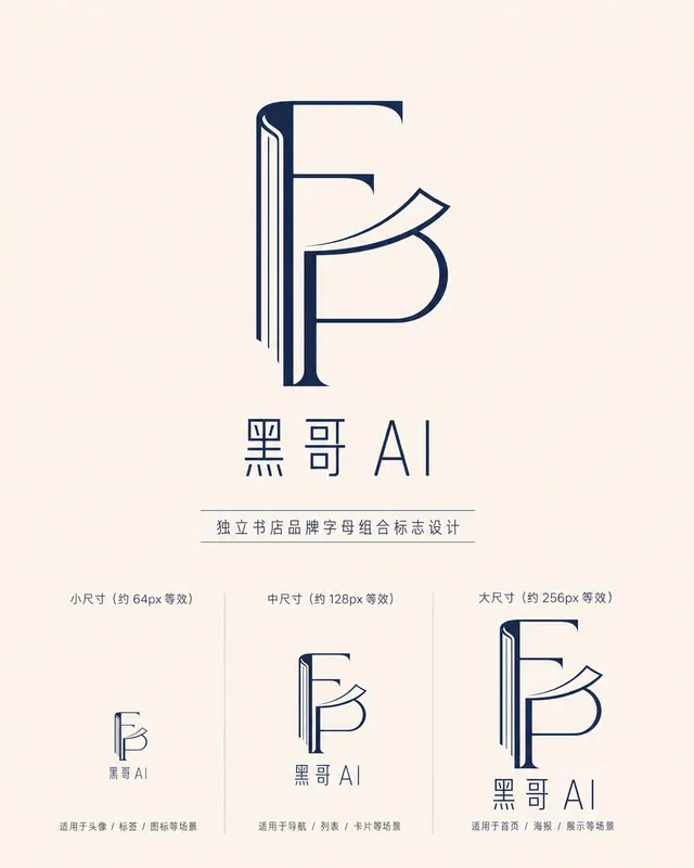
独立书店字母组合标志
一款精致的字母组合标志,用于名为 「Folded Page」 的独立书店。F 与 P 两字母以几何负空间方式互锁——F 的竖笔画化为翻开书脊,P 的曲线化为半空中翻动的页面。单色午夜蓝印在米白底上,品牌全名 「Folded Page」 以窄人文无衬线字体排于下方。展示三种尺寸版本(64px、128px、256px 等…
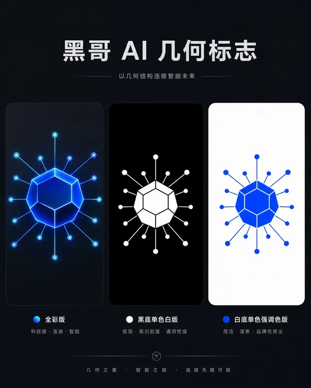
AI 初创公司几何图形标志
一款精致几何标志,用于名为 「Axon」 的 AI 初创公司。图形是十二面体衍生的六边形节点,每个顶点辐射出细连接线,将神经网络图抽象为一个完整独立的形状。以电钴蓝渲染,深石板灰底上带有微弱内发光。字标 "AXON" 以紧凑全大写几何无衬线字体居下,字距均等。展示全彩版、黑底单色白版和白底单色强调色版。气质自信、前瞻…
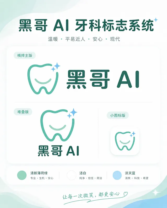
牙科诊所亲切品牌标志
一套温暖、平易近人的标志系统,用于名为 「Brightly」 的牙科诊所。图标是简化的牙齿形状,底部刻有微笑弧线,右上角有一颗小闪星——友好但不幼稚。色调:清新薄荷绿与洁白,辅以淡天蓝。横排全锁版将图标置于字标 「Brightly」 左侧,字体为圆润友好的无衬线体,字端柔和。展示横排主版、堆叠版和 favicon 尺…