慢页夜校品牌识别提案
这是一个「品牌识别」类别的 AI 生图提示词案例,风格偏向原创标志、品牌系统、触点设计。复制下方完整提示词,打开免费 GPT 生图工具粘贴,即可用 GPT Image-2 免费出图,并可替换主体、品牌名与画幅。
中文完整提示词
生成一张可就地使用的「慢页夜校」,用于建立「慢页夜校」可落地的品牌识别系统。
同一品牌板表现主标志、横版、单色版、最小尺寸和课程卡与夜间教室门牌应用,不用周边陈列代替系统设计
「慢页夜校」不用通用行业符号,而把书页折角和下班时钟重合为向内收拢的字母形符号压缩成原创轮廓,并从课程卡与夜间教室门牌提取方向和间距,维持可信、克制、具体
「慢页夜校」的课程卡与夜间教室门牌样机显示适合课程卡与夜间教室门牌的无涂布纸、耐用印墨、压印或导视基材的实际落地方式;字标不变形,提示图形与核心标志共享笔画、圆角和留白。
构图采用中心剖面加四角细节。
文字层级以「慢页夜校|建立「慢页夜校」可落地的品牌识别系统」为首,辅助标签控制在两行内,不遮挡主体证据。
先以中性工作灯照亮「慢页夜校」,再用镜头透视克制、边缘不变形建立层级;表面要求是让适合课程卡与夜间教室门牌的无涂布纸、耐用印墨、压印或导视基材上的印刷、压印、缝制或安装方式合乎现实可行。人文黑体配克制行距置于只保留必要环境线索的背景之上,确保克制而连贯的品牌提案质感。补充控制:工具和手部之间的接触影,软质部分自然卷曲、硬质部分确保受力;用清晰度差而非特效制造层级,焦点沿箭头或行为方向单向移动,局部亮色只用于操作方向。
清除现有商标轮廓、通用盾牌皇冠地球图形、随意字母缩写与纯装饰 3D 镀铬,保证全体物件有支撑、全体动势合乎人体工学、全体标注可读。
成片为单张 3:2,不附过程页或变体。
English full prompt
Create one immediately usable image titled “Slow Page Night School” for building a usable identity system for “Slow Page Night School”. One identity board shows the primary mark, horizontal lockup, monochrome version, minimum size, and course cards and an evening classroom sign; do not replace the system together with merchandise. Exclude ready-made industry symbols for Slow Page Night School. Compress the behavior of course cards and an evening classroom sign into an original outline, deriving spacing and orientation from the same touchpoint. The course cards and an evening classroom sign mockup for Slow Page Night School reveals how uncoated stock, durable ink, embossing, or wayfinding substrate suited to course cards and an evening classroom sign is made. Retain the wordmark undistorted and share stroke, corner, and spacing rules between cue and symbol. Compose Slow Page Night School as central cutaway alongside four corner details, seen using an overhead design-board view combined alongside an eye-level touchpoint mockup and restrained perspective. Build the type hierarchy around “慢页夜校|建立「慢页夜校」可落地的品牌识别系统,” keeping support labels within two lines and away from the central evidence. Control mood through plum violet, smoke gray, copper gold, and cream; soft directional light should describe the hardness, transparency, and wear of uncoated stock, durable ink, embossing, or wayfinding substrate suited to course cards and an evening classroom sign. Light Slow Page Night School with neutral task lighting, then establish hierarchy using restrained perspective without edge distortion. For all apparent surfaces, make printing, embossing, stitching, or installation on uncoated stock, durable ink, embossing, or wayfinding substrate suited to course cards and an evening classroom sign physically feasible. Set humanist sans serif with restrained leading on a background carrying only necessary environmental cues and preserve a restrained, complete identity-presentation finish. Additional control: contact shadows between tools and hands; soft parts bend naturally and simultaneously rigid parts carry load. Use clarity contrast instead of special effects, ensure focus travels one way along the arrow or action, and let the local bright hue indicate operation direction only. Remove existing trademark silhouettes, generic shield-crown-globe devices, arbitrary initials, or decorative chrome rendering; all visible object needs support, all visible movement valid ergonomics, and all visible label legibility. Return one 3:2 final image without variants or a process sheet. Final art direction: original brand identity presentation board with coherent symbol construction and real application scenes. Use this controlled palette as the dominant visual system: #242B2F, #F0E9DC, #6B8E81, #C66A45; preserve believable local material colors within it. Preserve the requested text hierarchy and wording as part of the design, but do not invent extra slogans, pseudo-text, logos, or watermarks. Keep one unmistakable primary subject or information route and one readable visual action. Use disciplined negative space and avoid default perfect symmetry. Physical credibility is mandatory: correct gravity, contact shadows, material thickness, tool weight, joint loading, fabric tension, liquid direction, reflections, scale, and occlusion. Create an original visual with no resemblance to a public figure, copyrighted character, existing campaign, or living artist signature style. No unrelated decorative icons, floating objects, duplicated limbs, plastic gloss, waxy skin, synthetic collage artifacts, or AI watermarks. Return exactly one finished image composed for 3:2; no variants, process sheet, split panels, mockup frame, or contact sheet.
相关案例
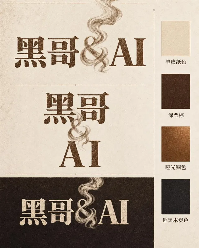
咖啡烘焙品牌字体标志
一张专业品牌识别展示页,品牌名称为 「Ember & Roast」。主字标使用压缩、略带做旧感的衬线字体,字色为暖棕色,底色奶白。与号(&)设计成一缕卷曲的烘焙烟雾。构图展示主要横排版本、紧凑堆叠版本以及深浓缩咖啡棕底色的反色单色版。旁侧附品牌色卡:羊皮纸色、深栗棕、哑光铜色和近黑木炭色。整体气质温暖、手工感十足,如…
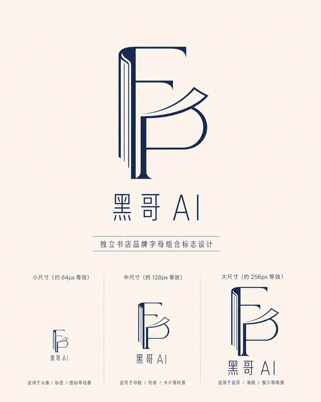
独立书店字母组合标志
一款精致的字母组合标志,用于名为 「Folded Page」 的独立书店。F 与 P 两字母以几何负空间方式互锁——F 的竖笔画化为翻开书脊,P 的曲线化为半空中翻动的页面。单色午夜蓝印在米白底上,品牌全名 「Folded Page」 以窄人文无衬线字体排于下方。展示三种尺寸版本(64px、128px、256px 等…
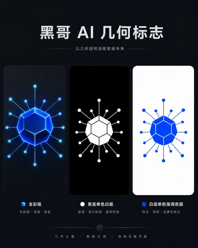
AI 初创公司几何图形标志
一款精致几何标志,用于名为 「Axon」 的 AI 初创公司。图形是十二面体衍生的六边形节点,每个顶点辐射出细连接线,将神经网络图抽象为一个完整独立的形状。以电钴蓝渲染,深石板灰底上带有微弱内发光。字标 "AXON" 以紧凑全大写几何无衬线字体居下,字距均等。展示全彩版、黑底单色白版和白底单色强调色版。气质自信、前瞻…
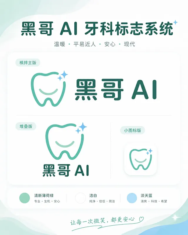
牙科诊所亲切品牌标志
一套温暖、平易近人的标志系统,用于名为 「Brightly」 的牙科诊所。图标是简化的牙齿形状,底部刻有微笑弧线,右上角有一颗小闪星——友好但不幼稚。色调:清新薄荷绿与洁白,辅以淡天蓝。横排全锁版将图标置于字标 「Brightly」 左侧,字体为圆润友好的无衬线体,字端柔和。展示横排主版、堆叠版和 favicon 尺…