果汁吧有机品牌系统
中文完整提示词
一套充满活力、以柑橘为主角的品牌识别系统,用于名为 「Grove」 的果汁吧。图标是风格化橙子横切面——一个完美圆形,以多汁橘橙和暖白构成放射状果瓣图案,中心以小填充圆表示脐眼,顶部对称伸出两枝小叶片仿佛仍在枝头。字标 "GROVE" 以中等字重人文无衬线字体呈现,深橄榄绿全大写适度字距。品牌系统展示页含:横排全锁版、以图标为重复花纹的杯套模型,以及深绿板上粉笔风格菜单版。品牌色:橘橙、橄榄绿、暖奶油和鲜青柠(强调色)。气质滋养、阳光、市集新鲜感。
English full prompt
A vibrant, citrus-forward brand identity system for a juice bar called "Grove". The icon is a stylised cross-section of an orange rendered in flat illustration — a perfect circle with a radiating segment pattern in juicy tangerine-orange and warm white, the navel indicated by a small filled circle, and two symmetrical leaf sprigs emerging from the top as if still on the tree. The wordmark "GROVE" is set in a medium-weight humanist sans-serif in deep olive-green, all caps with moderate letter-spacing. The full system sheet shows: the primary horizontal lockup, a cup-sleeve mockup with the icon tiled as a repeating pattern, and a menu-board version in chalk-style on dark green. Brand colors: tangerine, olive-green, warm cream, and fresh lime as accent. Mood: nourishing, sunny, market-fresh.
相关案例
-
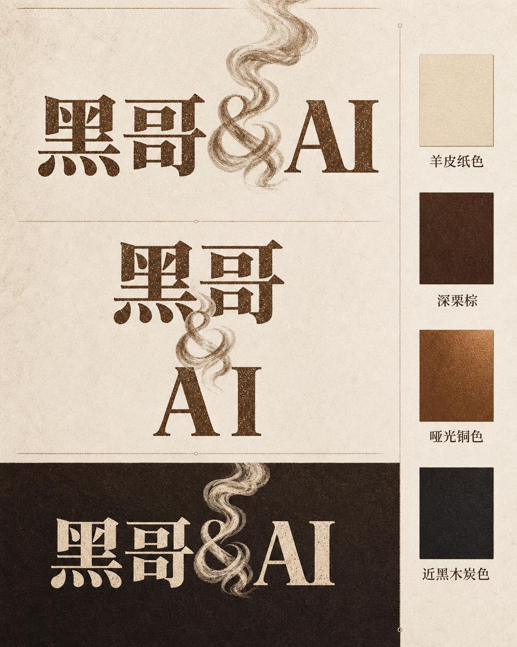
咖啡烘焙品牌字体标志
一张专业品牌识别展示页,品牌名称为 「Ember & Roast」。主字标使用压缩、略带做旧感的衬线字体,字色为暖棕色,底色奶白。与号(&)设计成一缕卷曲的烘焙烟雾。构图展示主要横排版本、紧凑堆叠版本以及深浓缩咖啡棕底色的反色单色版。旁侧附品牌色卡:羊皮纸色、深栗棕、哑光铜色和近黑木炭色。整体气质温暖、手工感十足,如…
-
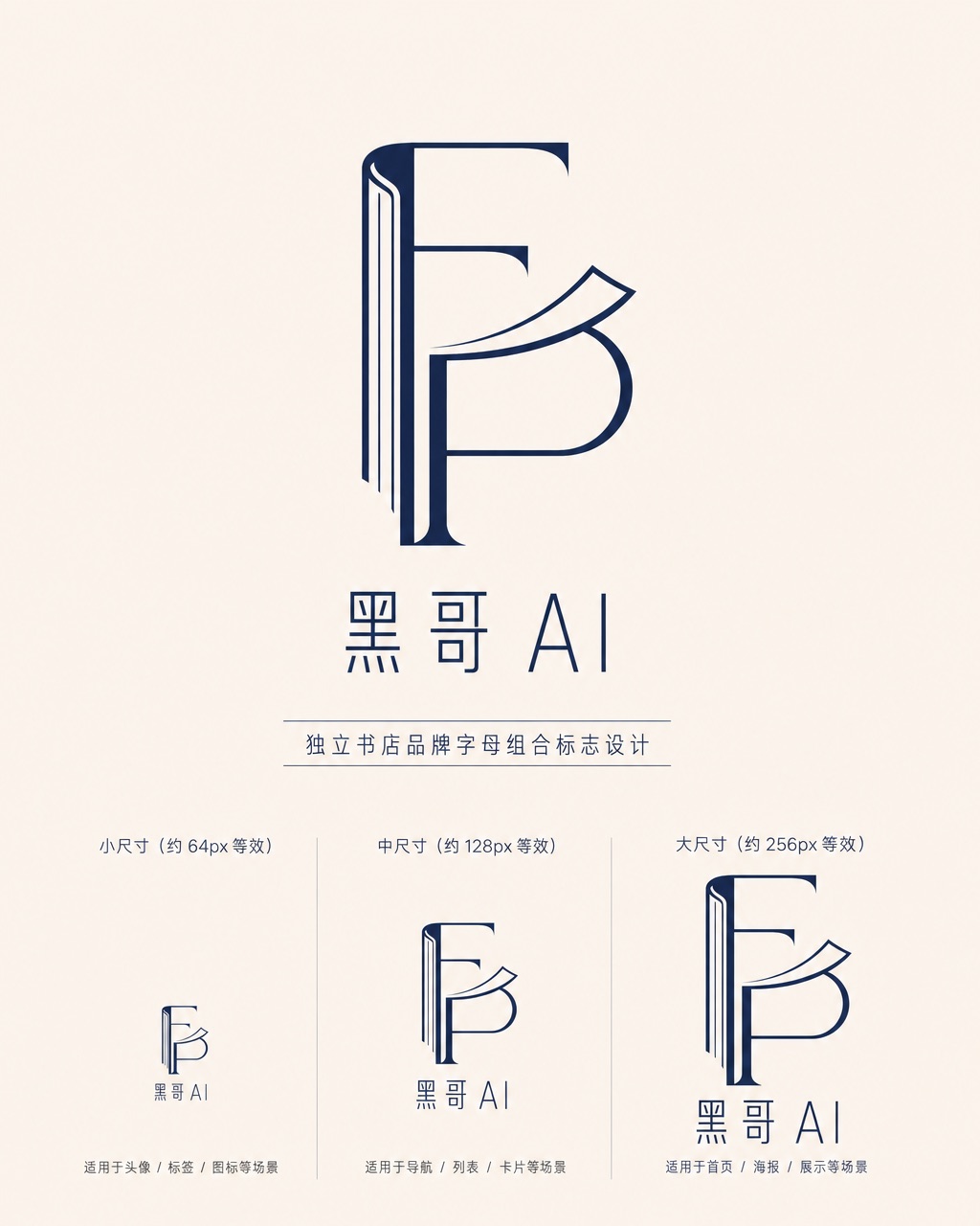
独立书店字母组合标志
一款精致的字母组合标志,用于名为 「Folded Page」 的独立书店。F 与 P 两字母以几何负空间方式互锁——F 的竖笔画化为翻开书脊,P 的曲线化为半空中翻动的页面。单色午夜蓝印在米白底上,品牌全名 「Folded Page」 以窄人文无衬线字体排于下方。展示三种尺寸版本(64px、128px、256px 等…
-
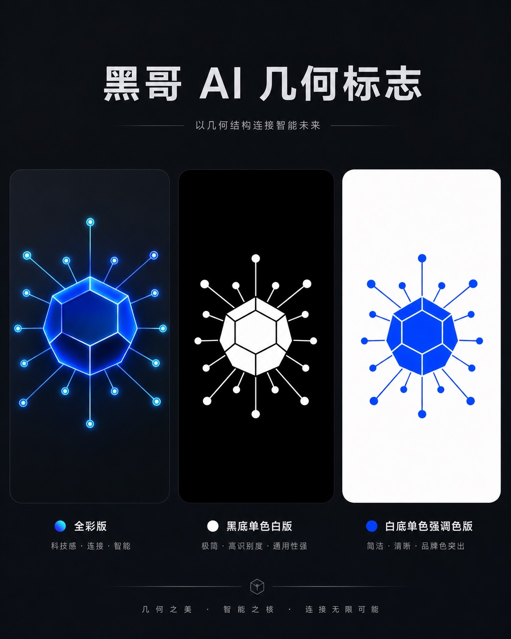
AI 初创公司几何图形标志
一款精致几何标志,用于名为 「Axon」 的 AI 初创公司。图形是十二面体衍生的六边形节点,每个顶点辐射出细连接线,将神经网络图抽象为一个完整独立的形状。以电钴蓝渲染,深石板灰底上带有微弱内发光。字标 "AXON" 以紧凑全大写几何无衬线字体居下,字距均等。展示全彩版、黑底单色白版和白底单色强调色版。气质自信、前瞻…
-
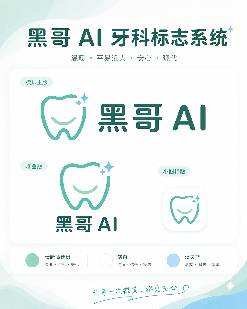
牙科诊所亲切品牌标志
一套温暖、平易近人的标志系统,用于名为 「Brightly」 的牙科诊所。图标是简化的牙齿形状,底部刻有微笑弧线,右上角有一颗小闪星——友好但不幼稚。色调:清新薄荷绿与洁白,辅以淡天蓝。横排全锁版将图标置于字标 「Brightly」 左侧,字体为圆润友好的无衬线体,字端柔和。展示横排主版、堆叠版和 favicon 尺…